import pandas as pd

# Importing titanic dataset
titanic = pd.read_csv("https://raw.githubusercontent.com/Datakortex/Datasets/refs/heads/main/titanic.csv")Data Visualization with Seaborn
Introduction
In this chapter, we introduce data visualizations in Python using Seaborn, one of the most widely used libraries for statistical graphics in Python. Seaborn is built on top of Matplotlib, the core plotting library in Python, and provides a higher-level, more modern interface for creating attractive and informative visualizations with less code. To keep things simple and focused, we’ll use the titanic dataset for all examples. This dataset is available from several public sources, including GitHub and Kaggle.
Seaborn is designed to make complex visualizations easier to create by handling much of the underlying plotting complexity automatically, allowing us to focus more on the data and the insights rather than low-level graphical details. In practice, we typically first choose the type of plot that matches the structure of the data (such as scatter plots for relationships between variables, bar plots for group comparisons, or histograms for distributions), and then refine the visualization by making adjustments such as grouping by categories, mapping variables to color or size, and customizing the style for better interpretability.
Preparing the Environment
Let’s begin by loading pandas and importing the titanic dataset from GitHub:
The titanic dataset contains information on 891 passengers aboard the RMS Titanic. This version is a cleaned subset of the original passenger manifest and is commonly used for educational and modeling purposes.
Since we’ll analyze this dataset in the next chapter as well, here we will only briefly describe the three variables we’ll focus on:
Fare: The fare paid for the ticketAge: The age of the passenger in yearsSurvived: Indicates whether the passenger survived (1) or did not survive (0)
To simplify our plots, we will create a subset of the dataset that includes only these three variables, while transforming the variable Survived to category:
# Subsetting the dataset to keep only the three relevant columns
titanic_subset = titanic[["Fare", "Age", "Survived"]].copy()

# Converting Survived to categorical (factor-like behavior)
titanic_subset["Survived"] = titanic_subset["Survived"].astype("category")
Starting from Scratch
We start by loading Seaborn and Matplotlib. The plot below shows the relationship between Age and Fare, where each point represents an individual observation in the dataset:
import seaborn as sns
import matplotlib.pyplot as plt

# Setting theme
sns.set_theme(style = "whitegrid")

# Plot example
sns.scatterplot(
  data = titanic_subset,
  x = "Age",
  y = "Fare"
  )

# Displaying plot
plt.show()
There is no strong association between these two variables—older passengers could have either cheaper or more expensive tickets compared to younger passengers. In statistical terms, there is no clear correlation between Age and Fare.
Let’s now walk through on how to re-create this plot from scratch using Seaborn.
After loading the dataset, we first need to specify the type of plot we want. In our case, we want a scatterplot, which is used to visualize the relationship between two continuous variables by plotting individual data points. For this reason, we use the function sns.scatterplot(). In this function, we need to specify the argument data, which refers to the dataset containing the variables we want to plot. Because a scatterplot shows the association between two variables, it is necessary to specify which variable will go on the x-axis (argument x) and on the y-axis (argument y). To refine its appearance, we can customize the theme, which controls non-data elements such as background color, grid lines, font sizes, and margins. Seaborn offers several built-in themes. In our original example, we used the theme "whitegrid" by setting the argument style inside the sns.set_theme() function. Finally, the function plt.show() is used to display the plot. This function is not strictly necessary in interactive environments such as Jupyter notebooks, but it is useful when running scripts to ensure the plot is rendered properly.
Putting everything together, we have the following result:
# Setting theme
sns.set_theme(style = "whitegrid")

# Creating scatterplot
sns.scatterplot(
  data = titanic_subset,
  x = "Age",
  y = "Fare"
  )

# Displaying plot
plt.show()
# Creating scatterplot
sns.scatterplot(
data = titanic_subset,
x = "Age",
y = "Fare"
)
# Displaying plot
plt.show()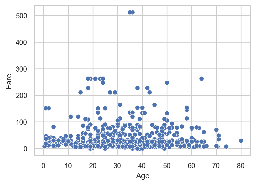
The final plot looks exactly like the one we presented at the beginning of this section. This example demonstrates the modular nature of Seaborn: we start by defining the data and the type of plot, and then we have the option to make additional adjustments depending on how we want to present and refine the visualization.
To summarize, Seaborn allows us to create statistical visualizations in a structured and efficient way by separating data mapping (variables and plot type) from visual styling (themes and aesthetics), making the workflow both flexible and easy to interpret.
Visual Aesthetics in Seaborn
The plot functions of seaborn such as sns.scatterplot() allows us to create plots with the minimum characteristics. For example, for a scatter plot it is necessary to specify the variables on the x-axis and y-axis. We can actually map more variables to visual properties in a plot. The most common ways are through color (hue), size (size) and style (style).
For instance, we can add the Survived variable to color the points in the scatter plot with the argument hue:
# Creating scatterplot with color
sns.scatterplot(
  data = titanic_subset,
  x = "Age",
  y = "Fare",
  hue = "Survived"
  )

# Displaying plot
plt.show()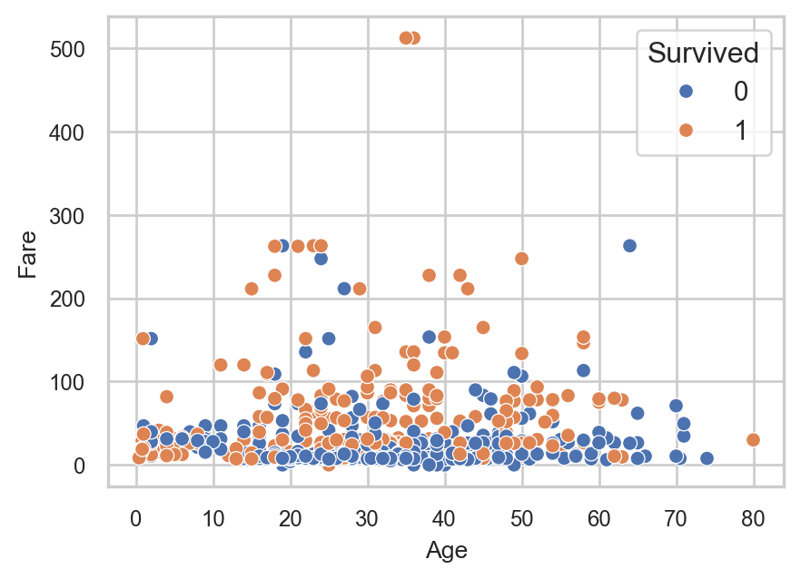
We also have the option to reverse the order of the categories using the argument hue_order:
# Creating scatterplot with colors and specific colors
sns.scatterplot(
  data = titanic_subset,
  x = "Age",
  y = "Fare",
  hue = "Survived",
  hue_order = [1, 0]
  )

# Displaying plot
plt.show()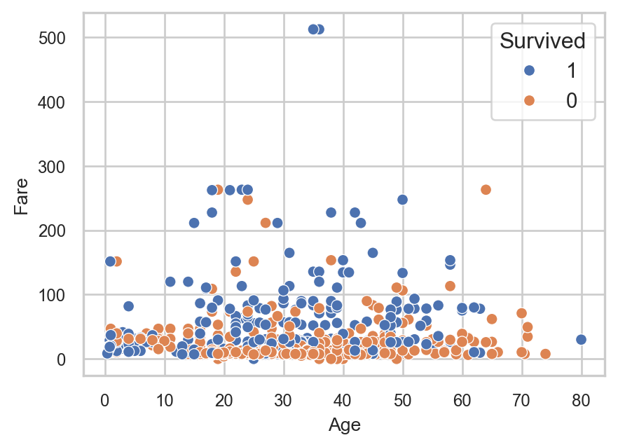
In this case, the category 1 is plotted first, which means it is assigned the first color in the default palette, while the category 0 is assigned the second color. As a result, we effectively change which group is visually emphasized by controlling the ordering of the color assignment.
We can also explicitly define the colors associated with each category using a dictionary. This gives full control over the visual appearance of the groups:
# Specifying category colors
palette_groups = {1: "blue", 0: "red"}

# Creating scatterplot with specific colors and order
sns.scatterplot(
  data = titanic_subset,
  x = "Age",
  y = "Fare",
  hue = "Survived",
  hue_order = [1, 0],
  palette = palette_groups
  )

# Displaying plot
plt.show()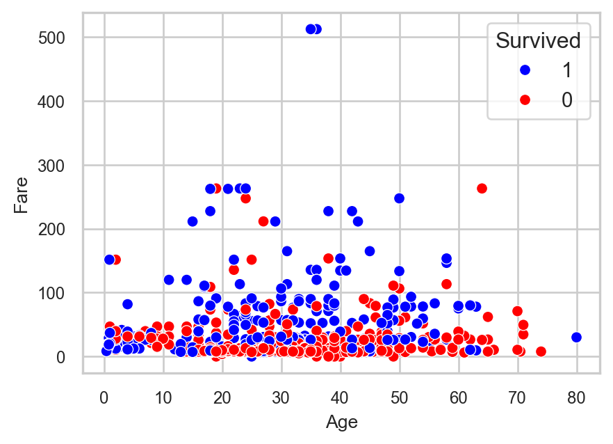
In this case, we explicitly assign blue to passengers who survived (1) and red to those who did not (0), ensuring that the color encoding is consistent and interpretable across all plots.
In a similar way, the characteristics style and size can be adjusted to encode additional variables:
style: changes the marker shape based on categoriessize: adjusts the size of points (or line thickness in some plot types)
These aesthetics allow us to represent multiple dimensions of the data within a single visualization, making exploratory analysis more informative and flexible.
Apart from mapping variables to visual properties, we can also directly modify the appearance of a plot. In other words, instead of linking aesthetics to data, we can control how the visual elements look globally. The most common elements we adjust are transparency (alpha), color (color), and size (s).
As an example, suppose we want to create the original scatter plot but with all data points displayed in blue:
# Creating scatterplot with blue data points
sns.scatterplot(
  data = titanic_subset,
  x = "Age",
  y = "Fare",
  color = "blue"
  )

# Displaying plot
plt.show()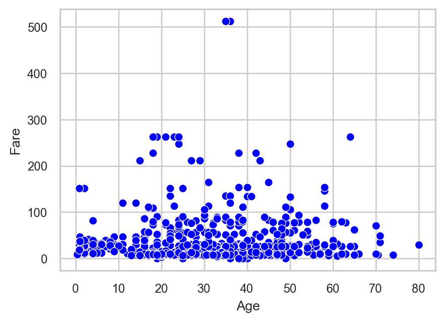
In this case, the color argument applies a single color to all observations, meaning that no grouping information is encoded in the plot. As a result, the visualization focuses purely on the relationship between the two continuous variables.
We can further control the appearance of the points by adjusting their transparency using the alpha parameter. This is particularly useful when there is overplotting (i.e. many points overlapping each other), as it allows dense regions to become visually more informative.
For example, if we set the transparency to 0.5 (i.e., 50%), the resulting plot is shown below:
sns.scatterplot(
  data = titanic_subset,
  x = "Age",
  y = "Fare",
  color = "blue",
  alpha = 0.5
  )

# Displaying plot
plt.show()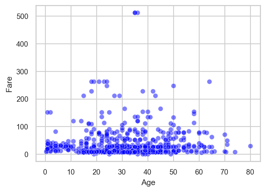
Here, lowering the transparency makes overlapping points partially visible, which helps reveal areas of higher concentration in the data.
Plot Types
There are many types of plot we can make with Seaborn. In this section, we will focus on some of the most common ones, namely:
Scatter plots
Histograms and density plots
Count plots
Box plots
Line plots
Scatter Plots
We already created a scatter plot at the beginning of this chapter using the sns.scatterplot() function. A scatter plot is ideal when we want to display two numeric variables on the axes. We can add more variables to a scatter plot by changing an element of the plotted points. For example, we previously used the variable Survived to color the points - we could similarly change shape.
Histogram and Density Plots
In Chapter Statistical Distributions, we introduced histograms and density plots as tools to visualize the distribution of a variable. Now let’s see how to create them.
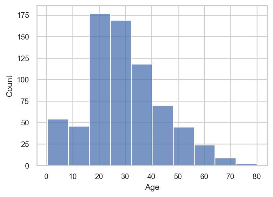
We use sns.histplot() and sns.kdeplot() to generate histogram and density plots respectively. These are one-dimensional plots, so we only need to specify the x variable:
# Creating histogram
sns.histplot(
  data = titanic_subset,
  x = "Age"
  )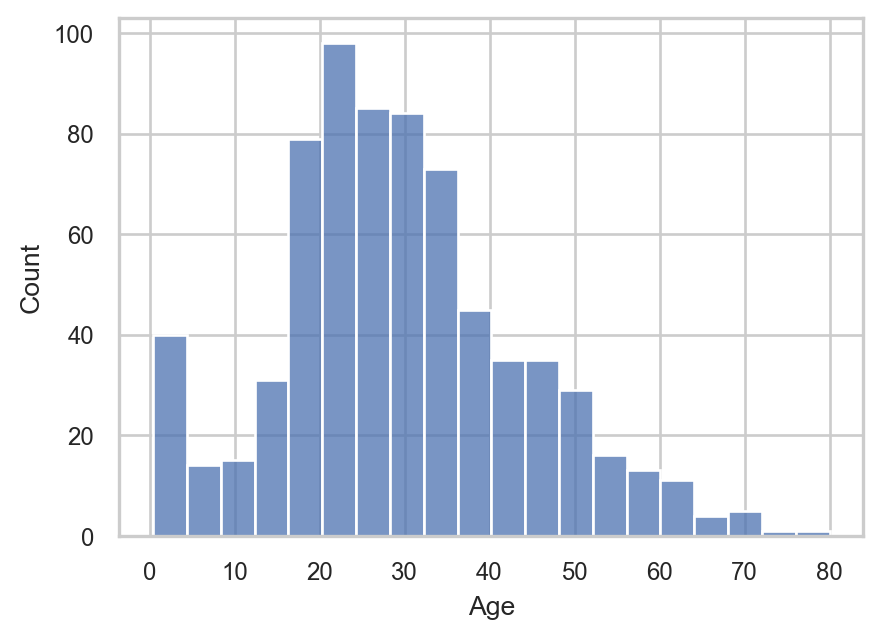
The distribution of Age looks roughly normal. We can change the granularity of the histogram by using the (number of) bins or binwidth arguments in sns.histplot(). We only need to set one of the two, as the other one will be set automatically:
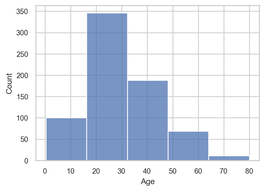
# Creating histogram with 5 bins
sns.histplot(
  data = titanic_subset,
  x = "Age",
  bins = 5
  )
# Creating histogram with 10 bins
sns.histplot(
  data = titanic_subset,
  x = "Age",
  bins = 10
  )
We can also explore the distribution of Fare, using a density plot:
# Creating density plot
sns.kdeplot(
  data = titanic_subset,
  x = "Fare"
  )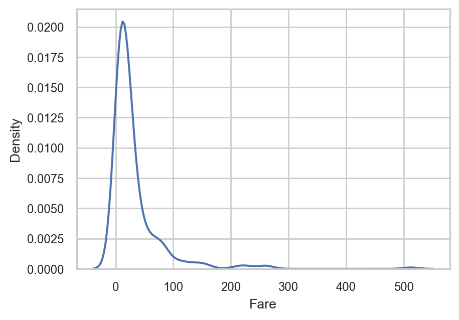
The variable Fare seems to follow a log-normal distribution, with a long right tail.
We can also combine these two types of geometries into one plot. This can easily be done using the sns.histplot() function and setting the argument kde to True:
# Creating histogram with density line
sns.histplot(
  data = titanic_subset,
  x = "Age",
  bins = 10,
  kde = True
  )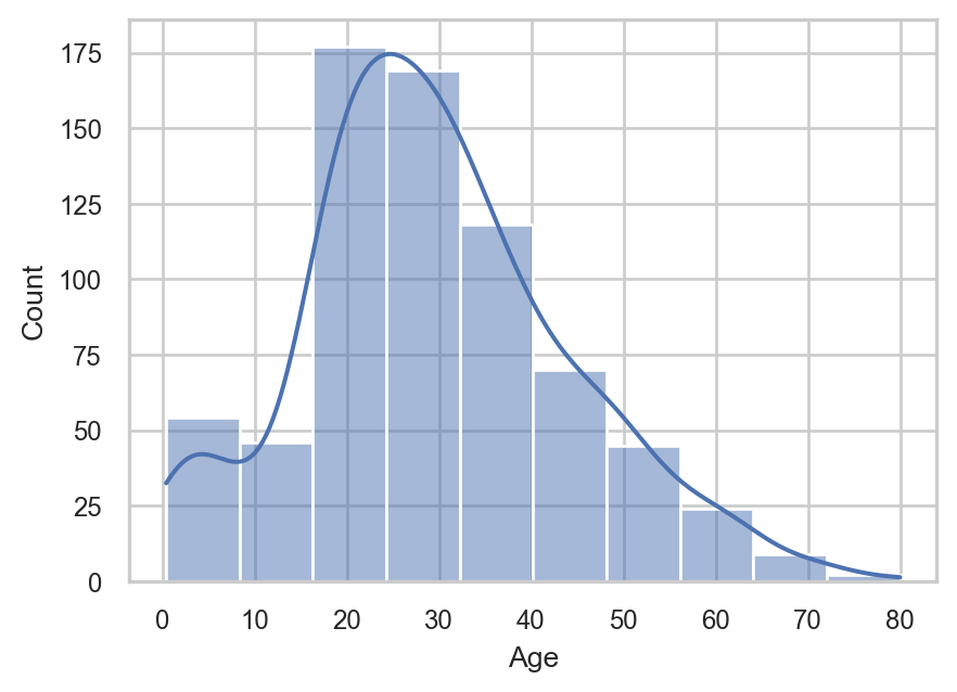
Now, we see the histogram along with the density line, with the y-axis representing the estimated probability density of the variable. This means that instead of showing raw counts, the plot is scaled so that the total area under the curve equals one, allowing us to interpret the distribution in terms of relative likelihood rather than absolute frequencies
Count Plots
Count plots are an excellent choice for visualizing categorical data. To create a count plot, we use the function sns.countplot(). As with histograms and density plots, we need to include only one variable on the x-axis. Let’s plot the variable Survived:
# Creating countplot
sns.countplot(
  data = titanic_subset,
  x = "Survived"
  )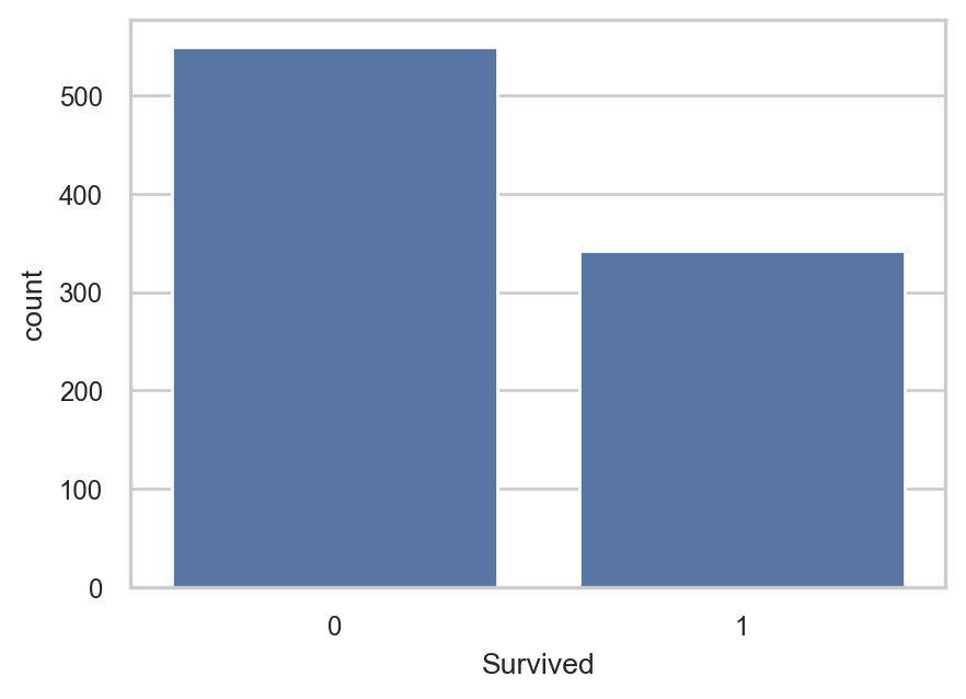
Similar to sns.histplot(), the y-axis here represents the number of observations. In fact, a count plot can be thought of as a histogram for categorical variables, where each “bin” corresponds to a specific category. This plot shows that most passengers on the Titanic did not survive.
Controlling Plot Structure
In the last code chunk, we place the categories on the x-axis by specifying the argument
x = "Survived". If we instead wanted horizontal bars, we could place the categories on the y-axis by usingy = "Survived"instead. This highlights the intuitive design of Seaborn, where the structure of the plot is directly controlled through the function arguments.
Instead of plotting counts on the y-axis, we may sometimes want to show a summary statistic. For instance, we may be intersted in visualizing the average ticket price (Fare) within each category. In this case, the x-axis still displays the categories, but the y-axis will show a numerical value. To do this, we use the function sns.barplot(), which is similar to the sns.countplot() function. With sns.barplot(), we need to specify the y variable as well as the optional argument estimator, which has the default value of "mean":
Instead of plotting counts on the y-axis, we may sometimes want to show a summary statistic. For instance, we may be interested in visualizing the average ticket price (Fare) within each category. In this case, the x-axis still displays the categories, but the y-axis will show a numerical value. To do this, we use the function sns.barplot(), which is similar to the sns.countplot() function. With sns.barplot(), we need to specify the y variable as well as the optional argument estimator, which has the default value of "mean":
# Creating barplot
sns.barplot(
  data = titanic_subset,
  x = "Survived",
  y = "Fare",
  estimator = "mean"
  )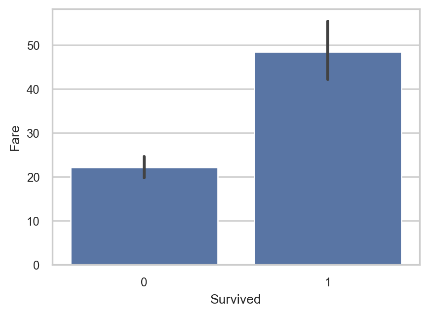
The bar height illustrates the mean value of Fare for each category on the x-axis. The error bars represent the uncertainty around this estimated mean value, based on repeated resampling of the data. These error bars can be removed by setting the argument errorbar to None.
We can verify these results by calculating the mean value of Fare for each category of Survived:
# Calculating the mean value of Frequency for each survival category
titanic_subset.groupby("Survived")[["Fare"]].mean()| Fare | |
|---|---|
| Survived | |
| 0 | 22.12 |
| 1 | 48.40 |
Regarding the interpretation, the average ticket price among survivors was higher than among non-survivors. This is an interesting insight as it may suggest that passengers who paid more had a higher priority when boarding the life boats or were located in more favorable areas of the ship (closer to the life boats perhaps?) before it sank.
Box Plots
To visualize the distribution of a numeric variable, we previously used histograms and density plots. Another way to do this is with a box plot. As the name suggests, a box plot is essentially a… plot that includes a box, which represents the values close to the center of the distribution.
A box plot typically displays five summary statistics known as the five-number summary (those were also discussed in Chapter Statistical Distributions). These include:
Minimum: The smallest value
First Quartile (Q1): The 25th percentile, marking the lower edge of the box
Median (Q2): The 50th percentile, shown by the line inside the box
Third Quartile (Q3): The 75th percentile, marking the upper edge of the box
Maximum: The largest value
Let’s create a box plot for the Age variable using sns.boxplot():
# Creating box plot
sns.boxplot(
  data = titanic_subset,
  x = "Age"
  )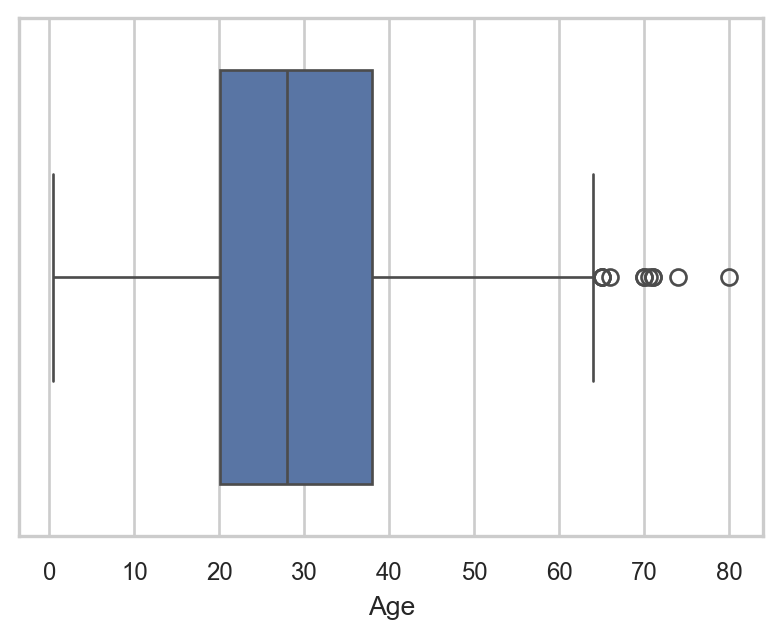
The black horizontal line close to the middle of the box represents the median. The box contains all values between the first and third quartiles, while the dots outside the box are outliers. This plot shows that the Age variable is fairly symmetric, with just a few outliers on the right-hand side.
While histograms or density plots are preferred when visualizing the distribution of a single variable, box plots are excellent for comparing distributions across categories. To do this, we place the numeric variable on the y-axis and the categorical variable on the x-axis. For instance, the following plot shows the distribution of Age across survival categories:
# Creating box plot
sns.boxplot(
  data = titanic_subset,
  x = "Survived",
  y = "Age"
  )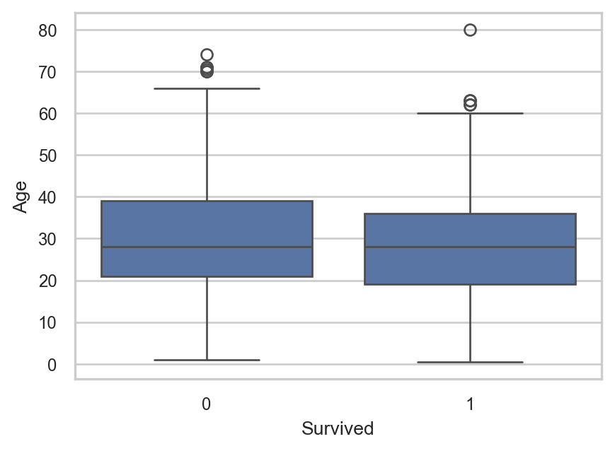
The centers of the two distributions are nearly at the same level, with the distribution of non-survivors being slightly higher. This might reflect the fact that older passengers were slightly less likely to survive the disaster.
Line Plots
Line plots are another useful type of plot, although we haven’t encountered them in previous chapters. As the name suggests, a line plot connects data points with a line, helping to visualize trends or changes over time or ordered values.
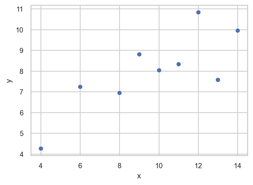
To see how this works, let’s manually create a simple dataset with just a few data points:
# Creating a simple data set
simple_data_set = pd.DataFrame({
  "x": [10, 8, 13, 9, 11, 14, 6, 4, 12],
  "y": [8.04, 6.95, 7.58, 8.81, 8.33, 9.96, 7.24, 4.26, 10.84]
  })
Since we have two numeric variables, we can first create a scatter plot using the sns.scatterplot() function:
# Creating scatter plot
sns.scatterplot(
  data = simple_data_set,
  x = "x",
  y = "y"
  )
For a line plot, we use the function sns.lineplot() instead of sns.scatterplot(). This connects the data points with a line:
# Creating line plot
sns.lineplot(
  data = simple_data_set,
  x = "x",
  y = "y"
  )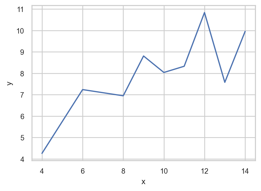
In the line plot above, the individual data points are not emphasized as clearly because the focus is on the connecting line. To include both the individual points and the connecting line, we can add markers directly to the line plot by setting the argument marker = "o":
# Creating line plot with markers
sns.lineplot(
  data = simple_data_set,
  x = "x",
  y = "y",
  marker = "o"
  )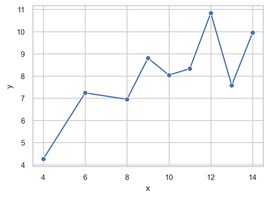
This combined plot is often used to show both the trend (line) and the individual values (points), especially when the number of points is small and we want to see both clearly.
Faceted Plots
All the previous plots are considered single plots, meaning that all observations are displayed within the same figure. However, in many cases it is useful to split a plot into multiple panels based on the values of a categorical variable. This approach is known as using facets.
Facets allow us to create multiple subplots that share the same axes but display different subsets of the data. In Seaborn, this is mainly done through the following functions:
sns.relplot(): used for relational plots (scatter plots and line plots) with optional facetssns.catplot(): used for categorical plots (box plots, bar plots, count plots, etc.) with optional facetssns.displot(): used for distribution plots (histograms and density plots) with optional facets
The key difference is that each function is designed for a specific type of variable relationship:
relplot: relationships between numeric variablescatplot: numeric vs categorical comparisonsdisplot: distribution of a single variable
Both sns.relplot() and sns.catplot() include an important argument called kind, which specifies the type of plot we want to create. For example, in sns.catplot(), we must explicitly define the plot type using kind, such as "box" for box plots, or "bar" for bar plots.
To understand how these functions work, let’s revisit the scatter plot we created earlier in the chapter. This time, we use sns.relplot() to split the data into separate scatter plots based on the values of the Survived variable:
# Faceted scatterplot by survival status
sns.relplot(
  data = titanic_subset,
  x = "Age",
  y = "Fare",
  kind = "scatter",
  col = "Survived"
  )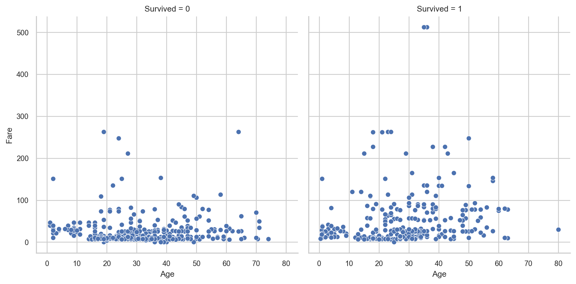
Now the data is split into two separate plots arranged in columns, one for passengers who did not survive and one for those who survived. Each subplot shows the same relationship between Age and Fare, but for a different subgroup of the data.
We can also create facets by rows instead of columns using the argument row:
# Faceted scatterplot by survival status
sns.relplot(
  data = titanic_subset,
  x = "Age",
  y = "Fare",
  kind = "scatter",
  row = "Survived"
  )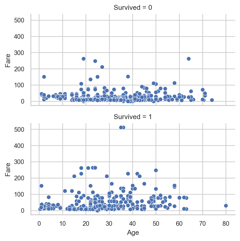
We can even combine both rows and columns by using both row and col arguments, which creates a full grid of subplots based on multiple categorical variables.
As an example, suppose we want to create a histogram of Fare for each combination of age group and survival status. For this, we first create a new variable called "Age_Category" that splits passengers into adults and underage individuals:
# Creating variable Age_Category
titanic_subset["Age_Category"] = np.where(
  titanic_subset["Age"] >= 18,
  "Adult",
  "Underage"
  )
Now we can use this variable together with Survived to create a faceted visualization. Because we want to create a histogram, we use the functionsns.displot(). In this function, we set kind = "hist", which tells Seaborn to use histograms within the faceting structure:
# Faceted histogram of Fare by Survived and Age_Category
sns.displot(
  data = titanic_subset,
  x = "Fare",
  col = "Survived",
  row = "Age_Category",
  kind = "hist"
  )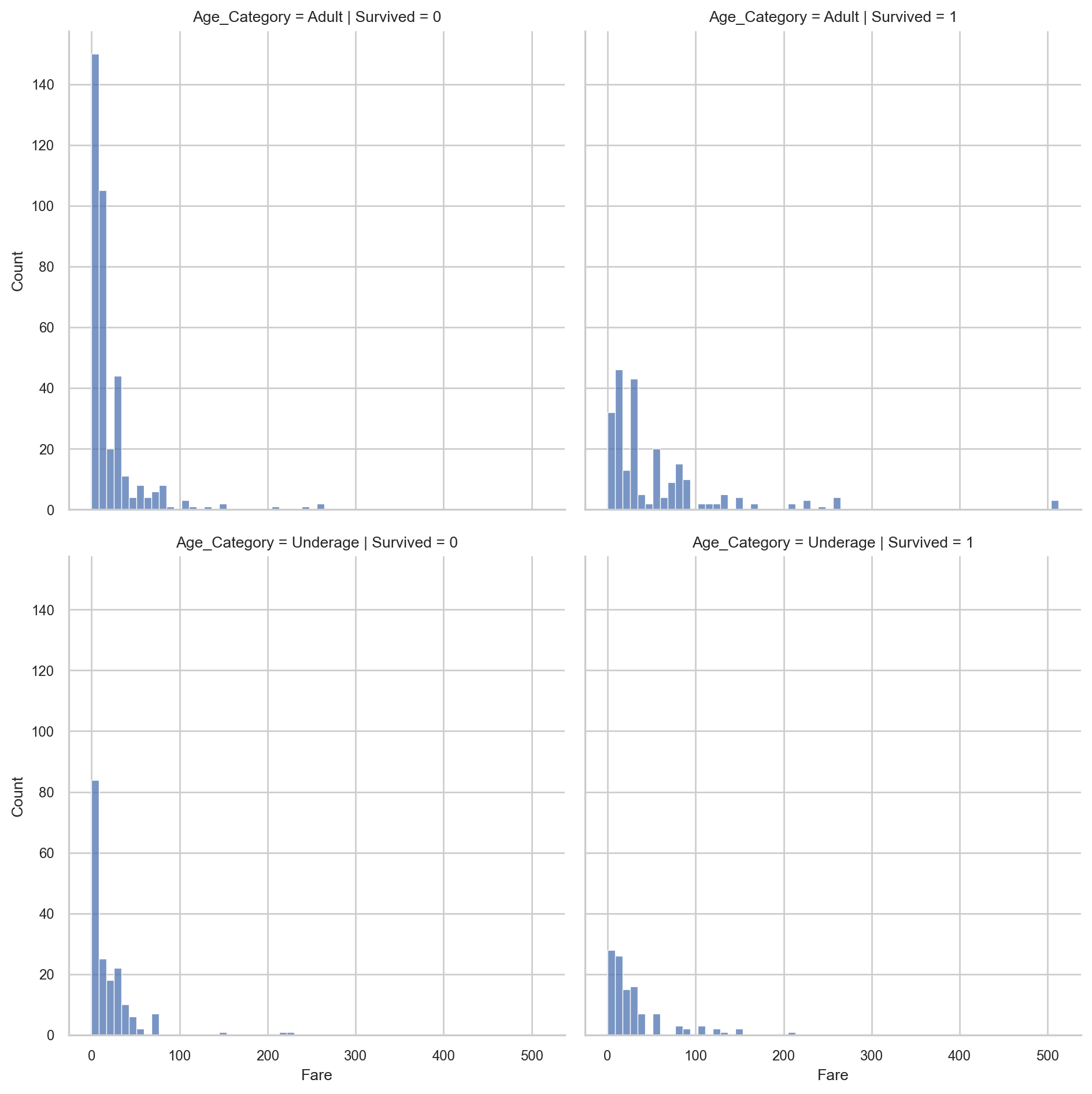
In this example, the data is divided into a grid of plots based on both survival status and age category. Each subplot shows the distribution of Fare for a specific subgroup, allowing for a much more detailed comparison across categories.
In a similar fashion, we can create different box plots using sns.catplot(). Here we use the same faceting structure, but instead of showing distributions, we summarize the data using the box plot representation:
# Faceted box plots of Fare by Survived and Age_Category
sns.catplot(
  data = titanic_subset,
  y = "Fare",
  col = "Survived",
  row = "Age_Category",
  kind = "box"
  )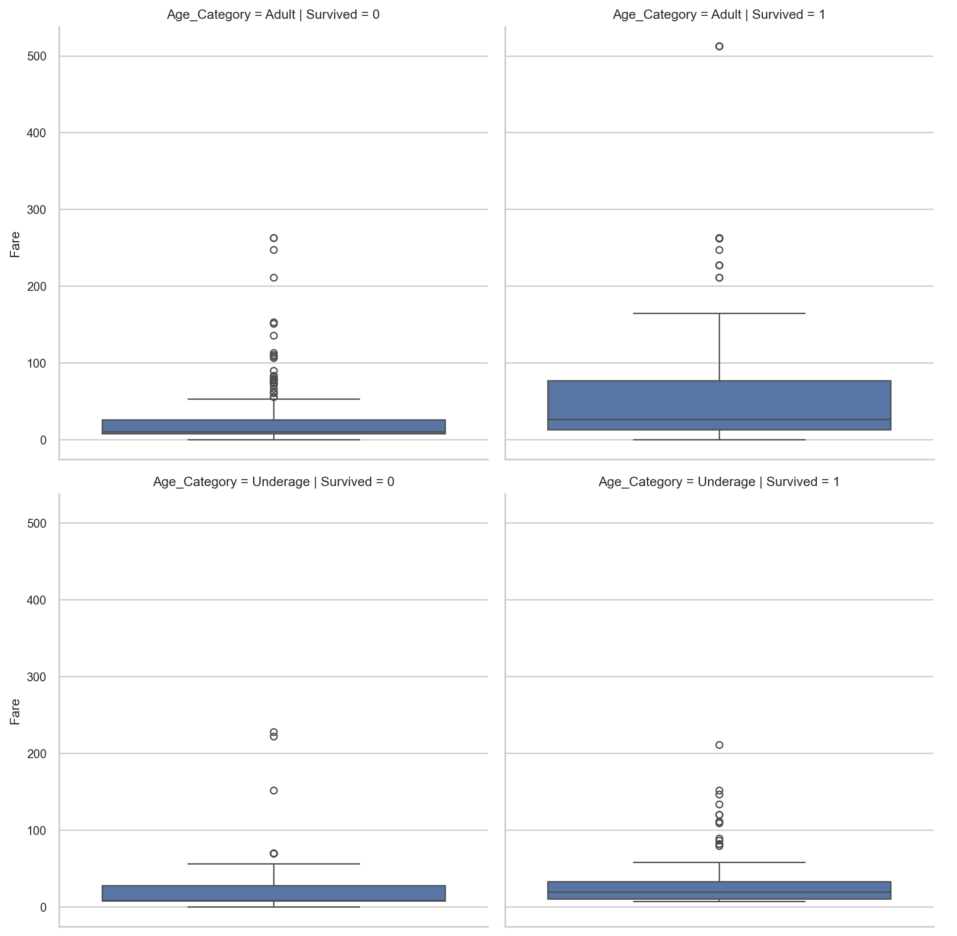
These faceted box plots allow us to compare both the distribution and central tendency of Fare across different groups, making it easier to identify differences between categories.
Further Customization
Apart from mapping variables to visual properties, we can also directly control the overall structure of the plot using functions from Matplotlib (plt). While Seaborn is built on top of Matplotlib and provides a high-level interface for statistical graphics, Matplotlib gives us more granular control over the final appearance of the figure. In practice, we often use Seaborn to create the plot itself and then use Matplotlib to adjust elements such as axis labels, limits, and layout. This is because Seaborn focuses on what is being plotted, while Matplotlib focuses on how the plot is displayed.
For example, we can change the axis titles using plt.xlabel() and plt.ylabel():
# Creating scatterplot
sns.scatterplot(
  data = titanic_subset,
  x = "Age",
  y = "Fare"
  )

# Changing axis labels
plt.xlabel("Passenger Age")
plt.ylabel("Ticket Fare")

# Displaying plot
plt.show()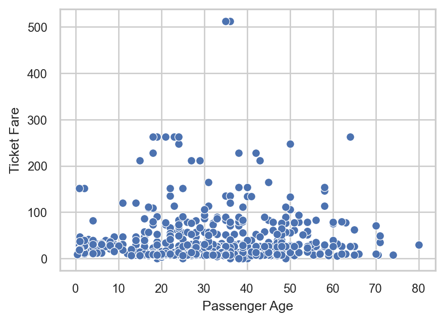
Here, the axis labels are no longer the raw variable names but more interpretable descriptions. This is particularly useful when preparing figures for reports or presentations.
We can also control the range of values displayed on each axis using plt.xlim() and plt.ylim(). This allows us to zoom into a specific part of the data or ensure consistency across multiple plots:
# Creating scatterplot
sns.scatterplot(
  data = titanic_subset,
  x = "Age",
  y = "Fare"
  )

# Limiting axis ranges
plt.xlim(0, 80)
plt.ylim(0, 300)

# Displaying plot
plt.show()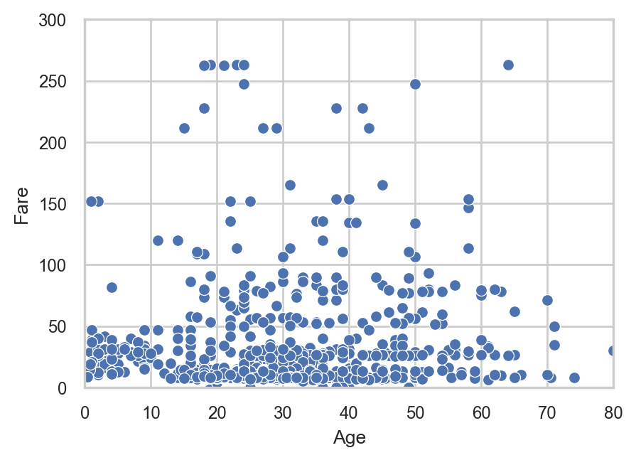
In this example, we restrict the x-axis to ages between 0 and 80 and the y-axis to fares between 0 and 300. Notice that in the previous plots, the y-axis extended beyond 300, whereas now it is explicitly limited to this range. As a result, any observations with a Fare value greater than 300 are no longer displayed in the plot.
Recap
In this chapter, we explored key types of plots in Seaborn, including scatter plots, histograms, density plots, count plots, bar plots, box plots, and line plots, as well as the use of facets to create multiple subplots based on categorical variables. We also discussed how to customize the appearance of plots through different aesthetic mappings, such as color, size, style, and transparency, as well as how to directly control visual elements like axis limits and labels using matplotlib.
These tools form the foundation for effective and flexible data visualization in Python. While Seaborn provides a wide range of built-in functionalities, there are still many additional options available depending on the type of plot and the visual effect one aims to achieve. More details can be found in the Seaborn official documentation site.