In this chapter, we examine the method of LOESS (Locally Estimated Scatterplot Smoothing), a non-parametric approach for fitting a smooth curve through a scatterplot. In contrast to traditional linear regression, which estimates a single global linear relationship across all observations, LOESS performs localized linear regressions around each data point. This enables the model to capture more complex, non-linear patterns in the data. A basic understanding of linear regression is nonetheless beneficial, as LOESS builds upon its principles by incorporating local fitting techniques.
Preliminary Setup
We begin by loading the necessary packages, Pandas and Seaborn, along with the mtcars dataset, which we import directly from a GitHub repository:
import pandas as pdimport seaborn as sns# Importing mtcarsmtcars = pd.read_csv("https://raw.githubusercontent.com/Datakortex/Datasets/refs/heads/main/mtcars.csv")# Printing the first few rowsmtcars.head()
name
mpg
cyl
...
am
gear
carb
0
Mazda RX4
21.0
6
...
1
4
4
1
Mazda RX4 Wag
21.0
6
...
1
4
4
2
Datsun 710
22.8
4
...
1
4
1
3
Hornet 4 Drive
21.4
6
...
0
3
1
4
Hornet Sportabout
18.7
8
...
0
3
2
5 rows × 12 columns
The mtcars dataset consists of 32 observations and 11 variables, providing information on various automobile attributes, including fuel consumption. For illustrative purposes, we will focus on two variables: wt (weight of the car) and mpg (miles per gallon). To facilitate the analysis, we create a new dataset containing only those variables, and rename it data, for clarity:
# Selecting variables and creating a new objectdata = mtcars[['wt', 'mpg']].rename( columns = {'wt': 'Weight','mpg': 'Miles_per_Gallon'} )
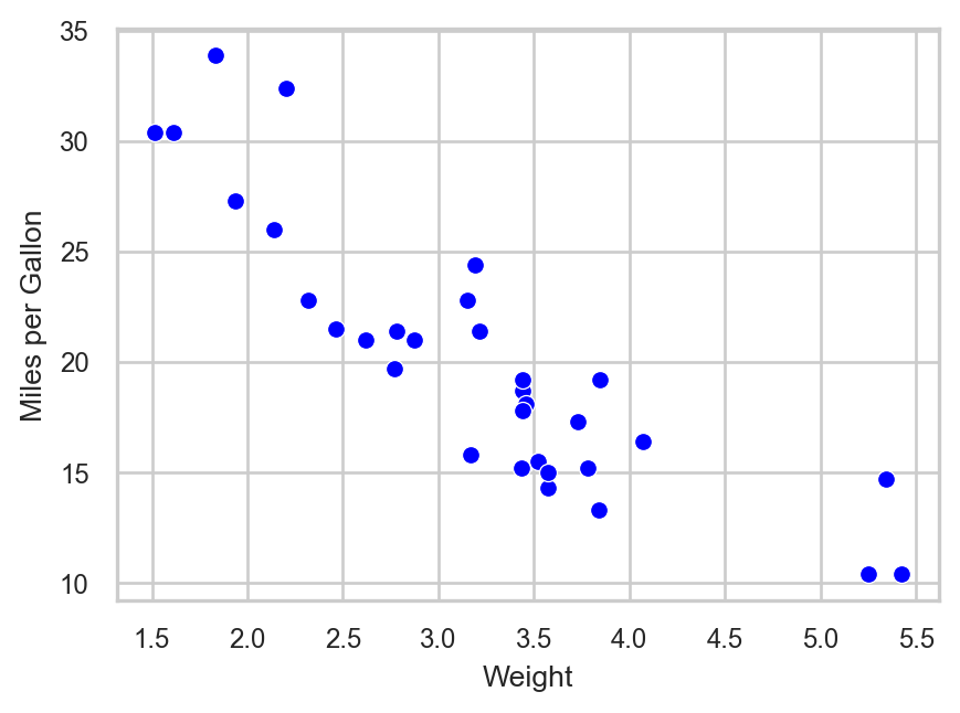
The scatterplot below illustrates the relationship between vehicle weight and fuel efficiency:
# Setting themesns.set_theme(style ="whitegrid")# Creating scatterplotsns.scatterplot(data = data, x ="Weight", y ="Miles_per_Gallon", color ="blue")# Adjusting axis titlesplt.xlabel("Weight")plt.ylabel("Miles per Gallon")# Displaying plotplt.show()
Figure 28.1: Scatterplot illustrating the association between car weight and miles per gallon.
A negative linear trend is apparent: as vehicle weight increases, miles per gallon tend to decrease.
Linear Regression via OLS
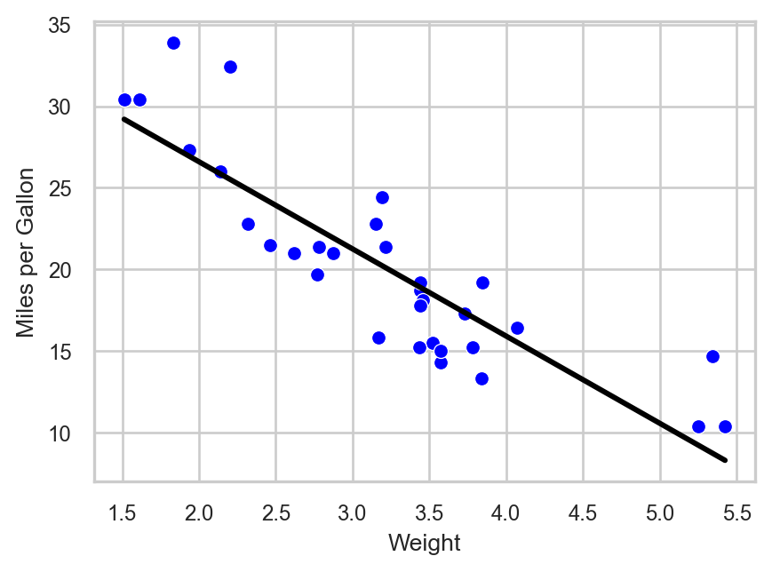
The conventional method for estimating linear relationships is Ordinary Least Squares (OLS) (see Chapter Simple Linear Regression). As a reminder, the objective of OLS is to minimize the sum of squared residuals, thereby identifying the best-fitting linear model. OLS therefore fits a single straight line that approximates all data points. We can visualize this fit using the function regplot() from Seaborn. This function is similar to the sns.scatterplot() function, but it is specifically designed for regression analysis. In other words, it automatically fits and displays a regression line on top of the data. Moreover, the argument ci is used to control whether a confidence interval is displayed around the regression line. By default, sns.regplot() shows a shaded confidence band (typically 95%), but setting ci = None removes this band for a cleaner visualization focused only on the fitted line and data points. Lastly, the argument scatter can be used to control whether the individual data points are displayed alongside the regression line. In the code below, we include a separate sns.scatterplot() call to display the raw data points for clarity, while setting scatter = False in sns.regplot() so that only the fitted regression line is drawn. This separation makes it easier to visually distinguish the observed data from the model fit.
# Creating scatterplotsns.scatterplot(data = data, x ="Weight", y ="Miles_per_Gallon", color ="blue")# Adding regression linesns.regplot(data = data, x ="Weight", y ="Miles_per_Gallon", color ="black", scatter=False, ci =None)# Adjusting axis titlesplt.xlabel("Weight")plt.ylabel("Miles per Gallon")# Displaying plotplt.show()
Figure 28.2: Scatterplot with OLS regression line.
Layering Plots in Seaborn
In Seaborn, calling plotting functions such as sns.regplot() multiple times on the same figure does not replace previous plots—it layers additional elements on top of the existing axes. This allows us to compare different models (e.g., linear, polynomial, or LOESS) by drawing multiple fitted lines on the same scatterplot. Each call adds a new line to the same plot, making it a flexible approach for visual model comparison. This behavior is not unique to sns.regplot() but reflects a general design principle in Seaborn (and Matplotlib), where multiple plotting calls are accumulated on the same figure unless a new figure is explicitly created.
To fit the model explicitly, we use the ols() function from statsmodels to define an ordinary least squares regression model:
from statsmodels.formula.api import ols# Creating a linear regression modelols_model = ols("Miles_per_Gallon ~ Weight", data = data ).fit()
Although the visual fit appears reasonable, we can assess model fit using summary statistics. The R-squared value, for instance, quantifies the proportion of variance in Miles_per_Gallon explained by Weight:
# Checking summary resultsols_model.summary()
Coefficient
Std. Error
t-value
p-value
CI Lower
CI Upper
Intercept
37.29
1.88
19.86
0.0
33.45
41.12
Weight
-5.34
0.56
-9.56
0.0
-6.49
-4.20
Statistic
Value
0
Dependent Variable
Miles_per_Gallon
1
Model
OLS
2
Method
Least Squares
3
No. Observations
32
4
Df Residuals
30
5
Df Model
1
6
Covariance Type
nonrobust
7
R-squared
0.75
8
Adj. R-squared
0.74
9
F-statistic
91.38
10
Prob (F-statistic)
1.29e-10
11
Log-Likelihood
-80.0
12
AIC
164.0
13
BIC
167.0
The resulting R-squared of approximately 0.75 indicates that 75% of the variation in fuel efficiency is explained by vehicle weight.
We can of course use OLS to capture a non-linear relationship by using polynomial terms, meaning that we can include the same (independent variable) on the power of 2 or higher.
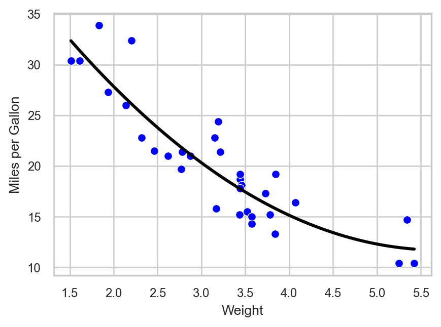
The following plot shows the regression line when we add 2nd degree polynomial term. The code is almost the same as previously; we just adjusted the argument order:
# Creating scatterplotsns.scatterplot(data = data, x ="Weight", y ="Miles_per_Gallon", color ="blue")# Adding regression line with 2nd degree polynomialsns.regplot(data = data, x ="Weight", y ="Miles_per_Gallon", scatter =False, line_kws = {"color": "black"}, ci =None, order =2)# Adjusting axis titlesplt.xlabel("Weight")plt.ylabel("Miles per Gallon")# Displaying plotplt.show()
Figure 28.3: Scatterplot with OLS regression line using 2nd-degree polynomial terms.
This line seems much more flexible and it fits the data data. We can actually confirm this by checking the R-squared of the new polynomial model:
# Creating a linear regression modelols_model_poly_2 = ols("Miles_per_Gallon ~ Weight + I(Weight ** 2)", data = data ).fit()
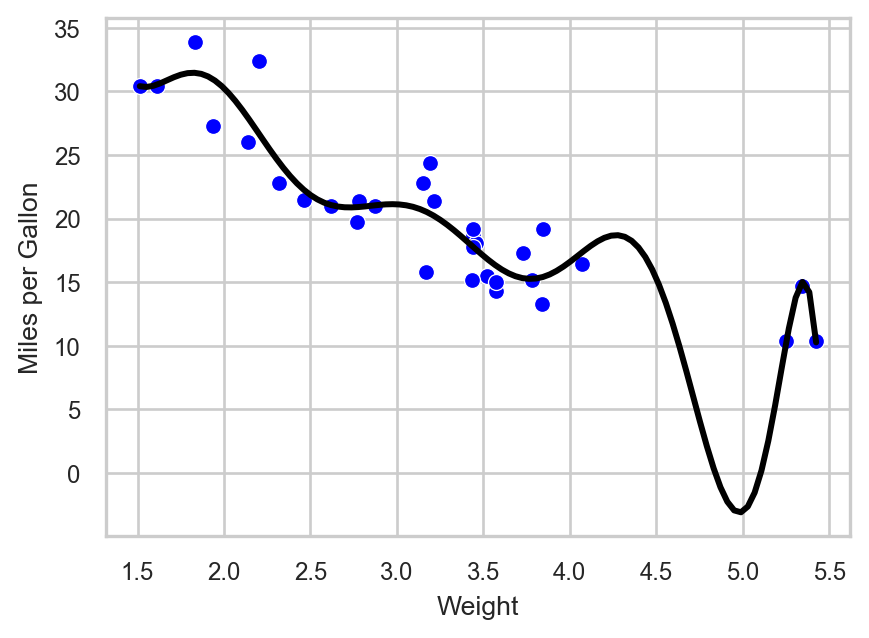
R-squared increased to approximately 82%, implying a better fit. Theoretically, the more polynomial terms we add, the more flexible our global line will be. For instance, with a 10 degree polynomial, the plot looks like this:
# Creating scatterplotsns.scatterplot(data = data, x ="Weight", y ="Miles_per_Gallon", color ="blue")# Adding regression line with 10th degree polynomialsns.regplot(data = data, x ="Weight", y ="Miles_per_Gallon", scatter =False, line_kws = {"color": "black"}, ci =None, order =10)# Adjusting axis titlesplt.xlabel("Weight")plt.ylabel("Miles per Gallon")# Displaying plotplt.show()
Figure 28.4: Scatterplot with OLS regression line using 10th-degree polynomial terms.
# Creating a linear regression modelols_model_poly_10 = ols("Miles_per_Gallon ~ Weight + I(Weight**2) + I(Weight**3) + I(Weight**4) + I(Weight**5) + I(Weight**6) + I(Weight**7) + I(Weight**8) + I(Weight**9) + I(Weight**10)", data = data ).fit()
We see though that the resulting line needs to bend a lot when the weight is close to 5. This is necessary because the model tries to capture the points that are relatively further away from the rest. We also see that R-squared increased to approximately 87% (although the adjusted R-square stayed almost the same).
Nonetheless, the last model does not make; we would never expect the miles per gallon being below zero! This already shows that when we try to make the line very flexible with OLS, the output may simply become unreliable.
Transitioning from Global to Local: Introduction to LOESS
OLS employs a single, global model for all data points. While the inclusion of polynomial terms can increase flexibility, we saw that this approach has its limitations and can give us a distorted picture.
LOESS (Locally Estimated Scatterplot Smoothing) offers an alternative approach by estimating localized regressions around each observation. Instead of fitting a single line, LOESS constructs multiple local linear models that collectively form a smooth, non-linear curve through the data. The method was originally introduced by Cleveland (1979) and later formalized by Cleveland and Devlin (1988), and it is now widely discussed in modern statistical learning literature.
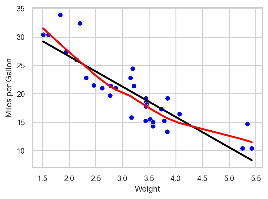
In Python, we can display a LOESS curve by setting lowess = True in sns.regplot(). The visualization below overlays both the OLS line (black) and the respective LOESS curve (red):
# Scatterplot with two regression linessns.scatterplot(data = data, x ="Weight", y ="Miles_per_Gallon", color ="blue")# Linear regression linesns.regplot(data = data, x ="Weight", y ="Miles_per_Gallon", scatter =False, ci =None, color ="black")# LOESS (smooth) linesns.regplot(data = data, x ="Weight", y ="Miles_per_Gallon", scatter =False, lowess =True, ci =None, color ="red")# Labelsplt.xlabel("Weight")plt.ylabel("Miles per Gallon")plt.show()
Figure 28.5: Scatterplot with LOESS regression line (red) and OLS regression line (black).
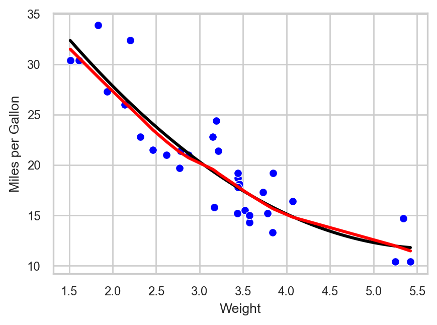
The LOESS curve is more adaptable and captures subtle patterns that the global OLS line cannot. This is achieved by fitting local regressions across the data space. Even though at this example the line looks a lot like the one that we got with the 2nd degree polynomial, there are some local spots where the flexibility of LOESS is obvious (see plot below):
# Scatterplotsns.scatterplot(data = data, x ="Weight", y ="Miles_per_Gallon", color ="blue")# Quadratic regression (polynomial degree 2)sns.regplot(data = data, x ="Weight", y ="Miles_per_Gallon", order =2, scatter =False, ci =None, color ="black")# LOESS smoothersns.regplot(data = data, x ="Weight", y ="Miles_per_Gallon", lowess =True, scatter =False, ci =None, color ="red")# Labelsplt.xlabel("Weight")plt.ylabel("Miles per Gallon")plt.show()
Figure 28.6: Scatterplot with LOESS regression line (red) and OLS regression line (black) using a 2nd degree polynomial.
Mechanics of LOESS
LOESS employs a moving window approach: for each focal data point, a subset of neighboring observations—termed “neighbors”—is selected. The proportion of neighbors used is governed by the bandwidth parameter, specified as a fraction of the total dataset. For instance, with 30 observations and a bandwidth of 0.2, the six nearest neighbors (20% of the data) are used to fit a local regression.
Unlike OLS, which assigns equal weight to all points, LOESS assigns greater weight to closer neighbors. This is implemented via Weighted Least Squares (WLS), where weights decline with increasing distance from the focal point. Consequently, LOESS is sometimes referred to as LOWESS (Locally Weighted Scatterplot Smoothing).
LOESS and Weighted Regression
OLS can be viewed as a special case of WLS in which all data points receive equal weights.
After fitting local models, LOESS makes predictions at each data point and connects them to create a smooth curve. In our example, we used just one predictor variable—meaning we looked at how the outcome (miles per gallon) changes as one thing (vehicle weight) changes. This is called “using a single predictor”. But LOESS, just like OLS, isn’t limited to one input. It can also be used with multiple predictors at the same time. For example, we could look at how both vehicle weight and engine size together affect miles per gallon. LOESS can also handle more complex situations, like when the effect of one variable depends on another, or when the relationship is curved rather than a straight line.
Implementing LOESS in Python
In Python, the function lowess() from statsmodels.nonparametric.smoothers_lowess fits a LOESS model. In this function, we include the dependent variable in the argument endog, and the independent variable(s) in the argument exog. Additionally, the argument frac controls the bandwidth, specifying the proportion of data used in each local fit, which determines how smooth or flexible the resulting curve is.
We fit two LOESS models using spans of 0.2 and 0.8, and then evaluate their predictive performance by calculating the pseudo R-squared, which is derived from the residual sum of squares (RSS) and total sum of squares (TSS). While technically, comparing the R-squared from OLS and the pseudo R-squared from LOESS is not appropriate due to the different nature of these models—OLS being a global linear model and LOESS a local non-linear model—we do so here for simplicity and intuition. This approach provides an intuitive measure of fit, even though the models have different underlying assumptions and structures.
from statsmodels.nonparametric.smoothers_lowess import lowessimport numpy as np# LOESS with 20% bandwidth## Fitting the modelloess_0_2 = lowess( endog = data["Miles_per_Gallon"], exog = data["Weight"], frac =0.2 )## Making predictionsloess_0_2_preds = loess_0_2[:, 1]## Calculating R-squared### Calculating residual sum of squares (RSS)rss = np.sum((data["Miles_per_Gallon"] - loess_0_2_preds) **2)### Calculating total sum of squares (TSS)tss = np.sum( (data["Miles_per_Gallon"] - np.mean(data["Miles_per_Gallon"])) **2 )### Calculating pseudo R-squaredr_squared =1- (rss / tss)# Printing pseudo R-squaredr_squared
np.float64(-0.9246751361331609)
# LOESS with 80% bandwidth## Fitting the modelloess_0_8 = lowess( endog = data["Miles_per_Gallon"], exog = data["Weight"], frac =0.8 )## Making predictionsloess_0_8_preds = loess_0_8[:, 1]## Calculating R-squared### Calculating residual sum of squares (RSS)rss = np.sum((data["Miles_per_Gallon"] - loess_0_8_preds) **2)### Calculating total sum of squares (TSS)tss = np.sum( (data["Miles_per_Gallon"] - np.mean(data["Miles_per_Gallon"])) **2 )### Calculating pseudo R-squaredr_squared =1- (rss / tss)### Printing pseudo R-squaredr_squared
np.float64(-0.796335626739815)
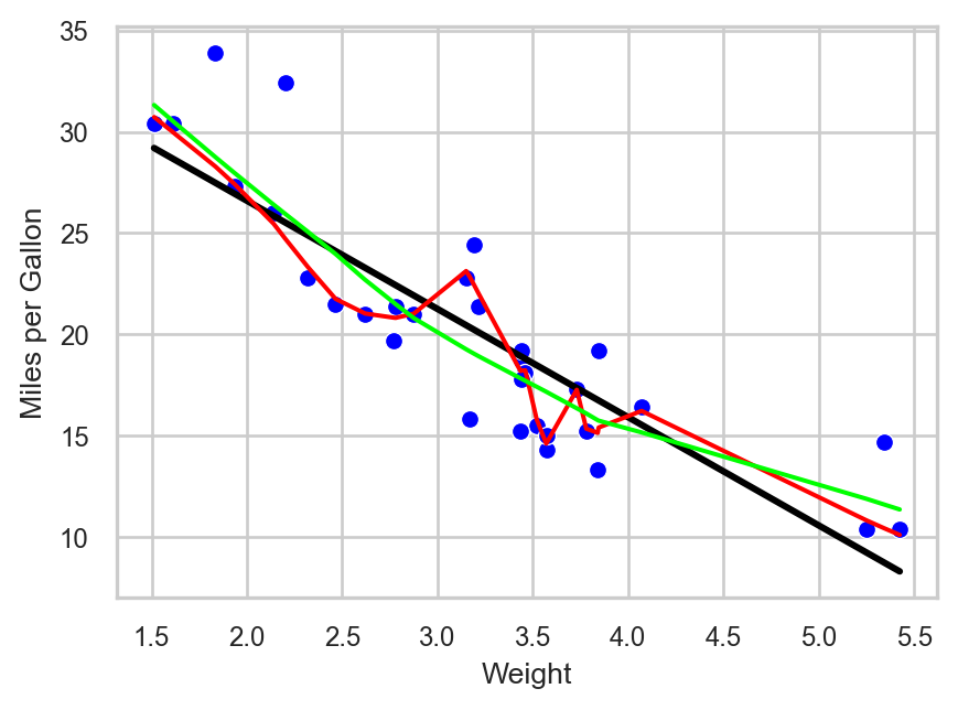
Models with a smaller bandwidth (0.2) generally offer a closer fit to the data, albeit at the risk of overfitting. Conversely, a larger bandwidth (0.8) produces a smoother, less complex curve. To compare visually:
Figure 28.7: Scatterplot with LOESS regression lines using bandwidths of 0.2 (red) and 0.8 (green), and OLS regression line (black).
The red curve (span = 0.2) is highly flexible and follows the data closely, while the green curve (span = 0.8) is more stable and arguably better suited for generalization.
In general, it becomes obvious that, the less the bandwidth, the more complex the model will be, which is what provides for better fit against the data. This is not always the best approach though as—at the extreme—the model would fit a line that passes through all the available data points. Such model would make no sense in terms of interpretability. This is the same phenomenon with trying to use high-degree polynomial to fit a linear regression line using OLS. In our example above, we see that red line implies negative miles per gallon values, something that is impossible! Overfitting is something we still need to take into consideration when using LOESS.
Purpose of LOESS
LOESS is designed to reveal patterns in data that are difficult to capture with traditional linear regression. As mentioned, OLS fits a single global line to the entire dataset while LOESS adapts locally, fitting small weighted regressions around each observation. This local approach allows LOESS to uncover non-linear relationships and produce smooth trends that better reflect the structure of the data.
The method is particularly useful for descriptive modeling and exploratory analysis. It excels when the goal is to visualize trends, detect patterns, or make local predictions rather than to generate a single global formula. By assigning greater weight to nearby points, LOESS balances flexibility and stability, revealing subtle structures without being overly influenced by distant observations. Smaller bandwidths yield more complex models, which may fit the data more closely but are also more prone to overfitting. The optimal choice depends on the specific context and objectives of the analysis.
In practice, LOESS helps answer questions such as how the response variable changes across the range of predictors, whether there are local trends or deviations that a global model might miss, and what patterns can be visualized before applying more formal modeling techniques. Therefore, LOESS is a valuable tool for understanding and visualizing complex relationships in data, providing insights that guide further analysis and decision-making.
Limitation of LOESS in Seaborn
Unfortunately, regplot() does not provide a direct argument for adjusting the LOESS smoothing parameter. When lowess = True is used, Seaborn applies LOWESS smoothing with the default settings from statsmodels, so customizing the bandwidth requires fitting the LOWESS curve manually.
Recap
This chapter has presented an intuitive overview of LOESS, a method that extends linear regression by applying Weighted Least Squares locally around each data point. LOESS is particularly effective for uncovering non-linear relationships and creating smooth data visualizations.
We discussed the mechanics of LOESS, including the moving window approach and the use of Weighted Least Squares to assign greater importance to nearby points. We also highlighted the key hyperparameter, the bandwidth (or span), which controls the trade-off between flexibility and smoothness. Smaller bandwidths result in more flexible curves that may overfit, while larger bandwidths produce smoother trends.
Practical implementation in Python was demonstrated using the lowess() function from statsmodels.nonparametric.smoothers_lowess and sns.regplot() in Seaborn, with the latter used to show how LOESS and regression lines can be visualized within a scatterplot. Finally, we emphasized the purpose of LOESS: it is a powerful tool for descriptive modeling, exploratory analysis, and visualizing complex relationships, though it is less suitable when a single closed-form analytical equation is required.