Applying Regression and Cluster Analysis to Student Performance
Introduction
Understanding what drives student performance is a central concern in education. From study habits to lifestyle choices, many factors can influence academic outcomes. By analyzing data on students’ behaviors, such as how much they study, how much sleep they get, and whether they engage in extracurricular activities, we can gain valuable insights into patterns that are associated with better or worse performance.
To explore student performance, we use two widely used statistical techniques: regression analysis and cluster analysis. Regression analysis helps us quantify the relationships between specific variables and academic performance, allowing us to test hypotheses and evaluate the importance of each factor. Cluster analysis, on the other hand, is used to group students into categories based on their habits, revealing different student profiles that may not be obvious at first glance.
To illustrate these techniques in practice, we use a dataset containing information on 10,000 students. Through this case study, readers will see how data science methods like regression and clustering can be applied to real-world data and how their results can be interpreted.
Brief Description of the Methods
Cluster Analysis: Hierarchical Clustering and K-Means
Cluster analysis is a statistical technique used to group observations into clusters based on their similarity. The main goal is to identify patterns or structures within the data by placing similar observations in the same group and different observations in separate groups. Two of the most commonly used cluster analysis methods are hierarchical clustering and K-Means.
Hierarchical clustering creates a tree-like structure that is visualized with a diagram called a dendrogram. In this method, each observation starts as a separate group. Then, at each step, the two most similar observations or groups are merged based on a chosen distance metric. If some observations have already been grouped in previous steps, that grouping remains fixed throughout the process. The procedure continues until all observations are merged into a single group. Afterwards, we can “cut” the dendrogram at the desired height to determine the final number of clusters.
The K-Means method, in contrast, requires us to know in advance how many clusters we want to create. This method uses an iterative algorithm that assigns observations to groups based on their similarity, which is also measured using a distance criterion.
Although the choice of distance metric depends on the method and type of data, for continuous data the most commonly used distance measure in both cases is Euclidean distance.
In cluster analysis, many aspects are subjective, even when using the exact same dataset, meaning that there is no single correct answer. For example, based on customer data such as website visits, number of purchases, etc., we might create clusters such as “Good Customers” and “Bad Customers,” or perhaps “Good,” “Average,” and “Bad Customers.” Moreover, there is no specific rule guiding us on which variables to include in the analysis.
In practice, a common approach is to use hierarchical clustering first to explore the data and get a sense of the number of natural clusters, and then use K-Means to refine those clusters more efficiently on larger datasets (Lantz, 2019).
Regression Analysis
The method of regression analysis is a statistical technique used to examine the linear relationship between a dependent variable and one or more independent variables.
For example, we can use this method to find the relationship between hours studied and the final exam grade. In this example, the number of study hours is the independent variable, and the final exam grade is the dependent variable. Using regression analysis, we could test the hypothesis of whether study hours (independent variable) have a significant effect on the exam grade.
Mathematically, simple linear regression is expressed as follows:
\[ y = \alpha + \beta x \]
where \(x\) is the independent variable (e.g., hours studied), \(y\) is the dependent variable (e.g., final exam grade), \(\beta\) is the slope of the line, and \(a\) is the value of \(y\) when \(x = 0\) . If \(\beta\) is positive, then as \(x\) increases, \(y\) also increases. If it is negative, then as \(x\) increases, \(y\) decreases. In our example, we would expect \(\beta\) to be positive, meaning that the more hours someone studies, the higher their final exam grade would be.
The most common method to estimate the intercept \(\alpha\) and the coefficient \(\beta\) is Ordinary Least Squares (OLS). OLS works by minimizing the sum of the squared differences between the observed values and the values predicted by the linear model. While the detailed mathematical derivation and theoretical properties of OLS are important, we will skip those here since the primary focus is on practical application. However, it is important to understand that OLS estimates have desirable properties, such as being unbiased and consistent, under standard assumptions, which justifies their widespread use in regression analysis (Wooldridge, 2016).
We can extend this regression by adding more independent variables, a method called multiple linear regression. An additional independent variable could be the average number of hours of sleep. In this case, we would expect that the more someone sleeps, the better their performance could be, so this variable might also be positively related to the exam grade. Of course, every new variable must have some logical justification and interpretation within the context of the analysis. For example, if we added the number of hours spent on social media as an independent variable, we would probably expect a negative relationship with the grade, since this time might be taken away from studying or sleeping.
Adding more independent variables allows the model to better explain the variation in the dependent variable, i.e., the grade. The measure we use to check how well the model “fits” the data is the coefficient of determination, also known as \(R^2\). The \(R^2\) shows what percentage of the total variability of \(y\) is explained by our model. Its value ranges from 0 to 1. If \(R^2\) is 0, it means the model does not explain any variation in \(y\). If it is 1, it means it explains the variability in \(y\) completely based on the independent variables. For example, if \(R^2\) is 0.75, then 75% of the variability in the grade (the dependent variable) is explained by variables like study hours and sleep.
As mentioned, regression helps us test hypotheses. More specifically, hypothesis testing in regression allows us to evaluate whether an independent variable has a statistically significant effect on the dependent variable. For each coefficient (such as \(\beta\)), we state two hypotheses:
H0: \(\beta = 0\) (the variable \(x\) does not affect the variable \(y\))
H0: \(\beta \ne 0\) (the variable \(x\) affects the variable \(y\))
Of course, an estimated \(\beta\) will never be exactly 0; what we really want to know is whether the estimated \(\beta\) is statistically significantly different from 0. The idea behind this is that we use a sample to estimate the population parameter \(\beta\). Since different samples would yield different estimates, the \(\beta\) estimates themselves follow a sampling distribution. We assume this distribution is approximately normal, centered around the true population \(\beta\), with some standard deviation (the standard error of the estimate).
Estimating a \(\beta\) value that lies far from the center of this distribution—beyond what we would expect by random chance—provides evidence that the true \(\beta\) is different from zero. In hypothesis testing, we quantify how far the estimated \(\beta\) is from zero using a test statistic, which is then compared against a reference distribution (often the normal or t-distribution). This comparison helps us decide whether the effect of the independent variable on the dependent variable is statistically significant.
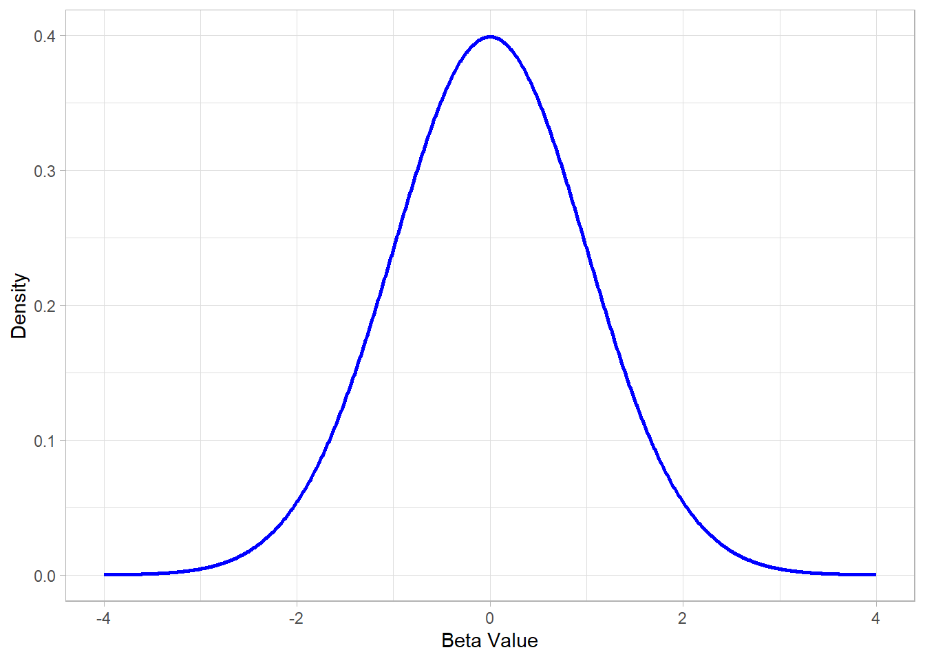
The figure below illustrates a standard normal distribution, which is commonly used as the basis for these tests:
Values of \(\beta\) estimates that lie in the tails of this distribution (far from zero) correspond to statistically significant effects, while values near the center suggest no strong evidence against the null hypothesis.
Case Study: Student Performance
The educational performance of students is influenced by many factors, such as study time, sleep quality, hours of class attendance, and other daily habits. The purpose of this analysis is to investigate the extent to which such factors are related to the overall student performance using the method of multiple linear regression, as well as to explore whether we can identify groups of students.
For this purpose, we use a public dataset from Kaggle (link: https://www.kaggle.com/datasets/nikhil7280/student-performance-multiple-linear-regression), which includes data on 10,000 students.
The code below is used to load the libraries and import the data in R:
# Libraries
library(tidyverse)
library(broom)
library(flextable)

# Setting theme
theme_set(
  new = theme_light()
  )

# Importing the data
dat <- read_csv("https://raw.githubusercontent.com/GeorgeOrfanos/Data-Sets/refs/heads/main/student_performance.csv")
Each record of the imported dataset contains information such as:
Hours Studied: The total number of hours each student dedicated to studying.
Previous Scores: The scores students received on previous tests.
Extracurricular Activities: Whether the student participates in extracurricular activities (Yes or No).
Sleep Hours: The average number of hours of sleep the student gets per day.
Sample Question Papers Practiced: The number of sample exam papers practiced by the student.
Performance Index: A measure of each student’s overall performance. The performance index represents the student’s academic achievement and is rounded to the nearest integer. The index ranges from 10 to 100, with higher values indicating better performance. We consider the baseline of the performance index to be 50.
Cluster Analysis – Application
To identify different student profiles, we started with the hierarchical clustering technique. The variables used to create the groups were:
Hours Studied
Extracurricular Activities
Sleep Hours
The choice of these features was based on the attempt to categorize students according to their daily habits, regardless of their grades or test performance.
The resulting dendrogram suggests that selecting four clusters provides a suitable solution, as it offers satisfactory differentiation between the groups.
# Clustering Data Set
dat_clustering <- dat %>%
  select(Hours_Studied, Extracurricular_Activities, Sleep_Hours) %>%
  transmute(
    Hours_Studied_ST = (Hours_Studied - mean(Hours_Studied)) / sd(Hours_Studied),
    Extracurricular_Activities = if_else(Extracurricular_Activities == "Yes", 1, 0),
    Sleep_Hours_ST = (Sleep_Hours - mean(Sleep_Hours)) / sd(Sleep_Hours)
    )

# Hierarchical Clustering
hc <- hclust(dist(dat_clustering))

# Dendrogram
plot(x = hc, labels = FALSE, hang = -1, xlab = "", sub = "")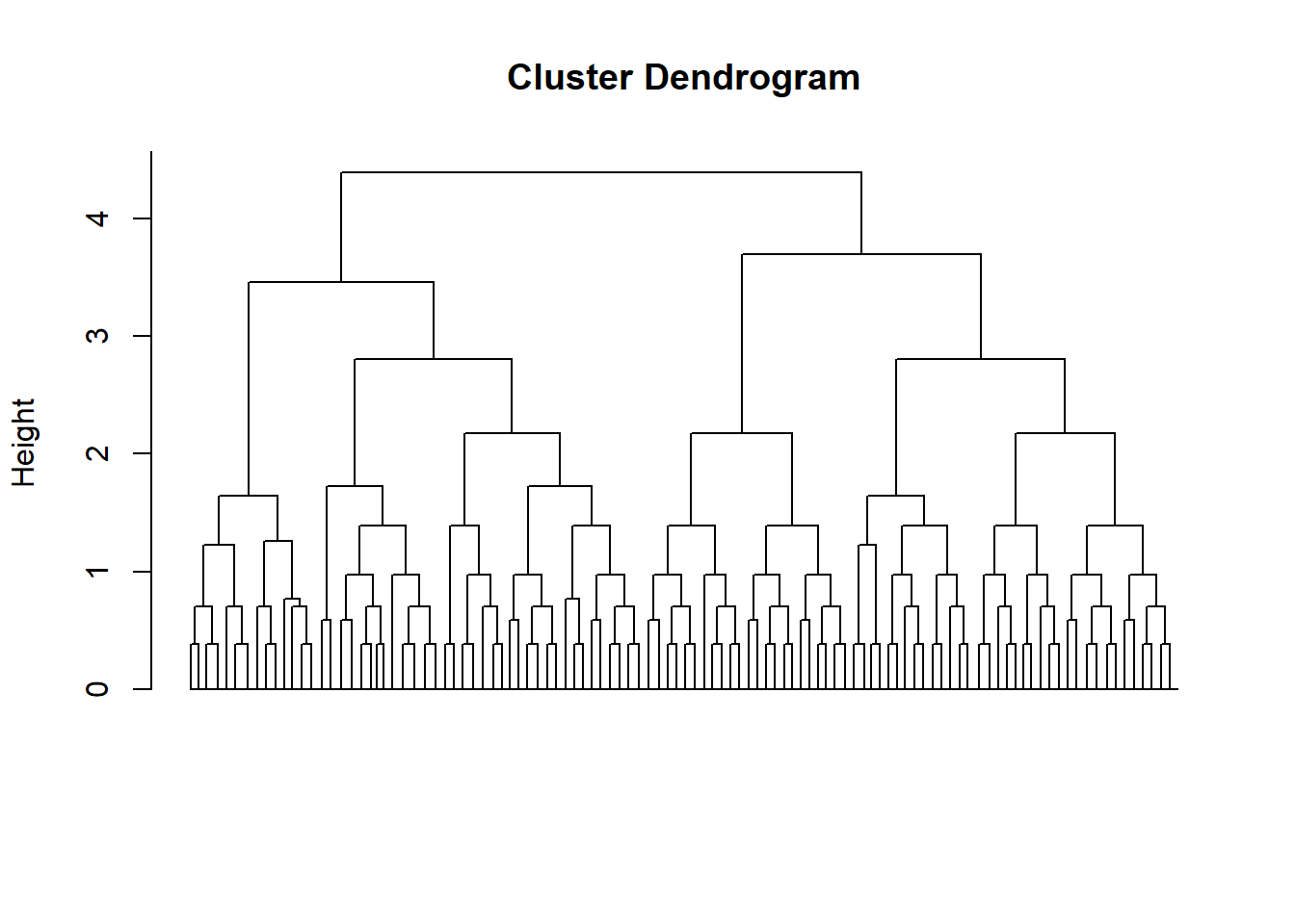
After defining four groups, we present two plots. The first shows the number of students in each cluster, while the second displays the average performance index for each group.
# Join the clusters to the main data frame
dat_clustering_HC <- dat_clustering %>%
  mutate(Hierarchical_Clustering = as.factor(cutree(hc, h = 3)))

# Visualizing the results
# Number of cases per cluster
dat_clustering_HC %>%
  ggplot(aes(x = Hierarchical_Clustering,
             fill = Hierarchical_Clustering,
             group = Hierarchical_Clustering)) +
  geom_bar(show.legend = FALSE) +
  labs(x = "Cluster", y = "Number of Students")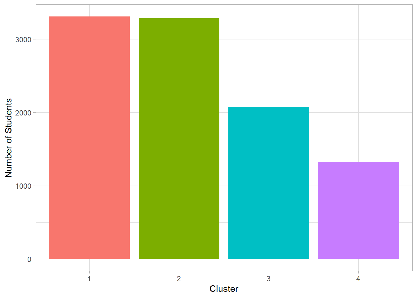
# Average Score per Cluster
dat_clustering_HC %>%
  bind_cols(
    dat %>%
      select(Performance_Index)
    ) %>%
  group_by(Hierarchical_Clustering) %>%
  summarize(Average_Score = mean(Performance_Index)) %>%
  ggplot(aes(x = Hierarchical_Clustering,
             y = Average_Score,
             fill = Hierarchical_Clustering,
             group = Hierarchical_Clustering)) +
  geom_col(show.legend = FALSE) +
  labs(x = "Cluster", y = "Average Score") +
  geom_hline(yintercept = 50)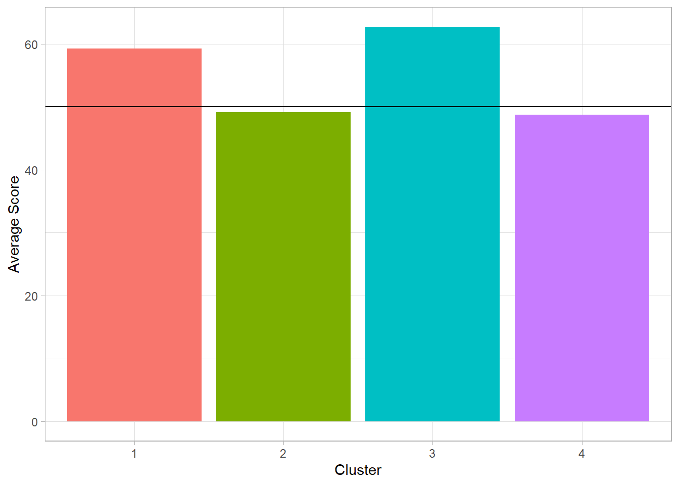
We observe that two of the four clusters each include more than 3,000 students, while the third contains around 2,000 and the fourth between 1,000 and 1,500 students. Among the two most populous clusters, one shows an average performance index below the passing threshold (50), as does the smallest cluster. The highest average is found in the third cluster, with a performance just above 60.
Next, we present the distribution of students in the space of the variables used to create the groups:
# Clusters among the variables
dat %>%
  bind_cols(dat_clustering_HC %>% select(Hierarchical_Clustering)) %>%
  ggplot(aes(x = Hours_Studied,
             y = Sleep_Hours,
             color = as.factor(Hierarchical_Clustering))) +
  geom_jitter(show.legend = FALSE) +
  facet_wrap(. ~ Extracurricular_Activities) +
  labs(x = "Hours of Study", y = "Hours of Sleep")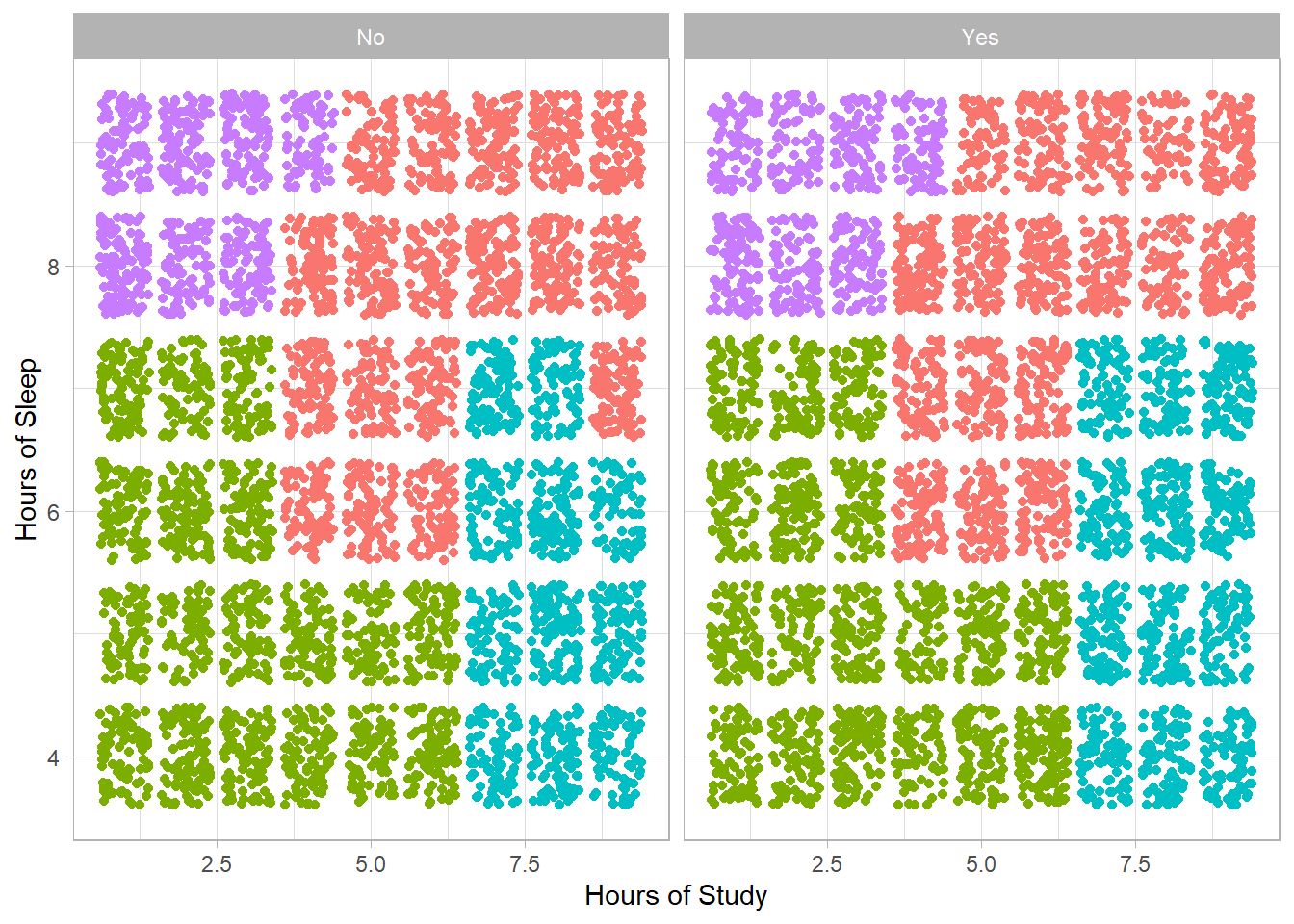
The X-axis represents study hours, while the Y-axis shows sleep hours. On the left side of the plot are students without extracurricular activities (No), and on the right, those who participate in such activities (Yes).
We observe that the clusters are nearly the same regardless of extracurricular participation. In addition, students appear to be grouped into four main categories:
Many hours of sleep, few study hours
Few hours of sleep, few study hours
Few hours of sleep, many study hours
Many hours of sleep, many study hours
The clusters characterized by many study hours show the highest average performance. However, we notice that students who study a lot and sleep less perform slightly better—something that might not have been expected.
In contrast, for students who study little, the average performance is almost the same regardless of sleep duration. This suggests that sleep alone does not seem to significantly impact performance when study time is limited.
Next, we applied the K-Means clustering technique, again setting four groups based on the results of the hierarchical analysis. As before, we present two plots: the first shows the number of students per cluster, and the second shows the average performance index for each group.
# K-Means
k_means <- kmeans(dat_clustering, centers = 4)

# Join the clusters to the main data frame
dat_clustering_K_Means <- dat_clustering %>%
  mutate(K_means = as.factor(k_means$cluster))
# Visualizing the results
# Number of cases per cluster
dat_clustering_K_Means %>%
ggplot(aes(x = K_means,
fill = K_means,
group = K_means)) +
geom_bar(show.legend = FALSE) +
scale_fill_manual(values = c("1" = "#332D56",
"2" = "#4E6688",
"3" = "#71C0BB",
"4" = "#E3EEB2")) +
labs(x = "Cluster", y = "Number of Students")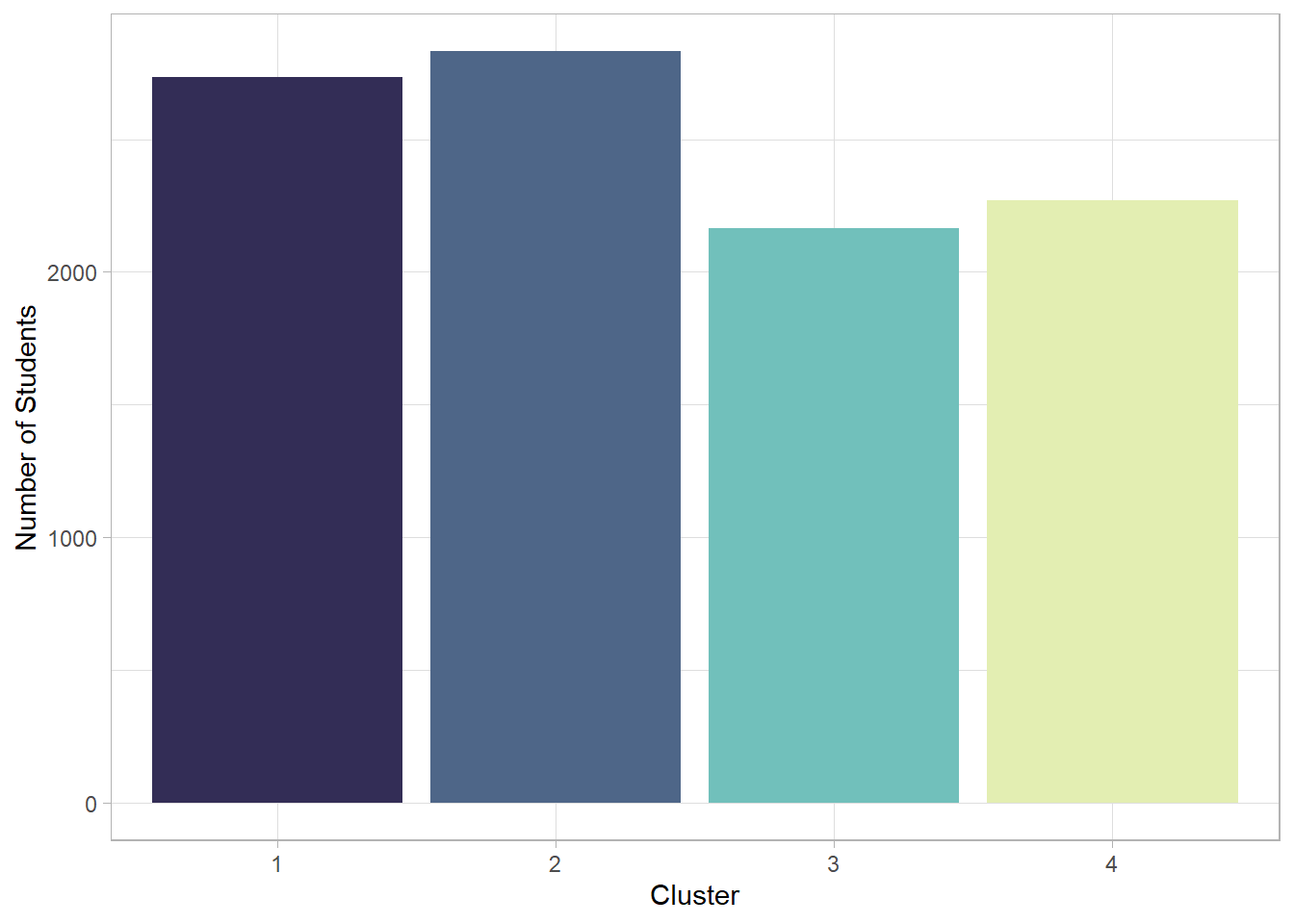
# Average Score per Cluster
dat_clustering_K_Means %>%
  bind_cols(dat %>% select(Performance_Index)) %>%
  group_by(K_means) %>%
  summarize(Average_Score = mean(Performance_Index)) %>%
  ggplot(aes(x = K_means,
             y = Average_Score,
             fill = K_means,
             group = K_means)) +
  geom_col(show.legend = FALSE) +
  scale_fill_manual(values = c("1" = "#332D56",
                               "2" = "#4E6688",
                               "3" = "#71C0BB",
                               "4" = "#E3EEB2")) +
  labs(x = "Cluster", y = "Average Score") +
  geom_hline(yintercept = 50)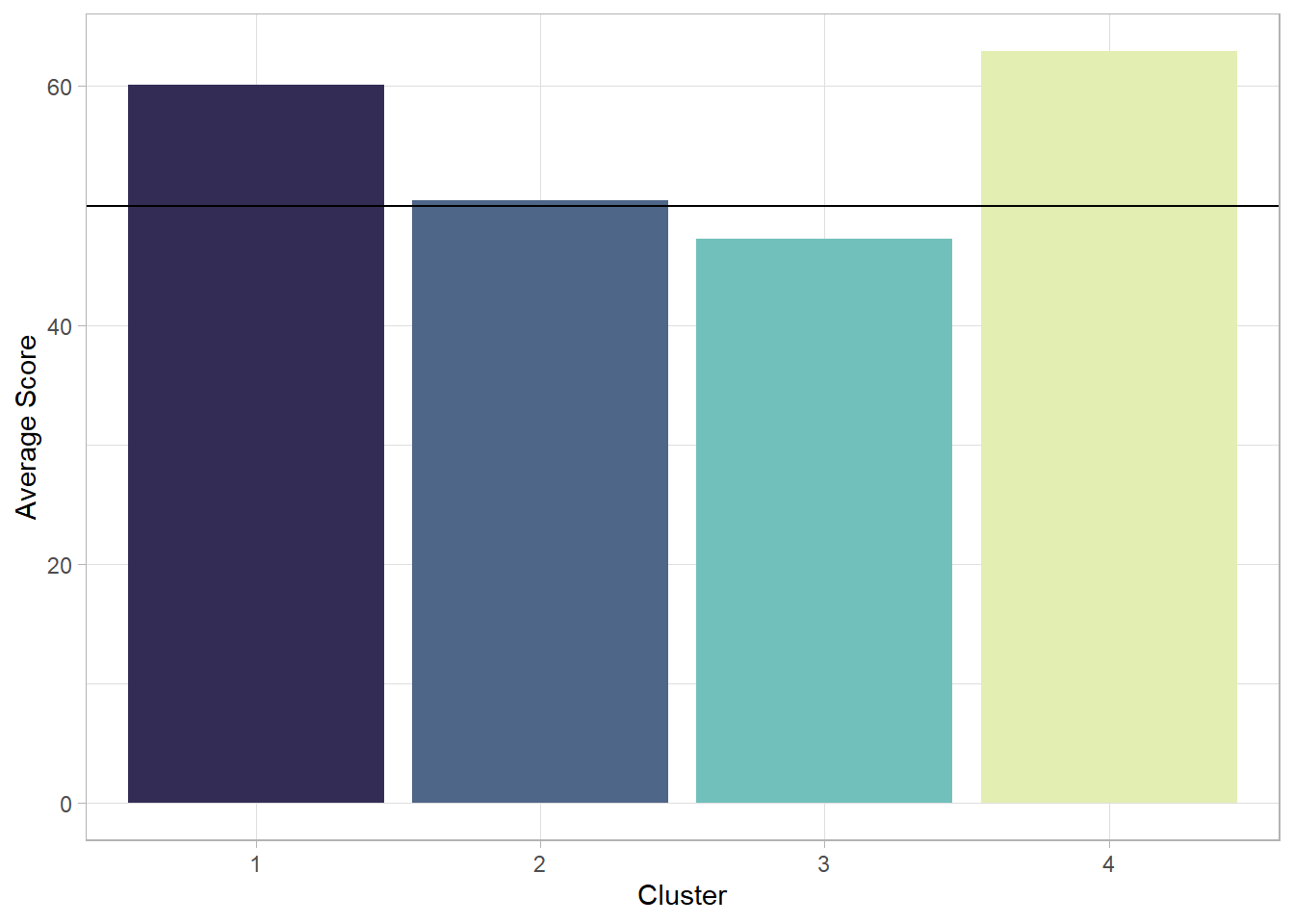
The clusters resulting from the K-Means method appear slightly different compared to the hierarchical analysis. This time, the average performance index is above the passing threshold in three out of the four groups. Apart from the first cluster, which includes around 3,000 students, the other three do not show major differences in size. However, the cluster with the fewest students also has the highest average performance.
Among the two clusters with an intermediate number of students, one has an average performance index around 60, while the other is the only one with performance below the passing threshold.
Finally, we visualize the arrangement of the K-Means clusters with respect to the original variables, in order to compare their structure with that of the hierarchical method.
# Clusters among the variables
dat %>%
  bind_cols(dat_clustering_K_Means %>% select(K_means)) %>%
  ggplot(aes(x = Hours_Studied, y = Sleep_Hours, color = as.factor(K_means))) +
  geom_jitter(show.legend = FALSE) +
  scale_color_manual(values = c("1" = "#332D56",
                                "2" = "#4E6688",
                                "3" = "#71C0BB",
                                "4" = "#E3EEB2")) +
  labs(x = "Hours of Study", y = "Hours of Sleep") +
  facet_wrap(. ~ Extracurricular_Activities)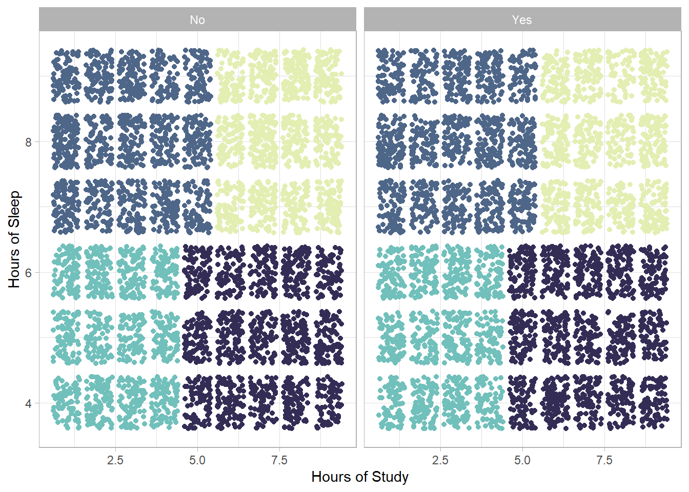
As in the previous analysis, the clusters do not appear to differ significantly with respect to the presence of extracurricular activities. The distribution of the groups is similar; however, their separation is now clearer, enhancing the interpretability of the results. The categories of students remain the same, but two important changes are observed compared to the hierarchical clustering:
The students who sleep many hours and study many hours now show the highest average performance index.
Among the students who do not spend many hours studying, those who sleep more have a higher average performance index compared to those who sleep less—and in fact, this index exceeds the passing threshold.
Regression Analysis – Application
After identifying distinct student profiles through clustering techniques, the next step is to quantitatively examine the relationship between these habits and the performance index. For this purpose, we proceed with a regression analysis.
Specifically, we will use the following model:
\[ y = \alpha + \beta_1x_1 + \beta_2x_2 + \beta_3x_3 + \beta_4x_4 + \beta_5x_5 \]
where:
\(x_1\): Hours Studied
\(x_2\): Previous Scores
\(x_3\): Extracurricular Activities
\(x_4\): Sleep Hours
\(x_5\): Sample Question Papers Practiced
\(y\): Performance Index
Each independent variable has its corresponding coefficient, which will be estimated through the regression. Our goal is to test the following hypotheses:
H0: \(\beta_1 = 0\) (variable \(x_1\) does not affect \(y\))
H1: \(\beta_1 \ne 0\) (variable \(x_1\) affects \(y\))
H0: \(\beta_1 = 0\) (variable \(x_2\) does not affect \(y\))
H1: \(\beta_1 \ne 0\) (variable \(x_2\) affects \(y\))
H0: \(\beta_1 = 0\) (variable \(x_3\) does not affect \(y\))
H1: \(\beta_1 \ne 0\) (variable \(x_3\) affects \(y\))
H0: \(\beta_1 = 0\) (variable \(x_4\) does not affect \(y\))
H1: \(\beta_1 \ne 0\) (variable \(x_4\) affects \(y\))
H0: \(\beta_1 = 0\) (variable \(x_5\) does not affect \(y\))
H1: \(\beta_1 \ne 0\) (variable \(x_5\) affects \(y\))
The results of the regression analysis are presented in the table below:
Term | Estimate | Standard Error | t-statistic | p.value |
|---|---|---|---|---|
(Intercept) | -34.08 | 0.13 | -268.01 | 0.000 |
Hours_Studied | 2.85 | 0.01 | 362.35 | 0.000 |
Previous_Score | 1.02 | 0.00 | 866.45 | 0.000 |
Extracurricular_ActivitiesYes | 0.61 | 0.04 | 15.03 | 0.000 |
Sleep_Hours | 0.48 | 0.01 | 39.97 | 0.000 |
Sample_Question_Papers_Practiced | 0.19 | 0.01 | 27.26 | 0.000 |
The model shows a very high fit to the data, with R² = 0.989, while overall statistical significance is confirmed by the F-statistic = 175,700 and p < 0.001.
From the results of the regression analysis, it emerges that all independent variables have a positive and statistically significant effect on the students’ performance index.
Hours Studied (\(\beta_1\) = 2.85):
Study hours have the highest coefficient among the variables, indicating that an increase of one hour of studying is associated with an approximate increase of 2.85 points in the performance index, holding all other variables constant. This suggests that dedication to studying is the strongest factor for improving academic performance—something also observed in the cluster analysis.
Previous Scores (\(\beta_2\) = 1.02):
Previous academic performance also has a significant positive effect, although with a smaller coefficient than study hours. This implies that past academic success is a good predictor of future performance.
Extracurricular Activities (\(\beta_3\) = 0.61):
Participation in extracurricular activities shows a positive effect on the performance index, although the coefficient is relatively small. This can be interpreted as an indication that students involved in such activities develop skills like teamwork, time management, and discipline, which in turn enhance their academic performance.
Sleep Hours (\(\beta_4\) = 0.48):
Sleep hours, although having nearly the smallest coefficient among the hour-based variables, still show that adequate sleep plays a role in academic achievement. The positive association suggests that good sleep contributes to better concentration and study efficiency.
Sample Question Papers Practiced (\(\beta_5\) = 0.19):
Practicing with sample exam papers also has a positive effect, reinforcing the idea that familiarity with the format and style of exams helps improve performance.
Conclusions
The case study demonstrated how applying statistical and clustering methods to a dataset can uncover meaningful insights and guide interpretation. Through the analysis, it became clear which variables had significant effects and how they contributed to the outcome. For example, hours studied showed a strong positive association, indicating its important role in predicting performance index. Meanwhile, other factors such as sample question papers practiced had little to no effect, suggesting they may be less relevant in this context.
The use of these methods also highlighted the complexity of the data relationships, capturing non-linear patterns and interactions that simpler approaches might miss. The interpretation of the model results provided a clear, data-driven narrative explaining the underlying dynamics in the dataset.
Overall, the study underscored the value of these analytical techniques in transforming raw data into actionable insights, emphasizing that beyond the mathematical formulas and algorithms, the focus is on understanding what the findings mean in practical terms. This approach allows for informed decision-making based on evidence, supporting more effective strategies and better outcomes.
References
Wooldridge, J. M. (2016). Introductory econometrics: A modern approach (6th ed.). Cengage Learning.
Lantz, B. (2015). Machine learning with R (2nd ed.). Packt Publishing.