In this case study, we discuss a data analysis approach for the Product Sales project, based on the practical exam for the Data Analyst Professional Certificate from DataCamp.
The challenge of this project is to provide data-driven insights to update the executive team on sales strategies for the new product line.
According to the project description, the sales team needed to answer the following questions:
How many customers were there for each sales approach?
What does the overall revenue distribution look like, and how does it vary by sales method?
Was there any variation in revenue over time for each method?
Based on the data, which sales method should we continue using? Some methods are more time-consuming for the team, so we should consider discontinuing them if the results are comparable.
To answer these questions, we use data analysis and data visualization methods with R.
This case study is structured in the following sections:
Data Validation: Verifying the accuracy and quality of the data.
Exploratory Data Analysis: Examining the data to identify patterns and insights.
Definition of a Metric: Establishing a key metric for the business to monitor.
Final Summary and Recommendations: Providing a concise overview and actionable recommendations for the business.
Data Validation
The dataset was provided in CSV format and consisted of 15,000 rows (observations) and 9 columns (variables). The following image displays the variable names along with their descriptions:
To begin the project, we load the necessary R packages, set the theme for the plots, and import the dataset.
# Librarieslibrary(tidyverse)library(kknn)# Set the themetheme_set(new =theme_classic() )# Import the csv filedata <-read_csv("https://raw.githubusercontent.com/GeorgeOrfanos/Data-Sets/refs/heads/main/Datacamp_public_datasets/product_sales.csv")# Print the first 6 observationshead(data)
Upon examining the dataset, we identify three columns that required adjustments.
Sales Method Adjustment: The sales_method column initially had five unique values:
Call
Email
Email + Call
em + call
email
It is obvious that the values “em + call” and “email” should be changed to “Email + Call” and “Email” respectively. After making these changes, the sales_method column is consolidated to three unique values: “Call”, “Email” and “Email + Call.” The following code was used to implement this change:
# First adjustment# Fixing the sales method columndata <- data %>%mutate(sales_method =case_when( sales_method =="email"~"Email", sales_method =="em + call"~"Email + Call",TRUE~ sales_method))
Revenue Column Imputation: The revenue column contained approximately 7% missing values (NAs). To avoid bias in our data analysis, we create a linear regression model to predict these missing values. The dependent variable is the variable revenue, while the independent variables are the variables nb_sold and sales_method. The model’s adjusted R-squared was approximately 97%, indicating a strong fit suitable for data imputation. Missing values are predicted using this model, with the results rounded to the nearest integer:
# Second adjustment# Data frame with known revenuesdata_known_revenues <- data %>%filter(!is.na(revenue)) # Data frame with unknown revenuesdata_unknown_revenues <- data %>%filter(is.na(revenue)) # Create the imputation modelimputation_model <-lm(revenue ~ nb_sold + sales_method, data = data_known_revenues)# Use the linear model to make predictionsp <-predict(imputation_model, data_unknown_revenues)# Round and keep the predictionsdata_unknown_revenues <- data_unknown_revenues %>%mutate(p_revenues =round(p, 0)) %>%select(customer_id, p_revenues)# Join the results to the original data framedata <- data %>%left_join(data_unknown_revenues) %>%mutate(revenue =ifelse(is.na(revenue), p_revenues, revenue)) %>%select(-p_revenues)
Correction of “Years as Customer” Values: The years_as_customer column contains two outliers, 63 and 47, which are incorrect since the company was established in 1987, meaning the maximum value should be 39 at the time of this report. These two incorrect values are treated as missing (NA) and imputed using the K-Nearest Neighbors method, specifically using 5 neighbors. For the value of 63, we apply a KNN model only on the customers that had “Email” as sales method and located in California”. Similarly, for the value of 47, we use KNN only on those customers located in “California” and had “Call” as sales method:
# Third adjustment# Create a function to standardize the variablesstandardize <-function(x){ x <- (x -mean(x))/sd(x)return(x)}# Find the index of the value "63"index <-which(data$years_as_customer ==63)# Train the KNN model for "California" and "Email"train_knn <- data %>%filter(state =="California"& sales_method =="Email") %>%select(years_as_customer, revenue, nb_sold, nb_site_visits) %>%mutate_at(.vars =c("revenue", "nb_sold", "nb_site_visits"), .funs =~standardize(.)) %>%filter(years_as_customer !=63)# Data set with the unknown valueprediction_knn <- data %>%filter(state =="California"& sales_method =="Email") %>%select(years_as_customer, revenue, nb_sold, nb_site_visits) %>%mutate_at(.vars =c("revenue", "nb_sold", "nb_site_visits"), .funs =~standardize(.)) %>%filter(years_as_customer ==63)# Implement the KNN model (5 neighbors)imputation_model <-kknn(years_as_customer ~ ., train_knn, prediction_knn,k =5)# Assign the predicted value to the original data setdata$years_as_customer[index] <-round(predict(imputation_model), 0)# Find the index of the value "47"index <-which(data$years_as_customer ==47)train_knn <- data %>%filter(state =="California"& sales_method =="Call") %>%select(years_as_customer, revenue, nb_sold, nb_site_visits) %>%mutate_at(.vars =c("revenue", "nb_sold", "nb_site_visits"),.funs =~standardize(.)) %>%filter(years_as_customer !=47)# Data set with the unknown valueprediction_knn <- data %>%filter(state =="California"& sales_method =="Call") %>%select(years_as_customer, revenue, nb_sold, nb_site_visits) %>%mutate_at(.vars =c("revenue", "nb_sold", "nb_site_visits"),.funs =~standardize(.)) %>%filter(years_as_customer ==47)# Implement the KNN model (5 neighbors)imputation_model <-kknn(years_as_customer ~ ., train_knn, prediction_knn,k =5)# Assign the predicted value to the original data setdata$years_as_customer[index] <-round(predict(imputation_model), 0)
These changes are implemented in the specified order and maintained throughout all subsequent data analyses and visualizations.
Exploratory Data Analysis
Sales Method
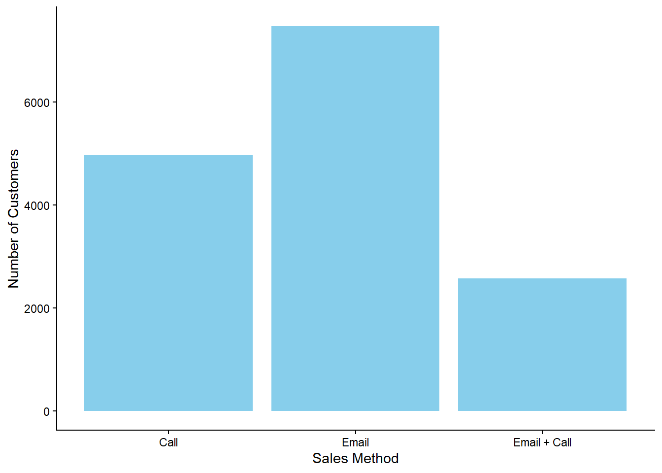
The plot below shows the number of customers for each sales method (call, email, or email + call) used for promoting the new products. As illustrated, the email method was the most commonly used, while the email + call method was used for the fewest customers:
# How many customers were there for each approach?data %>%count(sales_method, name ="Number") %>%ggplot(aes(x = sales_method, y = Number, label = Number)) +geom_col(fill ="skyblue") +xlab("Sales Method") +ylab("Number of Customers")
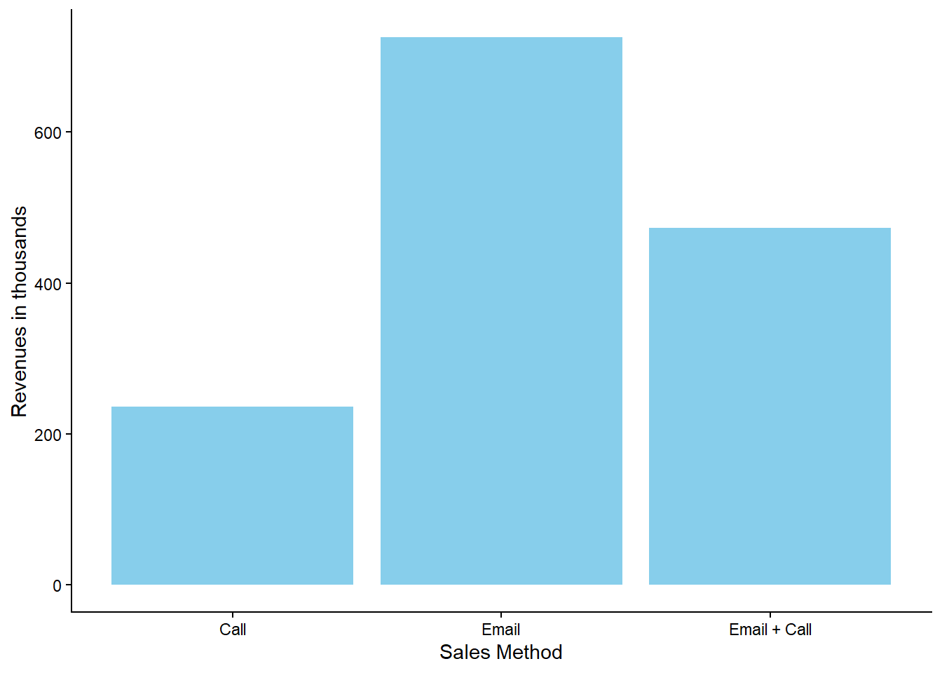
Additionally, the plot below illustrates the total revenue generated per sales method:
# What are the total revenues per sales method?data %>%group_by(sales_method) %>%summarize(Revenues =sum(revenue, na.rm =TRUE)) %>%ggplot(aes(x = sales_method, y = Revenues/1000)) +geom_col(fill ="skyblue") +xlab("Sales Method") +ylab("Revenues in thousands")
Based on these two graphs, we observe that although more customers were contacted using the call method than using the email + call method, the latter generated higher revenues.
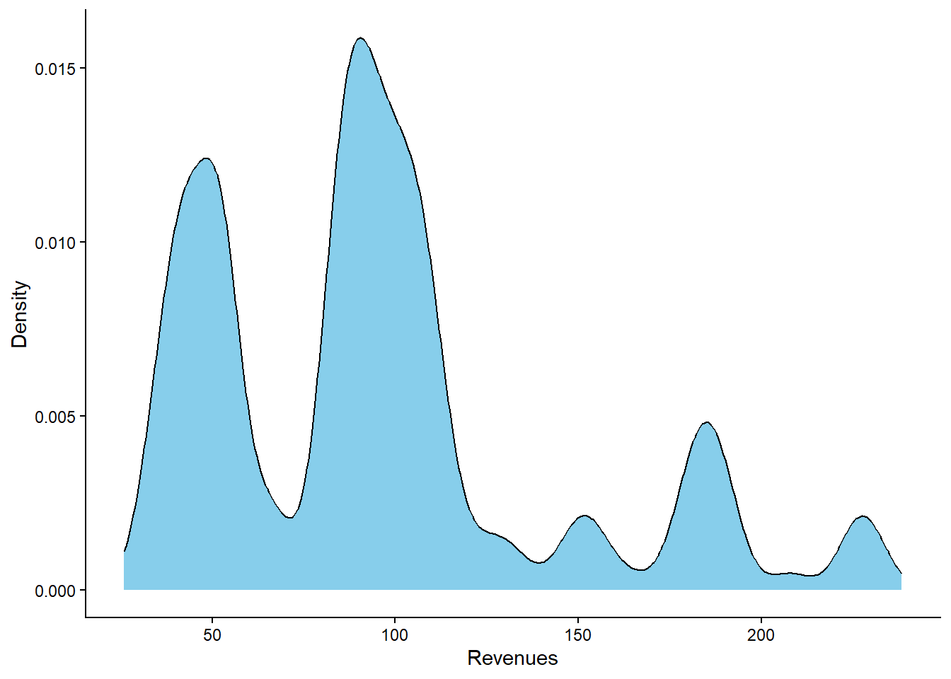
Sales Method - Distribution
The distribution of revenues reveals that the data tends to cluster around certain values: approximately 50, 100, and between 160 and 200.
# What does the spread of the revenue look like overall?data %>%ggplot(aes(x = revenue)) +geom_density(fill ="skyblue") +xlab("Revenues") +ylab("Density")
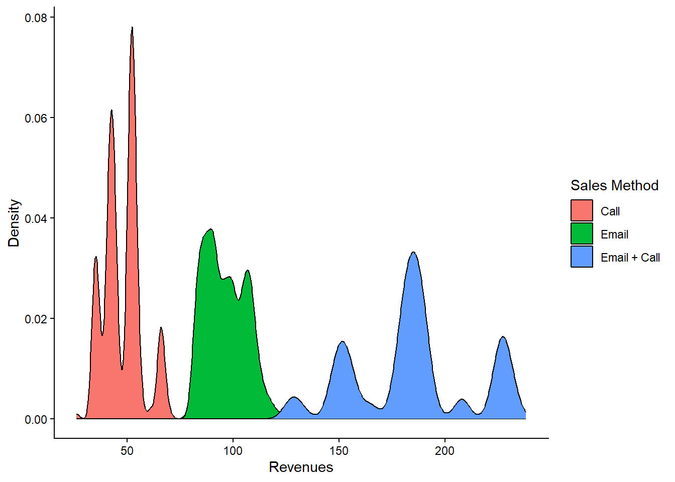
By incorporating the sales_method variable into the plot, we can observe that each cluster is associated with a specific sales method:
# What does the spread of the revenue look like for each method?data %>%ggplot(aes(x = revenue, fill = sales_method)) +geom_density() +xlab("Revenues") +ylab("Density") +labs(fill ="Sales Method")
As previously noted, the email + call method resulted in higher revenues than the call method. In fact, email + call was linked to higher revenues than those of the email method; however, the total revenue from the email method was higher due to the larger number of customers contacted through this method.
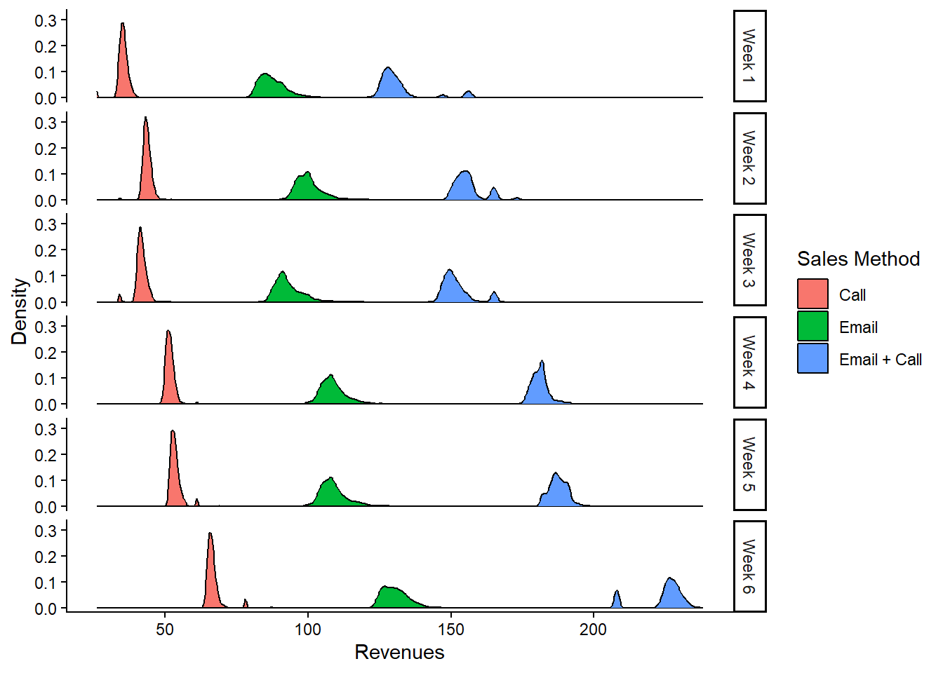
Sales Method - Distribution across Time
The plots above do not illustrate how revenue distribution changes over time. However, the following plot shows how the distribution of revenues shifts across different weeks. On average, there is a slight shift to the right for each sales method, indicating that, regardless of the sales method, higher revenues were generally observed in the later weeks compared to the initial weeks following the launch of the new products:
# Was there any variation in revenue over time for each method?data %>%mutate(week =case_when(week ==1~"Week 1", week ==2~"Week 2", week ==3~"Week 3", week ==4~"Week 4", week ==5~"Week 5",TRUE~"Week 6")) %>%ggplot(aes(x = revenue, fill = sales_method)) +geom_density() +labs(x ="Revenues",y ="Density",fill ="Sales Method") +facet_grid(week ~ .)
Definition of a Metric
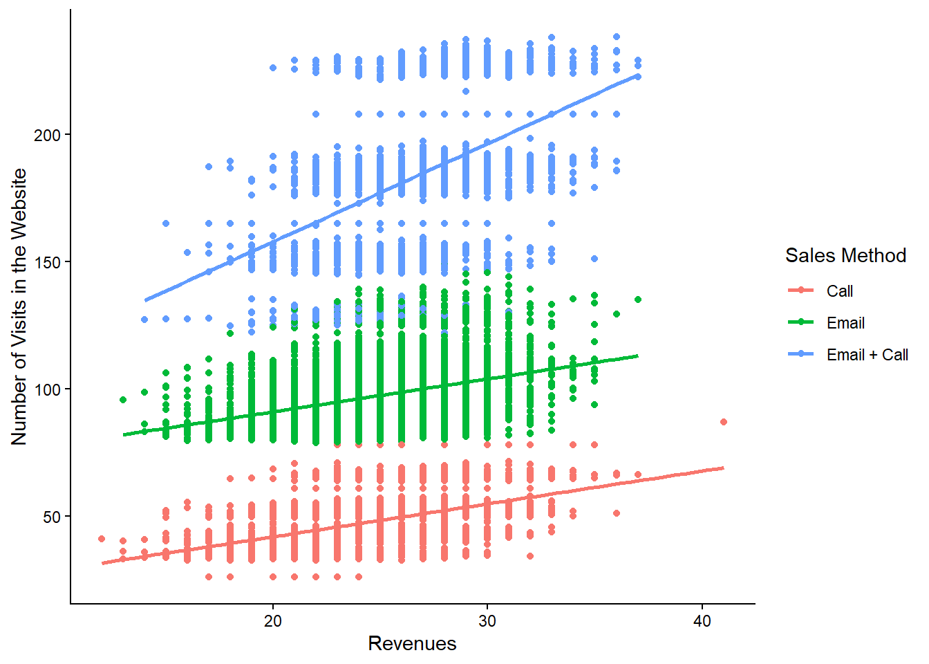
A valuable metric for the business to monitor is the “Number of Visits to the Website”. This metric is crucial for assessing the effectiveness of various sales methods, as it directly correlates with customer engagement and potential revenue generation. The plot below demonstrates a positive correlation between website visits and revenues across different sales method groups:
# What is the relationship between website visits and revenues per sales method?data %>%ggplot(aes(x = nb_site_visits,y = revenue, color = sales_method)) +geom_point() +geom_smooth(method ="lm", se =FALSE) +labs(x ="Revenues", y ="Number of Visits in the Website",color ="Sales Method")
The positive correlation indicates that an increase in website visits generally leads to higher revenues. Thus, the “Number of Visits to the Website” can serve as a key performance indicator (KPI) to evaluate the impact of different sales methods on driving customer engagement and boosting revenues.
From a strategic perspective, the business can leverage this metric to refine its sales approach. By focusing on sales methods that show a stronger correlation between website visits and revenues, the business can allocate resources more efficiently. For example, if website visits significantly increase for the email sales method, this suggests greater effectiveness in engaging customers through email communication.
To make this actionable, the business should consider targeted marketing efforts aimed at increasing website visits for specific sales methods, enhancing the user experience to encourage longer and more frequent visits, and developing strategies to sustain or improve the positive correlation observed.
Calculating the “Number of Visits to the Website” involves summing up the website visits over a specific period for each sales method. In the provided dataset, the number of website visits per sales method is as follows:
# Number of website visits per sales methoddata %>%rename(`Sales Method`= sales_method) %>%group_by(`Sales Method`) %>%summarize(`Number of Website Visits`=sum(nb_site_visits)) %>% knitr::kable()
Sales Method
Number of Website Visits
Call
121191
Email
184816
Email + Call
68856
These values provide a baseline for performance comparison. For instance, if the number of website visits for the email sales method increases to 200,000, the business can anticipate a corresponding rise in revenues for that method. This approach enables ongoing assessment and refinement of sales strategies based on real-time performance data.
Final Summary and Recommendations
Based on the analysis above, the following conclusions can be drawn:
The “Email” and “Email + Call” methods are more effective than “Call”: This holds true across all six weeks of the observed period.
The “Email + Call” method tends to generate higher revenues than “Email”, but the latter is more time-efficient. There is a trade-off between sales time and revenue, as the email method allows for reaching more customers, which is also associated with an increase in website visits.
Recommendations
Prioritize the “Email” and “Email + Call” methods over the “Call” method. The “Email + Call” approach not only results in higher revenues but may also be more time-efficient, particularly if applied to a large customer base.
Utilize the “Number of Visits to the Website” as a key metric. By regularly monitoring this metric and comparing it with revenue changes, the business can make informed strategic decisions and gain insights into the relationship between online presence and financial performance.