Correlation
Introduction
In this chapter, we discuss one of the most basic and widely used measures of association between variables: the correlation coefficient. Understanding correlation is fundamental for exploring relationships in data, helping us quantify whether two variables move together. We focus primarily on the Pearson correlation coefficient, but are also introducing other types of correlation that are useful in different contexts. Throughout, we emphasize both the practical applications and the limitations of these measures to build a solid foundation for analyzing associations in real-world data.
Using insights from correlation analysis can guide further analysis, support decision-making, and help identify potential predictors in modeling. For example, a strong positive correlation between hours studied and exam scores can suggest that studying more is associated with better performance. However, it is crucial to interpret correlation carefully, as it does not (in itself) establish cause and effect.
Finally, we will explore how to calculate the different types of correlation in R using built-in functions, making it easy to apply these concepts to real datasets. Additionally, we will touch on hypothesis testing for correlation, which allows us to assess whether observed associations are statistically significant or likely due to chance.
Understanding Correlation
Correlation refers to the association between two variables. There are different types of correlation measures depending on the nature of the variables involved, but the most commonly used is the Pearson correlation coefficient. When the term “correlation” is mentioned without further qualification, it typically refers to this Pearson correlation.
The Pearson correlation coefficient measures the strength and direction of the linear relationship between two continuous variables. For example, monthly advertising spend and sales revenue often exhibit a strong positive correlation: companies that spend more on advertising tend to generate higher revenues. This illustrates the two fundamental aspects of correlation:
Direction: Whether the variables move together in the same direction (positive correlation) or in opposite directions (negative correlation).
Strength: How strong the association is, regardless of direction.
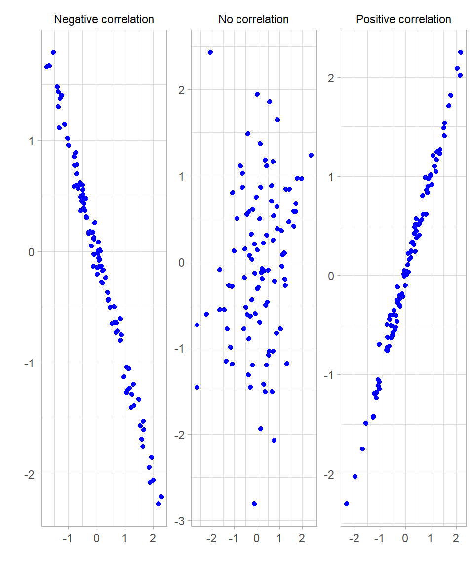
Before we dive into how correlation is calculated, let’s try to understand what the association between two variables actually means. Scatterplots are an excellent way to visually assess the association between two variables. The plots below illustrate three scenarios: a strong positive correlation, a strong negative correlation, and no correlation:
In these plots, correlation appears as the shape of the point cloud:
When the correlation is strong and positive, points cluster tightly around an upward straight line.
When the correlation is strong and negative, points cluster tightly around a downward straight line.
When there is no correlation, points appear scattered randomly with no clear pattern.
The more the points cluster closely around a straight line—forming a narrow, elongated pattern rather than a scattered cloud—the stronger the linear correlation.
Because the Pearson correlation coefficient only measures linear relationships, it nevertheless has its limitations, meaning the correlation values can be misleading (Urdan, 2022).
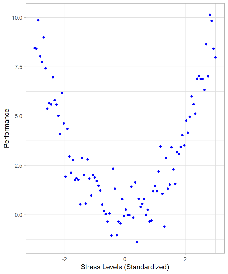
If the relationship between variables is nonlinear, Pearson correlation may underestimate or fail to detect the association. For example, if two variables have a strong nonlinear association (e.g., a U-shaped or inverted U-shaped relationship), the Pearson correlation might be close to zero, despite a clear relationship existing. Such an example could be the relationship between stress level and performance: moderate stress might improve performance, but very low or very high stress levels might reduce it, creating a U-shaped pattern. The following plot illustrates such a case:
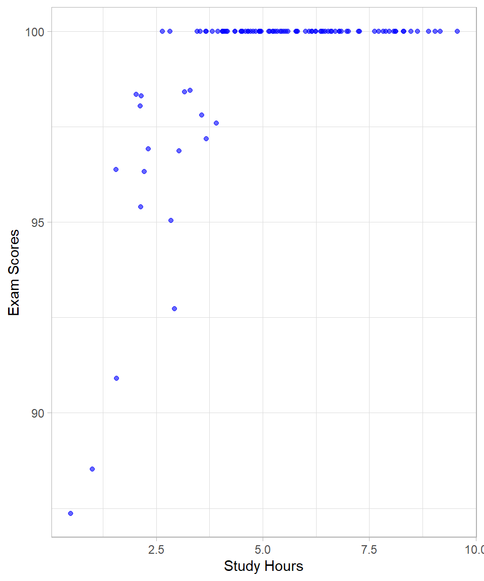
Another example is when the range of one or both variables is restricted or truncated, causing the correlation to be artificially lowered, thus hiding a true association. Such a situation may occur when an easy exam is given to a class of students, where most students score very high marks with little variation. Although students’ abilities and study hours might be strongly related in the full population, the limited variation in scores in this particular class reduces the observed correlation:
While the examples discussed—nonlinear relationships and range restriction—highlight common scenarios where Pearson correlation can be misleading, there are other situations that can also affect correlation estimates. For instance, outliers can disproportionately influence the correlation coefficient, either inflating or deflating its value. However, the core idea of correlation as a measure of linear association remains the same, and understanding its limitations helps us use it more effectively.
Calculating Correlation
Up to this point, we have discussed the intuition of the Pearson correlation coefficient. Now, let us examine how this coefficient is calculated. Understanding the underlying computation provides useful insights into what correlation truly measures.
The mathematical formula for the Pearson correlation coefficient is:
\[r = \frac{\sum^n_{i = 1} (z_{x{_i}} \cdot z_{y{_i}})}{n}\]
where:
\(z_{x_{i}}\) is the z-score (standardized value) of observation \(i\) from variable \(x\),
\(z_{y_{i}}\) is the z-score of the corresponding observation from variable \(y\),
\(n\) is the number of paired observations.
To understand this formula, we need to remember that the two variables of interest can have different units of measurement. To make the comparison between the two variables “fair”, we remove the original units of measurement, allowing us to compare variables on a common scale. By converting both variables to z-scores (which are unitless), we can evaluate how they vary together relative to their own distributions.
After standardizing the variables, we multiply each value of one variable with the corresponding one of the other variable. These multiplications are also known as the cross-products of the variables. The cross product of standardized values reveals how two variables deviate together from their respective means:
If both \(x\) and \(y\) are above their means (i.e., both z-scores are positive), their product is positive.
If both \(x\) and \(y\) are below their means (i.e., both z-scores are negative), their product is also positive.
But if one is above the mean and the other is below, the product is negative.
This is why the sign and magnitude of the sum of these cross-products reflects the direction and strength of the relationship, as we saw above. The final division by \(n\) gives us the average cross-product, which is precisely what the correlation coefficient represents: the average degree to which standardized values move together.
So, the steps to calculate the Pearson correlation coefficient are the following:
Standardize the variables \(x\) and \(y\) by converting each value to a z-score.
Multiply each standardized value of \(x\) with the corresponding standardized value of \(y\). This is known as the cross product.
Sum all the cross products.
Divide this total by the number of pairs, \(n\).
Fortunately, we do not need to calculate the Pearson correlation coefficient by hand. In R, we can use the built-in cor() function to compute the correlation between two numeric variables.
Regarding the interpretation, correlation values range from \(-1\) to \(+1\):
A value of \(-1\) indicates a perfect negative linear relationship, meaning as one variable increases, the other decreases, perfectly.
A value of \(+1\) indicates a perfect positive linear relationship, meaning both variables increase together, perfectly.
A value of 0 indicates no linear association.
In practice, it is extremely rare to observe perfect correlation because real-world data are influenced by many factors, including measurement error and natural variability.
Let’s use the mtcars dataset as an example. Suppose we want to examine the relationship between the number of cylinders a car has (cyl) and its fuel efficiency measured in miles per gallon (mpg).
# Loading mtcars
data(mtcars)

# Printing the first 10 rows
head(mtcars, n = 10)
mpg cyl disp hp drat wt qsec vs am gear carb
Mazda RX4 21.0 6 160.0 110 3.90 2.620 16.46 0 1 4 4
Mazda RX4 Wag 21.0 6 160.0 110 3.90 2.875 17.02 0 1 4 4
Datsun 710 22.8 4 108.0 93 3.85 2.320 18.61 1 1 4 1
Hornet 4 Drive 21.4 6 258.0 110 3.08 3.215 19.44 1 0 3 1
Hornet Sportabout 18.7 8 360.0 175 3.15 3.440 17.02 0 0 3 2
Valiant 18.1 6 225.0 105 2.76 3.460 20.22 1 0 3 1
Duster 360 14.3 8 360.0 245 3.21 3.570 15.84 0 0 3 4
Merc 240D 24.4 4 146.7 62 3.69 3.190 20.00 1 0 4 2
Merc 230 22.8 4 140.8 95 3.92 3.150 22.90 1 0 4 2
Merc 280 19.2 6 167.6 123 3.92 3.440 18.30 1 0 4 4# Calculating correlation between mpg and cyl
cor(mtcars$mpg, mtcars$cyl)[1] -0.852162This function returns a correlation coefficient of approximately -0.85. This indicates a strong negative linear relationship: as the number of cylinders increases, fuel efficiency tends to decrease. This makes sense intuitively, as cars with more cylinders generally consume more fuel and thus travel fewer miles per gallon.
If we apply the cor() function to an entire data frame (rather than to just two vectors), R will compute the pairwise correlations between all numeric variables in the data frame. The result is known as a correlation matrix. Each cell in this matrix represents the Pearson correlation coefficient between a pair of variables.
In the code below, we keep the first 5 columns and apply the cor() function:
# Computing correlation matrix for all numeric variables in mtcars
mtcars %>% select(1:5) %>% cor()
mpg cyl disp hp drat
mpg 1.0000000 -0.8521620 -0.8475514 -0.7761684 0.6811719
cyl -0.8521620 1.0000000 0.9020329 0.8324475 -0.6999381
disp -0.8475514 0.9020329 1.0000000 0.7909486 -0.7102139
hp -0.7761684 0.8324475 0.7909486 1.0000000 -0.4487591
drat 0.6811719 -0.6999381 -0.7102139 -0.4487591 1.0000000This returns a square matrix where both the rows and columns correspond to the variables in the dataset. The diagonal elements are all 1, since each variable is perfectly correlated with itself. The off-diagonal elements show the correlation between different variables. This matrix is a useful tool for quickly assessing the relationships among multiple variables, especially during exploratory data analysis.
Hypothesis Testing for a Correlation Coefficient
Correlation is still a statistic. Even though we may apply rules of thumb to interpret its strength, we often want to know whether the correlation is from a statistical standpoint significantly different from zero (or any other pre-specified threshold). This is especially important when we’re working with sample data and want to draw inferences about the broader population.
To assess this, we conduct a hypothesis test. For the Pearson correlation, we use a t-test with the following test statistic:
\[t = \frac{r - \rho}{SE_r}\]
where:
\(r\) is the sample correlation,
\(\rho\) is the hypothesized population correlation (usually 0 under the null hypothesis),
\(SE_r\) is the standard error of the sample correlation.
The standard error of \(r\) is given by:
\[SE_r = \sqrt{\frac{(1 - r^2)}{df}} = \sqrt{\frac{(1 - r^2)}{n - 2}}\]
This formula tells us how much the sample correlation can be expected to vary from sample to sample, assuming that the true correlation \(\rho\) is fixed.
Why does the expression involve \(1 - r^2\) ? Recall that \(r^2\) measures the proportion of explained variation. So, \(1 - r^2\) is the proportion of unexplained variation—essentially, the noise. The more unexplained variation there is, the larger the standard error will be. When \(r\) is small (weak correlation), there’s more noise, and the estimate of \(r\) becomes less precise.
By substituting \(s_r\) into the t-formula and simplifying algebraically, we arrive at:
\[t = r \times \sqrt{\frac{n - 2}{1 - r^2}}\]
This t-statistic then follows a t-distribution with:
\[df = n - 2\]
degrees of freedom. To test the hypothesis, we compare the calculated t-value to the critical values from the t-distribution, or compute a p-value. If the p-value is less than the chosen significance level (usually 0.05), we reject the null hypothesis and conclude that the correlation is statistically significantly different from zero.
In R, you can test the significance of a correlation using the cor.test() function. This function performs a hypothesis test for the Pearson correlation coefficient (by default) and also provides a respective confidence interval.
Let’s test the correlation between miles per gallon (mpg) and the number of cylinders (cyl) from the mtcars dataset. We previously saw that the sample correlation is about -0.85. Now let us test whether this correlation is significantly different from 0 (a note: well, it is quite evident that it is, but the point of this exercise is to actually demonstrate the steps towards documenting this):
# Performing a Pearson correlation test
cor.test(x = mtcars$mpg,
         y = mtcars$cyl,
         method = "pearson",
         conf.level = 0.95,
         alternative = "two.sided")
    Pearson's product-moment correlation

data:  mtcars$mpg and mtcars$cyl
t = -8.9197, df = 30, p-value = 6.113e-10
alternative hypothesis: true correlation is not equal to 0
95 percent confidence interval:
 -0.9257694 -0.7163171
sample estimates:
      cor
-0.852162
This function returns the correlation coefficient \(r\), the t-statistic, the degrees of freedom, the 95% confidence interval, and the p-value.
In this case, the p-value is much lower than 0.05, indicating that the observed negative correlation between mpg and cyl is statistically significantly different from zero at the 5% level (as expected). Even though the correlation is strong, it’s the p-value that tells us whether we can confidently generalize this relationship to the population.
Fisher’s Z Transformation
In the last output, we examined the confidence interval of the correlation estimate. However, correlation coefficients themselves do not follow a normal distribution, especially when their true value is far from zero. Intuitively, this happens because the correlation coefficient is bounded between –1 and 1. When the true correlation is near these bounds, the possible values the sample correlation can take are limited on one side, which makes the sampling distribution asymmetric or skewed. For example, if the true correlation is very close to 1, the sample correlation cannot exceed 1, but it can still take lower values, producing a distribution that is compressed on the upper end and stretched on the lower end. This non-normality complicates statistical inference, such as constructing confidence intervals or performing hypothesis tests (Urdan, 2022).
To address this, Fisher introduced a transformation that converts the sample correlation \(r\) into a new variable \(z\), defined as:
\[z = \frac{1}{2} \cdot \ln (\frac{1 + r}{1 - r})\]
This Fisher’s Z-transformation stabilizes the variance of the sample correlation and makes its sampling distribution approximately normal, assuming the original data come from a bivariate normal distribution. This approximate normality allows us to use standard parametric methods for confidence intervals and hypothesis tests regarding correlations.
Fisher’s Z-transformation is particularly important when comparing two correlation coefficients or constructing confidence intervals, because the distribution of \(r\) is skewed and its variance depends on the true correlation. By working on the z-scale, the variance becomes roughly constant, simplifying calculations and improving the accuracy of statistical inference.
To perform inference using Fisher’s Z-transformation, we follow these steps:
Transform the sample correlation \(r\) to Fisher’s \(z\):
\[ z = \frac{1}{2} \cdot \ln(\frac{1 + r}{1 - r})\]
Calculate the standard error of \(z\) with \(n\) sample size:
\[SE_z = \frac{1}{\sqrt{n - 3}}\]
Construct a confidence interval for \(z\):
\[z \pm z^* \times SE_z\]
where \(z^*\) is the critical value from the standard normal distribution (e.g., 1.96 for a 95% confidence level).
Convert the confidence interval back to the correlation scale by applying the inverse Fisher transformation:
\[r = \frac{e^{2z} - 1}{e^{2z} + 1}\]
This calculation relates directly to the operations performed towards the previous R output. By transforming the correlation coefficient using Fisher’s Z-transformation, we “standardize” it, making its distribution approximately normal, and stabilizing its variance. This standardization allows us to construct accurate confidence intervals on the z-scale. Once the confidence interval is calculated, we convert it back to the original correlation scale using the inverse Fisher transformation to interpret the results in terms of the familiar correlation coefficient.
To compare two independent correlation coefficients \(r_1\) and \(r_2\) from samples of sizes \(n_1\) and \(n_2\), we transform each to Fisher’s z values \(z_1\) and \(z_2\), then calculate the test statistic:
\[Z = \frac{z_1 - z_2}{\sqrt{\frac{1}{n_1 - 3} + \frac{1}{n_2 - 3}}}\]
This Z-score approximately follows a standard normal distribution under the null hypothesis that the two population correlations are equal.
Thankfully, we don’t need to perform these calculations manually. In R, we can easily compare two independent correlations using the cocor package. Suppose we have two variables with 30 pairs of observations and a correlation of 0.6, and two other variables with 35 pairs of observations and a correlation of 0.3. The function cocor.indep.groups() returns the test statistic and p-value for comparing these two correlations from independent samples.
# Libraries
library(cocor)

# Comparing two independent correlations
cocor.indep.groups(r1.jk = 0.6, r2.hm = 0.3, n1 = 30, n2 = 35)
  Results of a comparison of two correlations based on independent groups

Comparison between r1.jk = 0.6 and r2.hm = 0.3
Difference: r1.jk - r2.hm = 0.3
Group sizes: n1 = 30, n2 = 35
Null hypothesis: r1.jk is equal to r2.hm
Alternative hypothesis: r1.jk is not equal to r2.hm (two-sided)
Alpha: 0.05

fisher1925: Fisher's z (1925)
  z = 1.4680, p-value = 0.1421
  Null hypothesis retained

zou2007: Zou's (2007) confidence interval
  95% confidence interval for r1.jk - r2.hm: -0.1032 0.6866
  Null hypothesis retained (Interval includes 0)
In this example, the difference between the two correlations is not statistically significant, even at the 10% significance level. This means that, based on the data, we do not have enough evidence to conclude that the true population correlations are different from each other. In practical terms, the observed difference in sample correlations could simply be due to random variation.
It’s important to remember that failing to find a statistically significant difference does not prove that the correlations are equal; it only indicates that any difference detected is not strong enough to be distinguished from chance, given the sample sizes.
Using Fisher’s z-transformation and functions such as those in the cocor package allows us to rigorously test and compare correlations, improving the reliability of our conclusions when working with sample data.
Other Types of Correlation
So far, we have focused on the Pearson correlation coefficient, which is appropriate when both variables are continuous and normally distributed. However, in practice, not all data fit this structure. There are cases where one or both variables is categorical, or when the data violate the assumptions of linearity or normality. In these cases, alternative correlation measures are used: the point-biserial correlation, Spearman’s rho, and the phi coefficient.
The point-biserial correlation is used when one variable is continuous and the other is binary. For example, suppose we want to measure the association between gender (0 = female, 1 = male) and height (a continuous variable). Although gender is not numeric in nature, if coded properly, we can use the point-biserial correlation to assess whether gender is associated with differences in height. A strong positive point-biserial correlation would indicate that males (coded in this example as “1”) tend to be taller, while a strong negative value would indicates that females (coded as “0” in this example) tend to be taller. In fact, the point-biserial correlation is mathematically equivalent to the independent samples t-test (see Chapter Statistical Tests), meaning that a significant point-biserial correlation corresponds directly to a significant difference in means between the two groups. Thus, when testing whether the correlation differs from zero, we are effectively testing whether the group means are significantly different. All the concepts we’ve discussed, such as coefficient of determination, statistical significance through a t-distribution, and confidence intervals, apply in exactly the same way. Even Fisher’s Z transformation can be used for inference or comparing correlations, although it’s less commonly applied for binary variables.
The Spearman’s rho is a rank-based correlation used when the assumptions of the Pearson correlation are violated, especially when the relationship between the variables is monotonic, meaning that as one variable increases, the other tends to consistently increase or decrease, though not necessarily at a constant rate. Instead of using the actual values of the variables, we rank them and then calculate the Pearson correlation on those ranks. This makes Spearman’s rho a non-parametric measure, meaning it does not assume normality of the underlying data. Suppose we are interested in the relationship between a person’s rank in a math competition and their score in a logic puzzle. Even if the scores are skewed or if the relationship is not linear, Spearman’s rho will still capture the strength and direction of their association. While the formula is different, the logic of hypothesis test remains intact. We can test whether the observed rho is significantly different from zero, compute confidence intervals, and even compare rho values across samples using methods analogous to those for Pearson’s correlation. Although Fisher’s Z transformation was originally derived for Pearson’s correlation, there are adjusted versions that can be applied to Spearman’s rho for constructing confidence intervals and conducting comparisons.
Finally, the phi coefficient is used when both variables are binary. It is a special case of the Pearson correlation applied to 2×2 contingency tables. For example, suppose we want to assess the relationship between smoking status (yes or no) and lung disease (again, yes or no). The phi coefficient will indicate whether there is a positive or negative association between these two binary variables. Just like Pearson correlation coefficient, phi ranges from –1 to +1 and can be squared to obtain the proportion of variance explained. Again, the same testing framework applies: we can assess whether the phi coefficient is significantly different from zero using the same principles of hypothesis testing. When sample sizes are large, the test statistic for phi approaches a chi-squared distribution—just like in the chi-squared test of independence (see Chapter Statistical Tests), which also uses contingency tables to examine relationships between categorical variables. The underlying logic of inference remains the same: we assess whether the observed association among categories could plausibly occur under the assumption of no true relationship.
In summary, all these correlation measures—point-biserial, Spearman’s rho, and phi—extend the core ideas we developed with Pearson’s correlation. The concepts of strength and direction of association, statistical significance testing, confidence intervals, and even Fisher’s Z transformation (in adapted forms) continue to apply. The key difference lies in the type of data we are analyzing and the assumptions we are willing—or not willing—to make. These alternative correlation measures allow us to work more flexibly and appropriately with a wide variety of data structures encountered in real-world problems.
In R, computing these different types of correlations is straightforward using the cor() or the cor.test() functions, which includes a method argument to specify the type of correlation desired. By default, cor() computes Pearson’s correlation, but if we want to compute Spearman’s rho, we can simply set method = "spearman". This tells R to rank the data internally and then apply the correlation to those ranks.
For the point-biserial and phi correlations, the situation is slightly different. Both are technically special cases of Pearson’s correlation. If we ensure that binary variables are coded numerically as 0 and 1, we can compute both point-biserial and phi correlations directly using the standard cor() function with method = "pearson". R treats the binary variables as numeric values and returns the appropriate correlation coefficient. This flexibility means that we don’t need a separate function to compute these correlations; R handles the necessary distinctions automatically as long as the data are structured correctly.
Recap
In this chapter, we discussed the Pearson correlation coefficient, a statistic that measures the strength and direction of the linear relationship between two continuous variables. We covered its interpretation in terms of direction and strength, as well as its limitations, such as insensitivity to nonlinear relationships and vulnerability to outliers or restricted data ranges. Alongside correlation, we introduced the coefficient of determination, which indicates how much variance in one variable can be explained by another.
We explored hypothesis testing for correlation, including Fisher’s z-transformation, which helps compare correlations or build confidence intervals by stabilizing the variance of the correlation coefficient.
While Pearson correlation is the most commonly used, we also introduced other types of correlation suited for different data types or relationships: Spearman’s rho for monotonic but possibly nonlinear relationships, point-biserial correlation for relationships between continuous and binary variables, and phi-coefficient for binary variables.