K-Means
Introduction
Imagine you work in the marketing department of a company, and your manager wants to better understand customer behavior in order to design targeted campaigns. In marketing (and, more broadly, in business), knowing your customers is essential, as different customer segments respond to different approaches. For example, a customer who frequently visits the company website but never makes a purchase might be looking for a specific item and checking its availability; in contrast, a customer who visits less often but buys different products each time is likely driven by a different set of needs or habits.
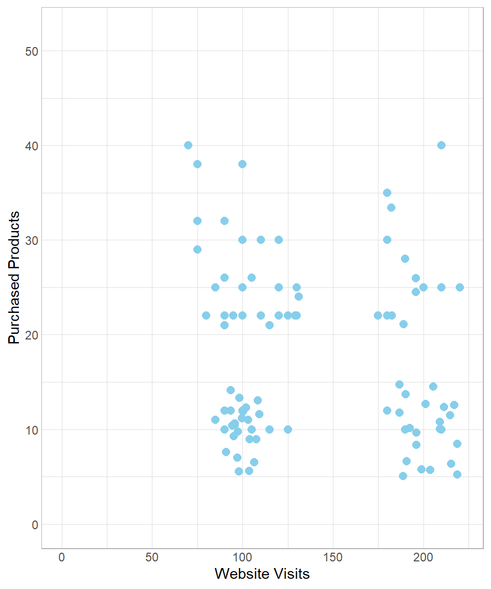
As a data scientist, your goal is to identify and describe these customer profiles based on available data. Suppose the company is able to put together a dataset with two key variables: the number of visits to the website and the number of products purchased. The following scatterplot visualizes this dataset:
Looking at the plot, you might notice that the points appear to form distinct groups. This suggests the presence of clusters—groups of customers with similar behaviors. For instance, customers with fewer than 150 website visits might belong to a cluster of “low visit frequency,” while the rest could be grouped under “high visit frequency.” We could illustrate this manually as follows:
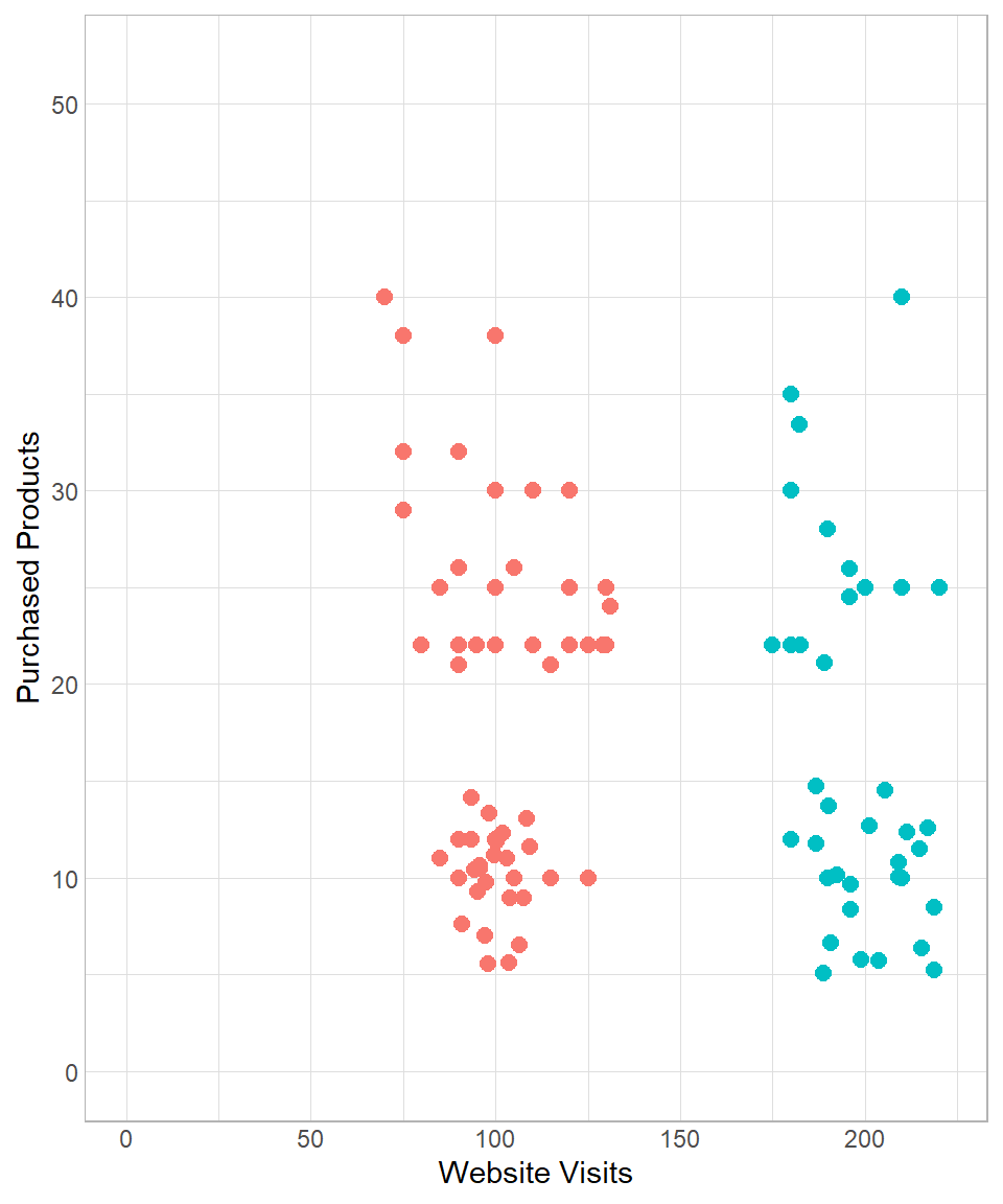
Of course, this kind of manual grouping is subjective. In practice, we use more systematic and scalable techniques, especially nowadays, in the era of machine learning and artificial intelligence. Grouping data points based on patterns within the data is a fundamental task of unsupervised machine learning, where no labeled output is given.
In this chapter, we introduce one of the most popular and intuitive clustering techniques in unsupervised learning: k-means clustering.
K-Means in Depth
To understand how the k-means algorithm works, let us revisit the data introduced earlier:

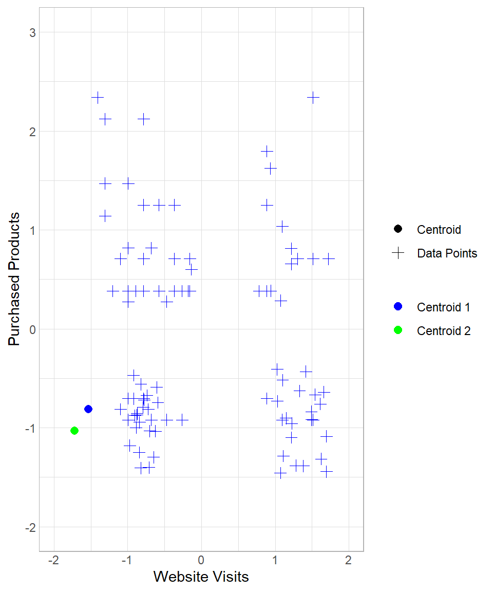
To start implementing the k-means method, we create \(k\) random data points, which can be seen as centers in the multi-dimensional space. As a result, a data point is assigned to its nearest center. To visualize this, suppose we set \(k\) equal to 2, meaning that we get two random centers, or centroids. Let’s refer to these centroids as Centroid 1 and Centroid 2, which appear as the blue and green point respectively:
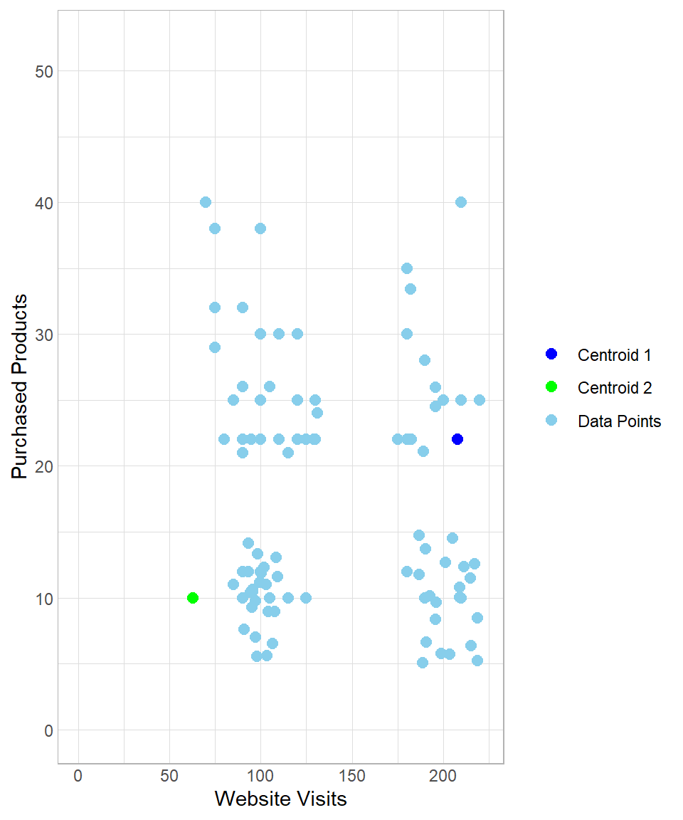
The two centroids are randomly generated points that were not part of the original dataset. They do not carry any significance; we simply introduce two artificial random points to the data.
The next step is to measure the distance of each data point from each centroid to determine which centroid is closest. As we discussed in Chapter K-Nearest Neighbors, we can measure the distance between two points using the Euclidean distance, calculated using the following formula:
\[\text{dist}(A,B) = \sqrt{(x_B - x_A)^2 + (y_B - y_A)^2}\]
In this formula, \(A\) and \(B\) represent the two points, while \(x\) and \(y\) are the two variables used to calculate the distance between them. Of course, we can expand this equation to include more than two variables and calculate distances in the multi-dimensional space. In our example, we have two variables—the website visits and number of purchased products—meaning we use only these two variables for the calculation of distance.
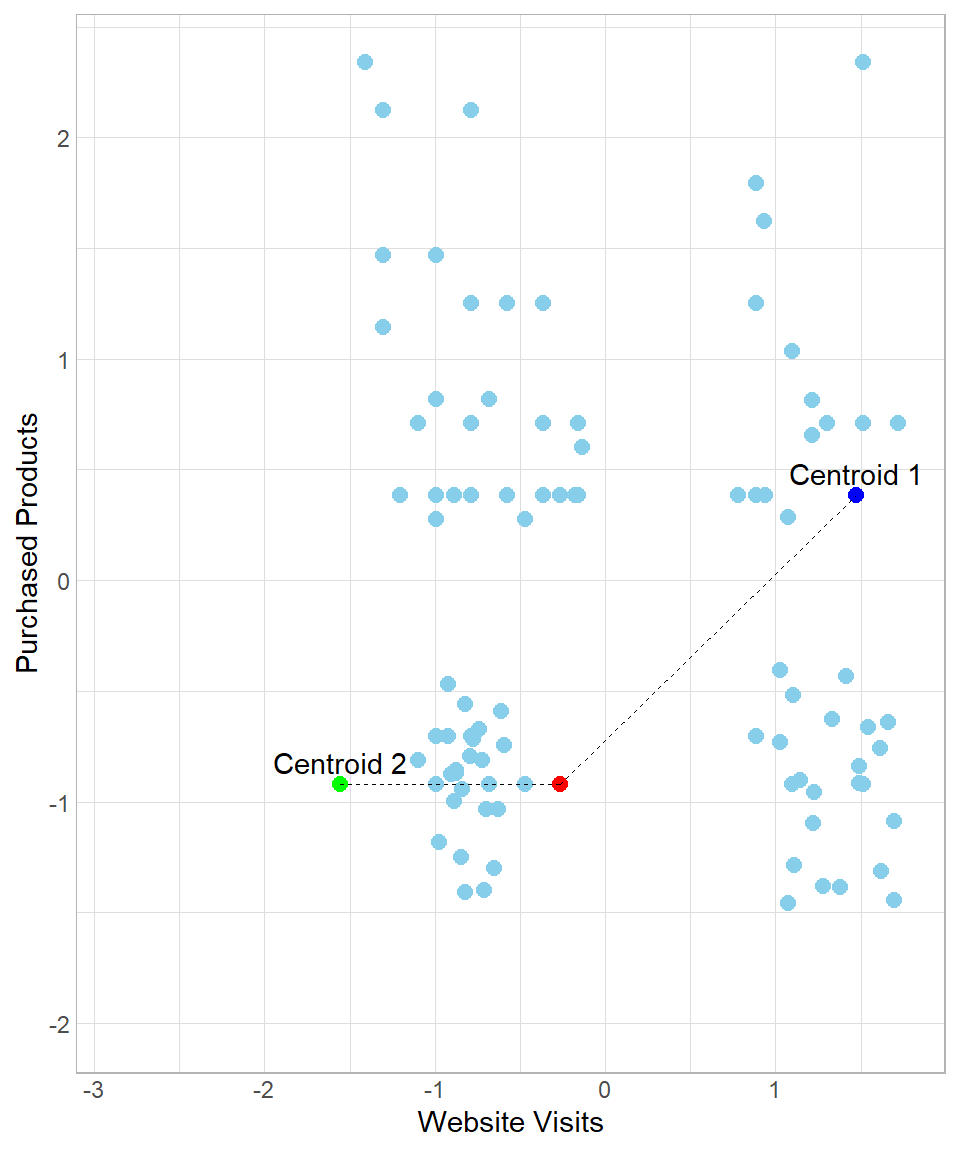
As an example, we can visualize the distance of a data point (colored by red) from each centroid:
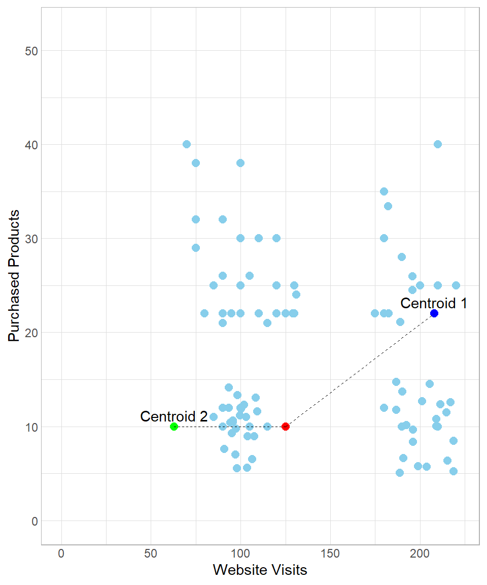
In this example, the distance between the red point and the green point (Centroid 2) is:
\[\begin{align*} \text{dist}(\text{Red}, \text{Centroid 2}) &= \sqrt{(x_{\text{Red}} - x_{\text{Centroid 2}})^2 + (y_{\text{Red}} - y_{\text{Centroid 2}})^2} \\ &= \sqrt{(125 - 63)^2 + (10 - 10)^2} \\ &= 62 \end{align*}\]
Similarly, the distance between the red point and the blue point (Centroid 1) is:
\[\begin{align*} \text{dist}(\text{Red}, \text{Centroid 1}) &= \sqrt{(x_{\text{Red}} - x_{\text{Centroid 1}})^2 + (y_{\text{Red}} - y_{\text{Centroid 1}})^2} \\ &= \sqrt{(125 - 208)^2 + (10 - 22)^2} \\ &= 84 \end{align*}\]
Because the distance between the red point and Centroid 2 is shorter than that between the red point and Centroid 1, the red point would be classified as green.
However, as we discussed in chapter K-Nearest Neighbors, using the raw values to calculate distances is not recommended if we want to give to each variable the same weight of importance. Hence, we need to scale the variables before we start calculating distances.
After standardization, the x- and y-axis values are on different scales:
The majority of the data points having website visits less than 0 (remember, those are just the standardized values, not actual values) would belong to centroid Centroid 2 and the rest would belong to centroid Centroid 1.
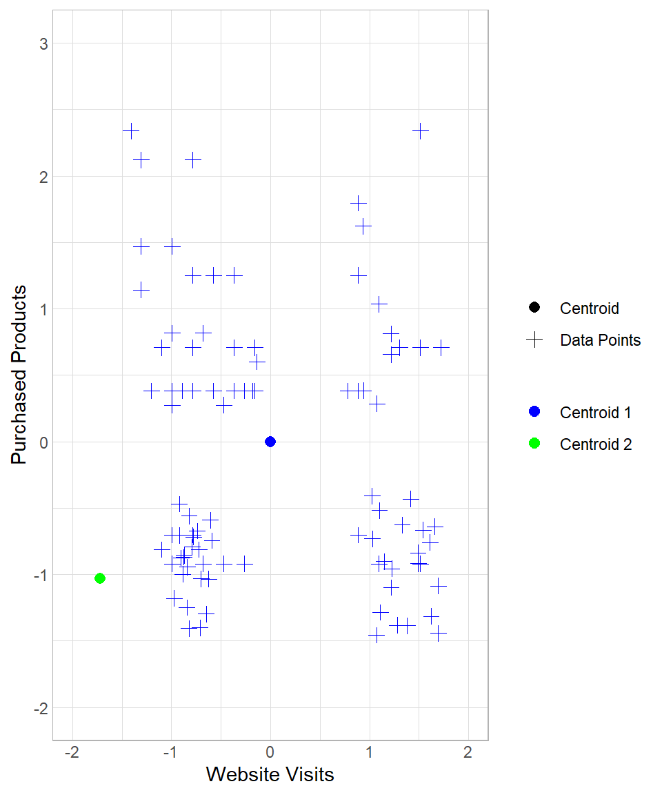
Even if the created clusters seem reasonable, we cannot stop the process here. There is a potential problem when we think about how we started this process: the centroids can appear anywhere and, as a result, there is a high risk of creating segments that do not make sense. To understand how this could be possible, suppose we have the following results:
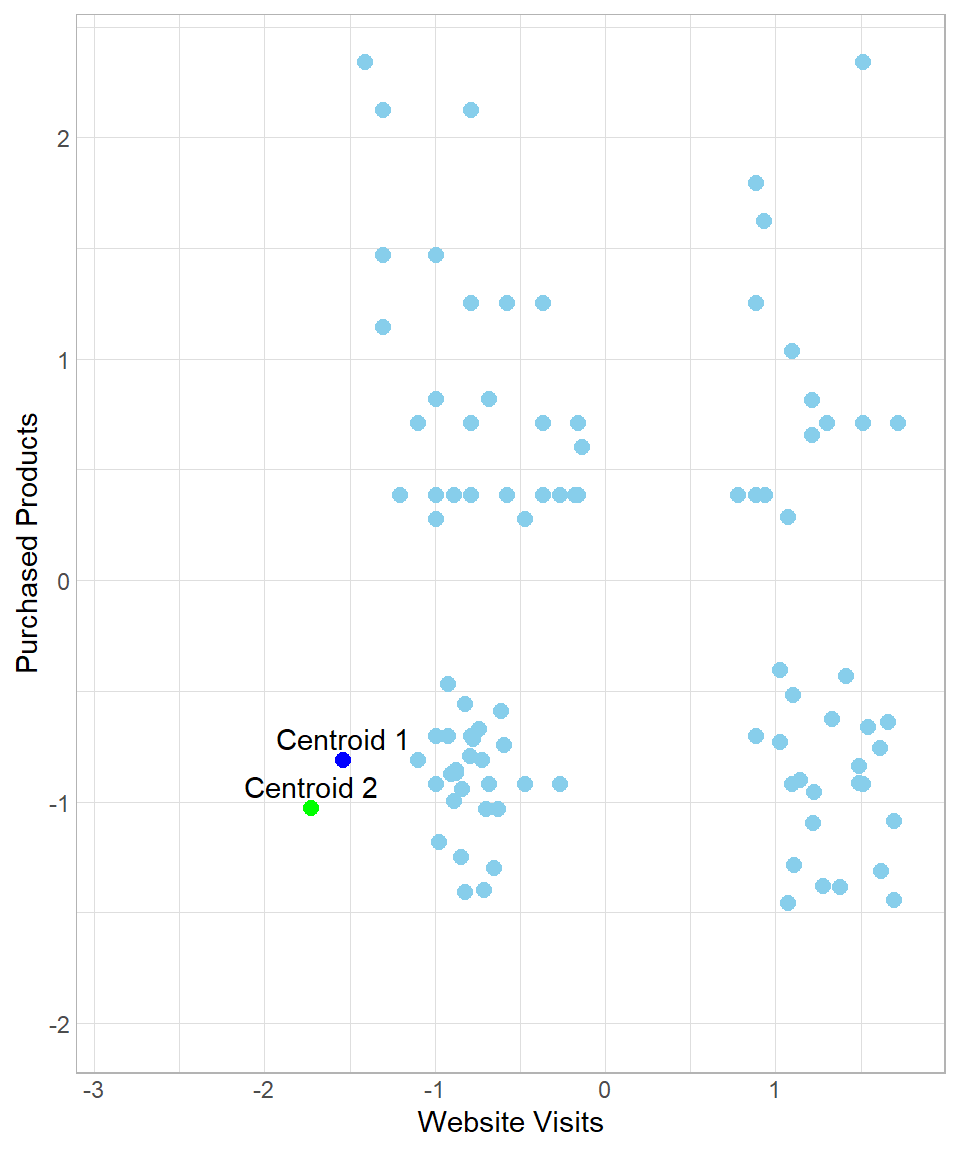
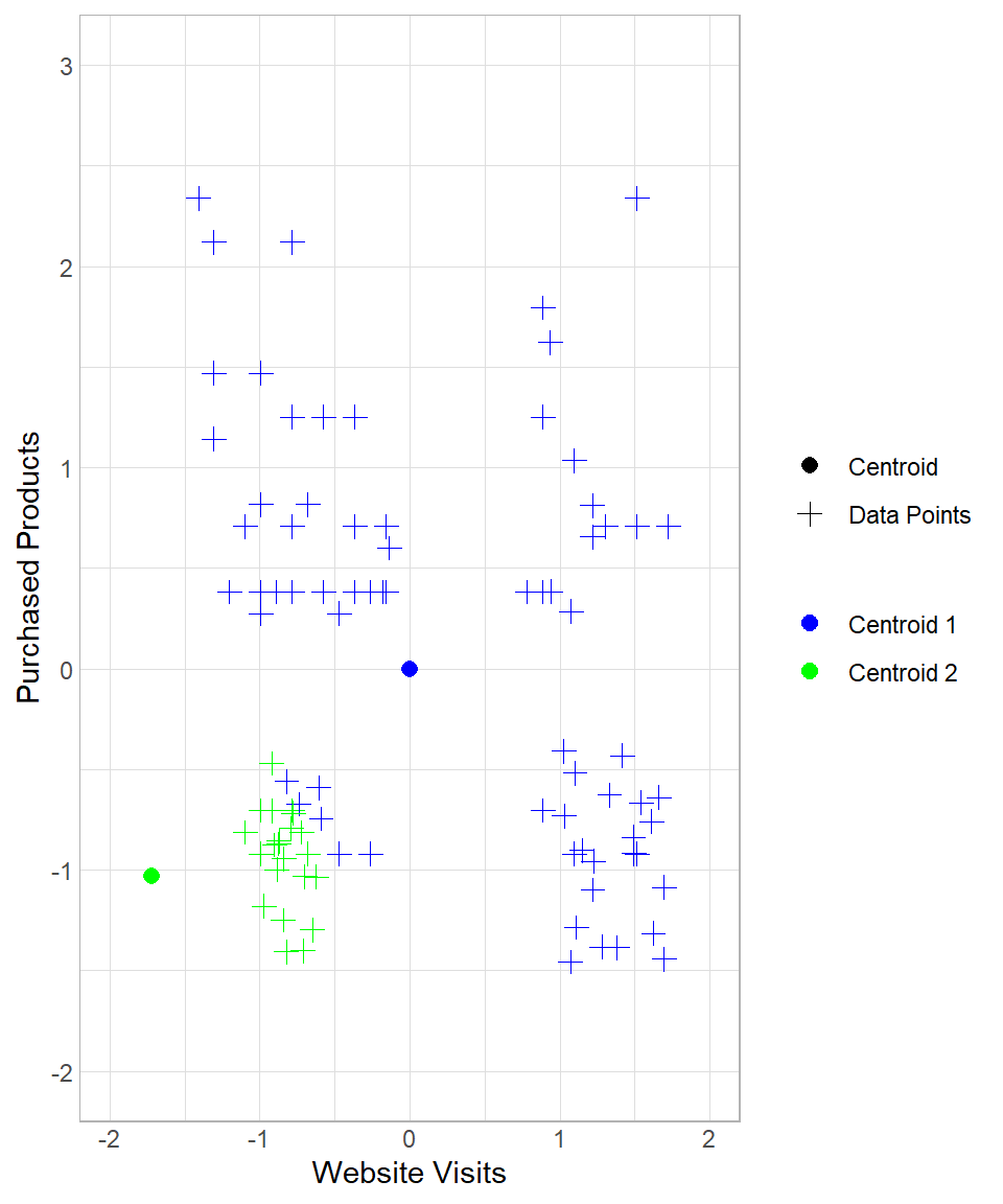
In this case, all data points would be assigned to Centroid 1, meaning that we would view all customers as having the same profile. Of course such an assignment would be useless. To make sure we end up with meaningful clusters, we start an iteration process by moving the centroids towards their closest assigned data points. In other words, the data points “pull” their centroids towards their center and then we re-assign the data points to the centers. In our example, after the “pull”, the plot now looks like this:
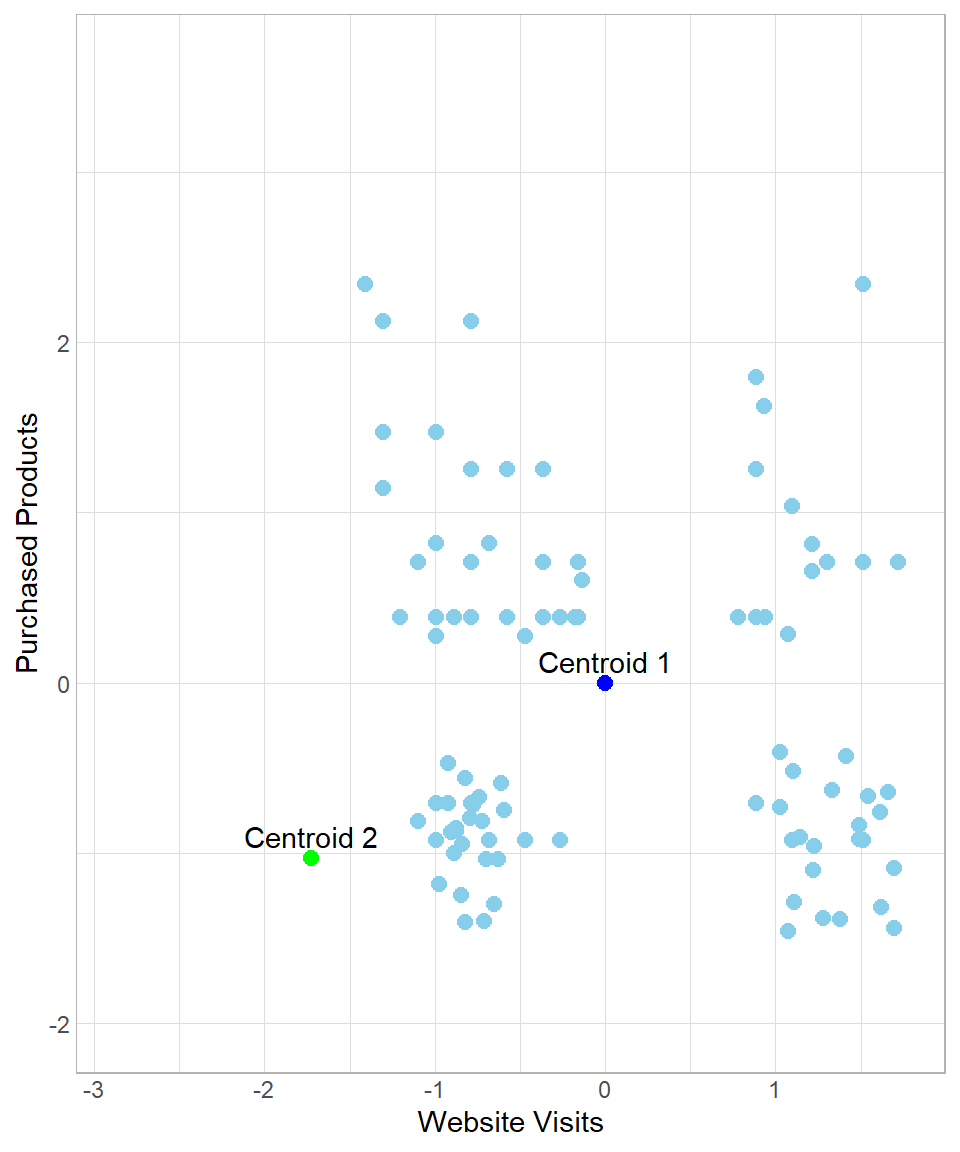
So, after the initial assignment to the clusters, the centroids move to the “center” of their assigned data points. After this moving of Centroid 1 though, there are some data points now that are closest to Centroid 2, not Centroid 1. The next step is to repeat the whole process, meaning that we calculate the Euclidean distance of all the data points from each centroid and then re-assign them to the closest centers. We can repeat this process many times until there is some stability regarding the moving of the centroids. The number of times that we repeat this process is called number of iterations.
To see the whole process from the beginning, suppose we start again the process in the example above, setting the number of iterations to three. How the results change throughout this process can be seen below:
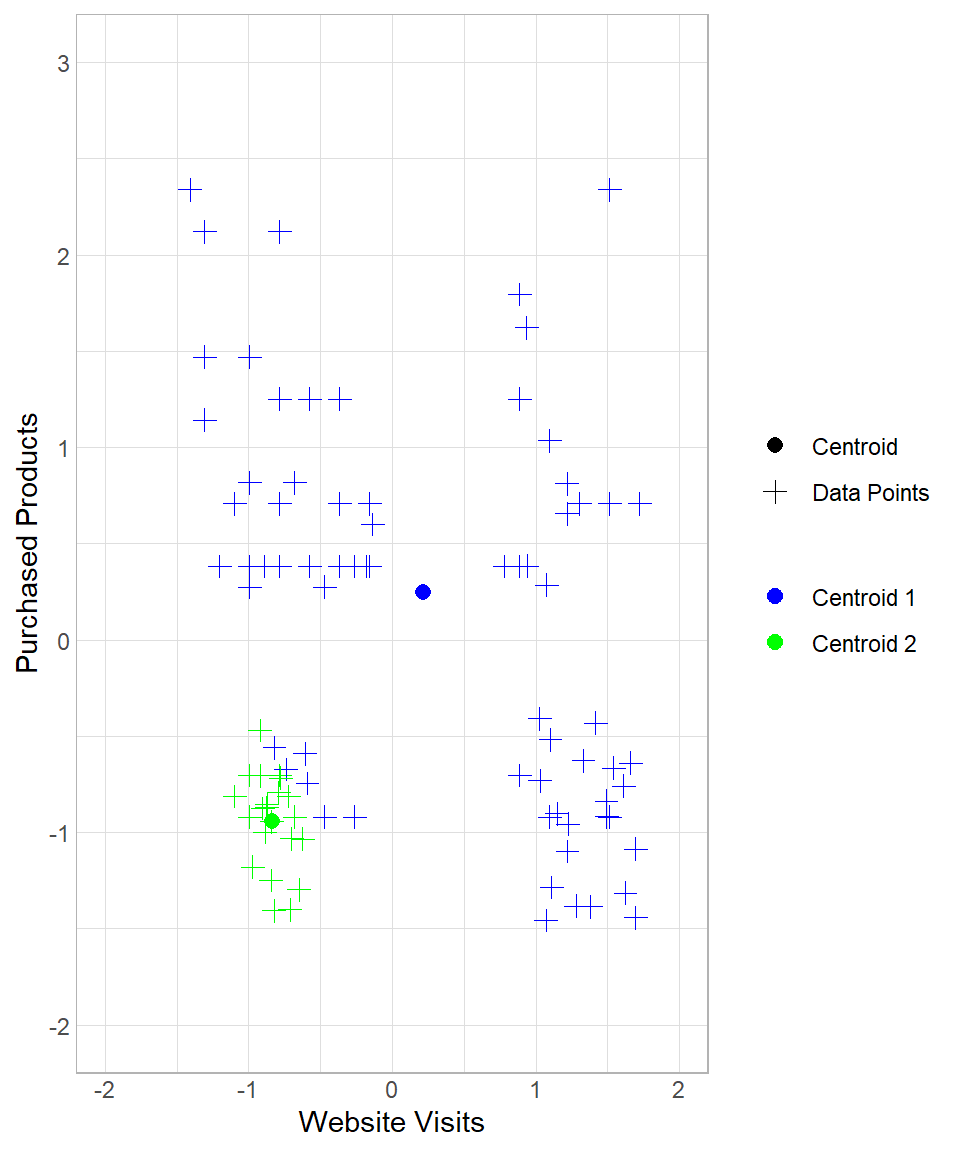

The first two plots above describe the initial creation of the two centroids and the assignment of the data points to “Centroid 1”. The third and the fourth plots reflect the re-location of “Centroid 1” and the re-assignment of the data points to the centroids. The last two plots show the results after one more iteration.
Therefore, each iteration consists of one assignment and one update of the centroids (in that order). After three iterations, we have the option to stop or continue. After some iterations, the centers will stop moving since no new assignment of the data points to the centroids will occur. When we decide to stop the iterations, we have our final clusters. We have the option to begin the same process again with the same or a different \(k\) to check how our results would change.
Assumptions
As with any clustering method, k-means is based on a set of assumptions about the structure of the data in the feature space. These assumptions describe the types of groupings the algorithm is designed to detect and, therefore, the conditions under which it is expected to perform well. When they are approximately satisfied, k-means typically produces meaningful and interpretable clusters, but when they are strongly violated, the resulting groupings can become unstable or misleading (Hastie et al., 2009; Jain, 2010). The main assumptions are the following:
Cluster Size Similarity: K-means assumes that clusters are roughly equal in size. This means that each group has about the same number of points, and they occupy a similar volume in space. If one cluster is much larger or denser than others, the algorithm may pull the shared centroid toward it, causing misclassification. For example, a large group may “absorb” nearby smaller groups if they are close enough, even if they are conceptually distinct.
Similar Variability: K-means assumes that the data points in each cluster have similar spread (or variance). This means the points in each cluster are about equally tight around their center. If one cluster has high variability and another has low variability, the centroid of the wider cluster may not represent it well. It may also pull points from neighboring clusters just because the boundaries are more “blurred.”
Linearity: K-means works best when the clusters can be separated by straight lines (or planes in higher dimensions). That is, the boundaries between groups are linear. K-means assigns points to the nearest centroid based on Euclidean distance. This results in linear decision boundaries. If the actual cluster shapes are curved or nested (like a circle within a circle), k-means won’t be able to separate them correctly.
Although violations of these assumptions do not automatically make k-means unusable, they do affect the reliability and interpretability of its results. In practice, even when the assumptions are only approximately satisfied, the algorithm can still provide useful exploratory insights, as long as its limitations are clearly recognized and taken into account during analysis and interpretation.
K-Means in R
To implement k-means in R, we’ll use the same dataset discussed throughout this chapter. Our goal is to apply the k-means algorithm and interpret the resulting clusters. Since base R already includes a function for k-means, we only need to load the tidyverse package (for easier data manipulation) and import the dataset website_visits, available on GitHub:
# Libraries
library(tidyverse)

# Importing the dataset
website_visits <- read.csv("https://raw.githubusercontent.com/DataKortex/Data-Sets/refs/heads/main/website_visits.csv")
As previously mentioned, this dataset includes just two columns:
Website_Visits: the number of times a customer visited the websitePurchased_Products: the number of products a customer has purchased
To apply k-means, we use the function kmeans(). Before we do so, however, it’s important to standardize our variables. Here’s a simple function to standardize a variable, which we then apply to both columns:
# Creating the standardization Function
standardization <- function(x) {return((x - mean(x)) / sd(x))}

# Applying standardization on the variables
website_visits <- website_visits %>%
  mutate(Website_Visits = standardization(Website_Visits),
         Purchased_Products = standardization(Purchased_Products))
Now that the values of Website_Visits and Purchased_Products are standardized, we can apply the k-means method using kmeans(). The main arguments to consider are:
centers: the number of clusters (k)iter.max: the maximum number of iterationsnstart: how many times to repeat the process with different initial centroids
Although we can run k-means just once (nstart = 1), using a larger value increases the chance of finding a better solution, since the starting points are random. For this example, we’ll set centers = 2, iter.max = 50, and nstart = 20. Also, we set a seed to ensure the reproducibility of the results:
# Setting seed
set.seed(123)

# Applying k-means
kmeans_results <- kmeans(website_visits, centers = 2, iter.max = 50, nstart = 20)
The resulting object is a list. With the dollar sign ($), we can extract the information of interest, such as the cluster that each observation belongs to. We can actually add the clustering number to the dataset as a column with the mutate() function (we give the name Cluster in this example):
# Printing the results with the clusters
website_visits <- website_visits %>%
  mutate(Cluster = as.factor(kmeans_results$cluster))

# Printing the first 6 rows
head(website_visits, n = 10)
Website_Visits Purchased_Products Cluster
1 -1.0976463 0.7091550 1
2 -0.9932219 0.2745556 1
3 -0.7843732 0.3832055 1
4 -0.5755246 0.3832055 1
5 1.7218109 0.7091550 2
6 0.8864162 -0.7032931 2
7 -1.0976463 -0.8119430 1
8 -0.4711002 0.2745556 1
9 -1.3064949 1.1437545 1
10 -0.9932219 1.4697040 1The Cluster column contains values 1 or 2, consistent with the k = 2 setting. These numerical values can later be relabeled with more descriptive names for interpretation. We can visualize the clusters using ggplot2:
# Visualizing the results
website_visits %>%
  ggplot(aes(x = Website_Visits,
             y = Purchased_Products,
             color = Cluster)) +
  geom_point(size = 2.5) +
  scale_colour_manual(values = c("grey", "darkgreen")) +
  theme_light()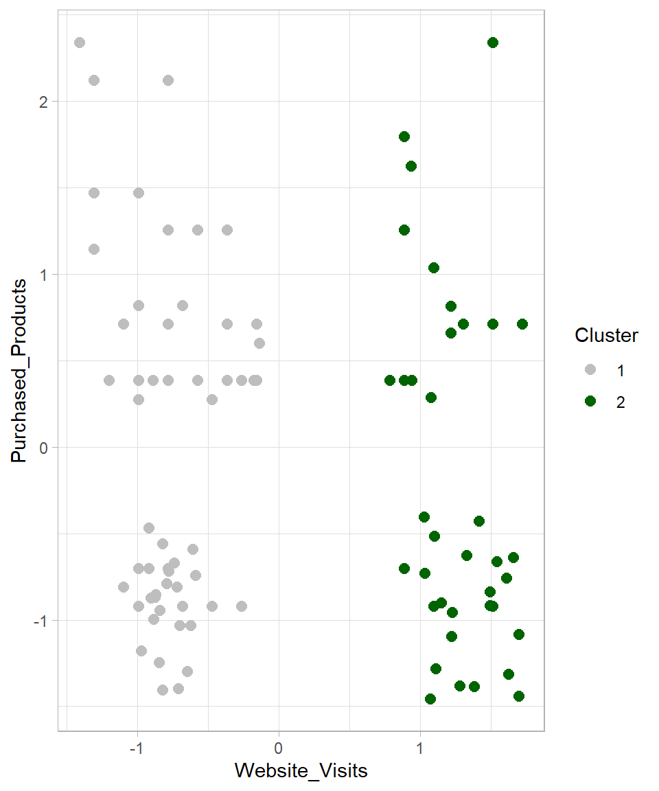
The visualization confirms that the data has been divided into two groups. But what happens if we change the number of clusters? Let’s try k = 3 and k = 4, and plot all results together:
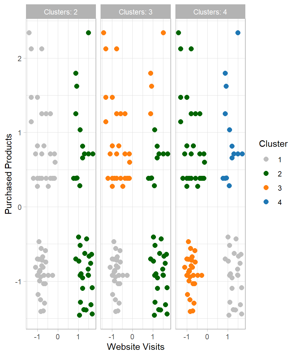
This raises the question: which number of clusters (k) should we choose? Since this is an unsupervised learning method, there is no single “correct” answer. However, one common technique to guide this choice is the Elbow Method. This method involves plotting the total within-cluster sum of squares (WSS) against different values of \(k\) (Ketchen & Shook, 1996). The “elbow” indicates diminishing returns in WSS, representing the point where adding more clusters no longer significantly reduces the total within-cluster variation:
# Setting seed
set.seed(123)

# Method to find the optimal number of clusters: Look for the "elbow"
## 1) Creating an empty vector for the total within sum of squares error: wss
wss <- vector()

## 2) Applying For-loop for 15 cluster centers
for (i in 1:15) {
  km.out <- kmeans(website_visits, centers = i, iter.max = 50, nstart = 20)

  # Saving the total within sum of squares in wss
  wss[i] <- km.out$tot.withinss}

## 3) Plotting total within sum of squares vs. number of clusters
plot(1:15, wss, type = "b",
     xlab = "Number of Clusters",
     ylab = "Within Sum of Squares")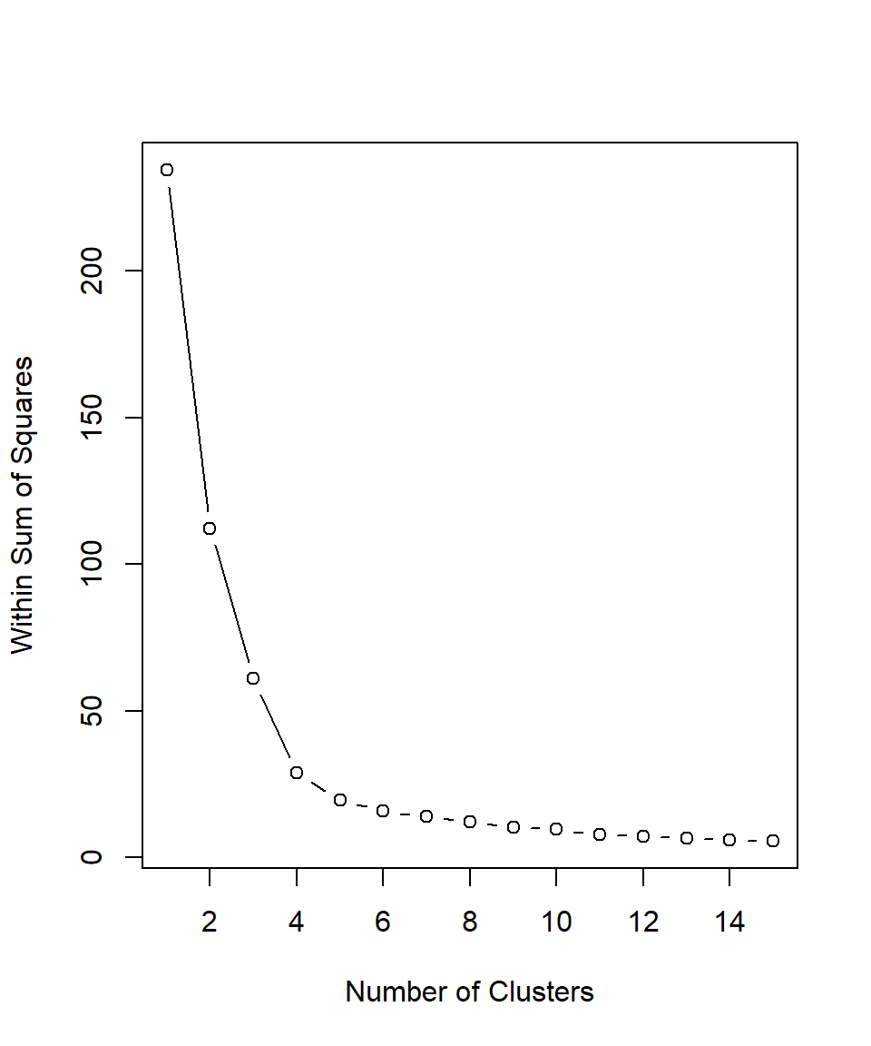
Based on the plot above, the recommended number of clusters is 4 because this is where the line starts to flatten, indicating that adding more clusters beyond this point does not significantly improve the clustering. Therefore, we can set \(k\) equal to 4, apply the kmeans() function for a last time and then assign the results in our dataset:
# Set seed
set.seed(12)

# Set k equal to 4
k <- 4

# K-means
kmeans_results <- kmeans(website_visits, centers = k, iter.max = 50, nstart = 20)

# Assign the results
website_visits <- website_visits %>%
  mutate(Cluster = as.factor(kmeans_results$cluster))

# Visualize the results
website_visits %>%
  ggplot(aes(x = Website_Visits, y = Purchased_Products, color = Cluster)) +
  geom_point(size = 2.5) +
  labs(x = "Website Visits",
       y = "Purchased Products") +
  scale_colour_manual(values = c("grey", "darkgreen", "#ff7f0e", "#1f77b4"))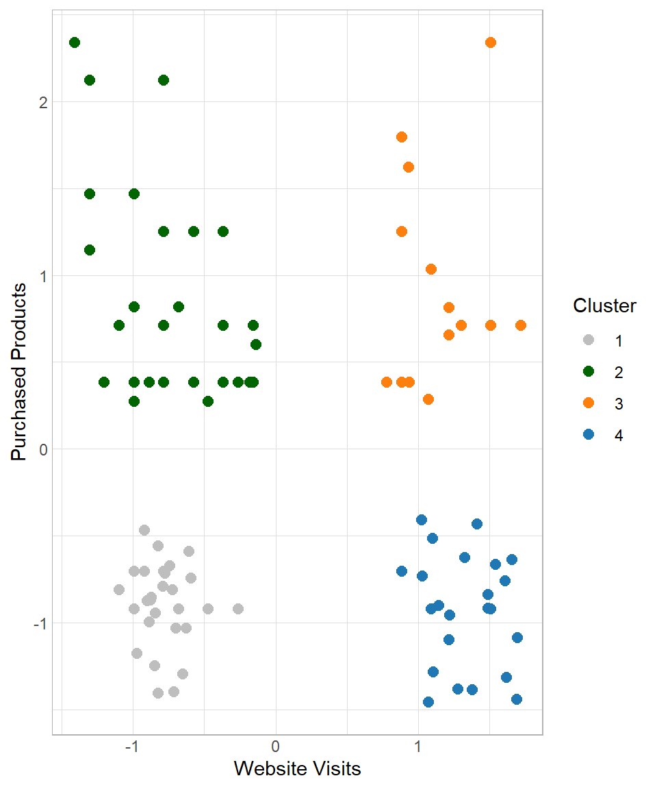
Based on the empirical results, it is suggested to keep four clusters. The next question is how do we move from there? Based on the characteristics of the clusters, we try to give an appropriate name and description in order to provide insights that make sense to the people who are interested. In this case, a plausible description could be the following:
- Cluster 1 – Casual Buyers: Customers with few website visits and few purchased products
- Cluster 2 – Selective Spenders: Customers with few website visits but many purchased products
- Cluster 3 – Shopping Champions: Customers with many website visits and many purchased products
- Cluster 4 – Explorers: Customers with many website visits but few purchased products
Advantages and Limitations
K-means is one of the most widely used clustering algorithms in practice, mainly because of its simplicity and efficiency (MacQueen, 1967; Lloyd, 1982). However, like any method, it comes with both strengths and limitations that should be taken into account when applying it.
K-means is relatively easy to understand and implement. The algorithm follows a clear and intuitive process: initialize centroids, assign data points, update centroids, and repeat. Additionally, k-means clustering is computationally efficient, even when applied to large datasets (Lantz, 2023). Its iterative nature and relatively simple calculations (mainly distance computations and averages) allow it to scale well compared to more complex clustering methods. The results are easy to interpret, as each cluster is represented by its centroid, which can be used to summarize the characteristics of the group. This makes it particularly useful in business contexts, such as customer segmentation, where interpretability is essential (Wedel & Kamakura, 2000).
One of the main challenges of k-means is selecting the appropriate number of clusters. Since the algorithm requires the value of k in advance, methods such as the Elbow Method are often used, but they do not always provide a clear answer. The initial placement of centroids can significantly affect the final results (Lantz, 2023). Poor initialization may lead to suboptimal clustering, which is why techniques such as multiple random starts (nstart) are commonly used. K-means assumes that clusters are evenly sized and roughly spherical, which is why we assume the clusters can be separated by straight lines. If the true clusters have irregular shapes, varying densities, or different sizes, the algorithm may fail to identify them correctly (Ester et al., 1996). Lastly, outliers can strongly influence the position of centroids, as the mean is affected by extreme values. This can distort the resulting clusters and reduce their interpretability.
Although these limitations do not prevent k-means from being useful, they highlight the importance of understanding the structure of the data and carefully interpreting the results. In practice, k-means is often used as an exploratory tool, providing a first insight into potential groupings within the data.
Recap
K-Means Clustering is a simple and effective method for grouping data points based on similarity, making it well-suited for tasks such as customer segmentation. It helps businesses uncover patterns in behavior, enabling targeted campaigns and personalized experiences. K-means is easy to implement even on large datasets, and its results can be interpreted using the characteristics of the cluster centroids. However, like any machine learning algorithm, it has limitations: the choice of k influences the outcome, the initial placement of centroids can affect clustering quality and outliers can skew the centroids. The key is to standardize data properly, select k thoughtfully, and interpret clusters using centroid characteristics to gain actionable business insights.