# Libraries
library(tidyverse)
library(scales)

# Setting theme
theme_set(theme_light())20 Data Analysis through Data Visualization
20.1 Introduction
In this chapter, we revisit the Titanic dataset, which we previously used to practice building plots from scratch. This time, our focus shifts from creating visualizations to using them as tools for analysis. Through the Titanic case, we aim to explore how data visualizations can help us better understand the structure of a dataset (and a problem), identify group differences, observe trends, and uncover meaningful patterns.
Our goal is to see, in practice, how data visualization supports the process of analyzing data, not just for presentation, but as an integral part of exploratory analysis. By visually examining the data from multiple viewpoints, we can form data-driven impressions and begin to interpret what the data might suggest, always keeping in mind that visualization is a starting point for insight, not a final answer.
20.2 Loading Packages and Importing Data
We begin by loading the necessary R packages. Since our analysis
follows the tidyverse principles, we load the
tidyverse package, which provides a suite of tools for
data manipulation and visualization. We also set a consistent visual
style for our plots using the theme_set() function.
Additionally, we load the scales package, which is
useful for formatting axis labels, such as percentages or currency,
based on the data’s scale:
With the environment ready, we now import the Titanic dataset directly from GitHub:
As introduced in the previous chapter, the Titanic dataset contains information about the passengers who were on board the RMS Titanic, which tragically sank after striking an iceberg on April 15, 1912. This dataset offers a range of variables that help us explore different aspects of the passengers’ demographics and travel conditions:
-
PassengerId: A unique identifier for each passenger -
Survived: Whether the passenger survived (1) or did not survive (0) -
Pclass: Ticket class (1 = 1st, 2 = 2nd, 3 = 3rd) -
Name: Full name of the passenger -
Sex: Gender of the passenger -
Age: Age in years -
SibSp: Number of siblings or spouses aboard -
Parch: Number of parents or children aboard -
Ticket: Ticket number -
Fare: Fare paid for the ticket -
Cabin: Cabin number -
Embarked: Port of embarkation (C = Cherbourg, Q = Queenstown, S = Southampton)
This dataset provides a rich context for exploring how we can use data visualization to understand different characteristics and distributions with real-world data.
20.3 Preprocessing the Data
Before diving into visual exploration, we begin with a few
preprocessing steps to prepare the Titanic dataset. First, we create
a new factor variable called Survived_Label. Using the
if_else() function, this variable assigns the label
"Survived" if the passenger survived (i.e., Survived == 1) and "Not Survived" otherwise. This transformation
makes the data more intuitive and easier to interpret in plots.
In addition, we convert several categorical variables to factor
type. Specifically, Pclass, Sex, and
Embarked are imported as either numeric or character
variables, but they represent distinct categories and should be
treated accordingly in our analysis:
# Preprocessing titanic
titanic <- titanic %>%
  mutate(Survived_Label = if_else(Survived == 1, "Survived", "Not Survived"),
         Survived_Label = as.factor(Survived_Label),
         Pclass = as.factor(Pclass),
         Sex = as.factor(Sex),
         Embarked = as.factor(Embarked))
20.4 Exploratory Data Analysis and Data Visualization
Up to now, we have set up the R environment, imported our dataset, and performed the necessary preprocessing steps. But how do we actually begin to analyze a dataset? We might create some plots or calculate summary statistics—but where do we start, and what should we look for? It turns out there is no universal answer to this question.
Our goal in data analysis is to understand the data we have. To do that, we need to ask meaningful questions and then dive into the data to find answers. This process is rarely linear. The questions themselves are not always obvious, especially in business settings, where figuring out which questions to ask can be one of the most difficult parts of the job. In fact, one answered question often leads to several new ones. This back-and-forth process lies at the heart of what makes exploratory data analysis (EDA) so vital.
In this sense, working with data is often more like being a detective than a statistician. Before running any formal tests or models, we must investigate the data to uncover patterns, anomalies, or clues that guide our understanding. John Tukey, a pioneer of EDA, emphasized this idea when he said, “The greatest value of a picture is when it forces us to notice what we never expected to see.” Visualizing data allows us to spot trends and surprises that raw numbers alone might hide. It helps us not only understand our data more deeply but also to communicate our findings more clearly and persuasively.
Hadley Wickham, a leading figure in modern data science, echoes this view: “Exploratory data analysis is not a formal statistical test. It is more about detective work to generate hypotheses.” Instead of trying to confirm a theory from the outset, we explore the data to form new ideas worth testing later. Just like a detective follows leads and refines theories based on evidence, a data analyst uses visualizations and summaries to make sense of complex information.
Ultimately, EDA is a creative, iterative, and question-driven process that brings the data to life and prepares us for deeper statistical inquiry. This is where data visualization becomes one of our most powerful tools. Visualizations allow us to “see” the structure of the data—its distributions, relationships, and outliers—often revealing insights that would be hard to detect through tables or summary statistics alone.
Through visual exploration, we can ask better questions: Are there unusual spikes in sales? Do certain customer groups behave differently? Is there a trend hiding behind seasonal variation? Each visualization acts like a spotlight, highlighting different parts of the dataset and helping us decide where to look next.
Moreover, data visualization doesn’t just help us understand the data—it helps us tell its story. A well-crafted plot can communicate findings more effectively than several paragraphs of explanation. Whether it’s a scatter plot showing a clear relationship, a bar chart comparing categories, or a time series revealing trends, visualizations turn raw numbers into something both interpretable and persuasive.
20.5 Analyzing the Titanic Dataset
To continue our Titanic case study, we start with the most basic question: How many passengers survived, and how many did not?
We can answer this question by creating a bar plot using the
Survived_Label variable we created earlier. Since this
is a categorical variable, we only need to specify it on the x-axis
inside aes()—ggplot2 will count the
occurrences automatically.
# Basic bar plot: count of survivors and non-survivors
titanic %>%
  ggplot(aes(x = Survived_Label)) +
  geom_bar()
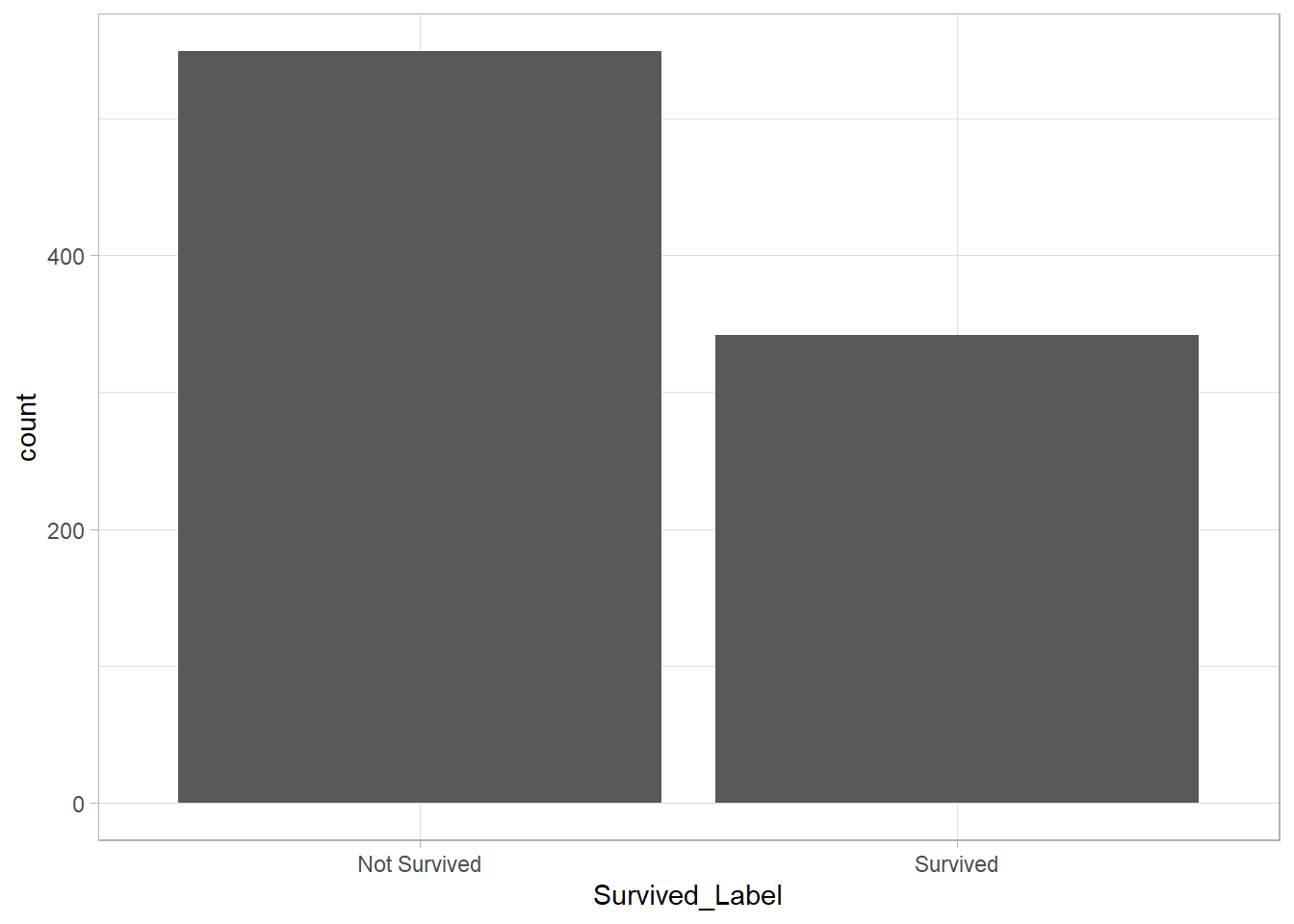
This bar plot reveals that most passengers in the dataset did not survive. Visually, we can estimate that around 450–500 passengers lost their lives, while about 350 survived.
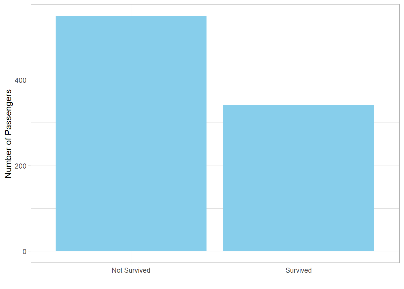
We can enhance this plot to make it more visually appealing and easier to interpret. Specifically, we can:
-
Change the bar color to
"skyblue" -
Remove the x-axis title (since the category names are self-explanatory)
Rename the y-axis to “Number of Passengers”
We use the fill argument in geom_bar() to
change the color and the labs() function to re-label
the axes:
# Improved bar plot: count of survivors and non-survivors
titanic %>%
  ggplot(aes(x = Survived_Label)) +
  geom_bar(fill = "skyblue") +
  labs(x = "",
       y = "Number of Passengers")
Next, we ask: How do proportions of survivors differ by gender?
We might expect a higher proportion of survivors among females, as historically, women and children are often given priority in evacuation situations.
To explore this, we again use a bar plot. This time, however, we are
interested in proportion, not raw passenger counts. Since the
Survived variable is binary (0 for not survived, 1 for
survived), we can use it to calculate proportion of survivors per
gender.
To do this, we use the group_by() and
summarize() functions, applying the
mean() function to calculate the proportion of
survivors for each gender. Since the Survived variable
is coded as 1 for passengers who survived and 0 for those who
didn’t, the mean of this binary variable within a group represents
the proportion of survivors:
# Compute proportion of survivors by gender
titanic %>%
  group_by(Sex) %>%
  summarize(Proportion_Survivors = mean(Survived))
# A tibble: 2 × 2
Sex Proportion_Survivors
<fct> <dbl>
1 female 0.742
2 male 0.189
This gives us the proportion of survivors for each gender, which we
can now visualize. Since we’re specifying both x and y aesthetics,
we use geom_col() instead of geom_bar() to
create the plot:
# Bar plot: proportion of survivors by gender
titanic %>%
  group_by(Sex) %>%
  summarize(Proportion_Survivors = mean(Survived)) %>%
  ggplot(aes(x = Sex, y = Proportion_Survivors)) +
  geom_col(fill = "skyblue") +
  labs(x = "",
       y = "Proportion of Survivors")
At this stage, the plot displays proportion of survivors as decimals
(e.g., 0.75 for 75%). To express these values as percentages, we use
the percent_format() function from the
scales package and apply it to the y-axis:
# Bar plot with percent labels: proportion of survivors by gender
titanic %>%
  group_by(Sex) %>%
  summarize(Proportion_Survivors = mean(Survived)) %>%
  ggplot(aes(x = Sex, y = Proportion_Survivors)) +
  geom_col(fill = "skyblue") +
  scale_y_continuous(labels = percent_format()) +
  labs(x = "",
       y = "Proportion of Survivors")
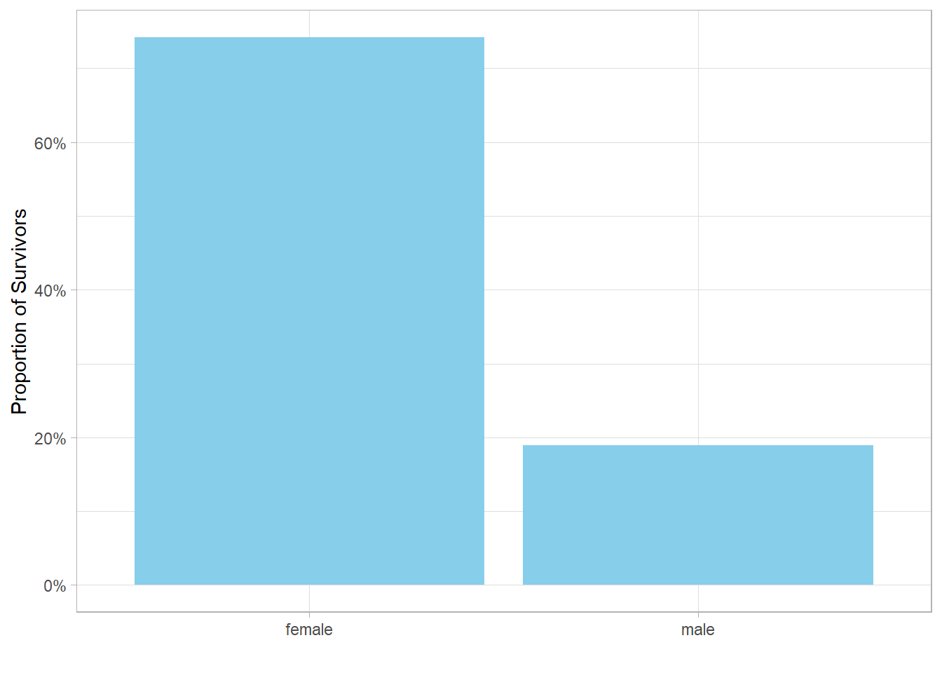
This final plot shows that approximately 75% of females survived, compared to only 20% of males. This stark contrast highlights a clear pattern in the data, giving us a powerful visual insight into the impact of gender on survival outcomes.
The Sex variable tells us whether a passenger was male
or female, but it doesn’t provide any information about their age
category—whether they were a child, teenager, adult, or elderly.
So, a natural next question is: How do proportions of survivors vary by both gender and age group?
For example, we might expect male and female children to have similar (and relatively high) proportion of survivors, since children are often prioritized in evacuation efforts. In contrast, adult males might be expected to have the lowest proportion of survivors.
To explore this, we extend our previous analysis. First, we use the
case_when() function to create a new variable,
Category, based on the Age variable. We
define four age groups:
-
0–12: Child
-
13–17: Teenager
-
18–64: Adult
-
65+: Elder
We then calculate proportions of survivors within each
gender–category combination using the same process as before:
group_by(), and summarize() using the
mean() function to calculate the proportions of
survivors.
Finally, we add Category as a facet to the plot to
compare across age groups:
# Create age categories
# Plot proportion of survivors by gender and age category
titanic %>%
  mutate(Category = case_when(
    Age <= 12 ~ "Child",
    Age <= 17 ~ "Teenager",
    Age <= 64 ~ "Adult",
    TRUE ~ "Elder")) %>%
  group_by(Sex, Category) %>%
  summarize(Proportion_Survivors = mean(Survived)) %>%
  ggplot(aes(x = Sex, y = Proportion_Survivors)) +
  geom_col(fill = "skyblue") +
  scale_y_continuous(labels = percent_format()) +
  labs(x = "",
       y = "Proportion of Survivors") +
  facet_grid(. ~ Category)
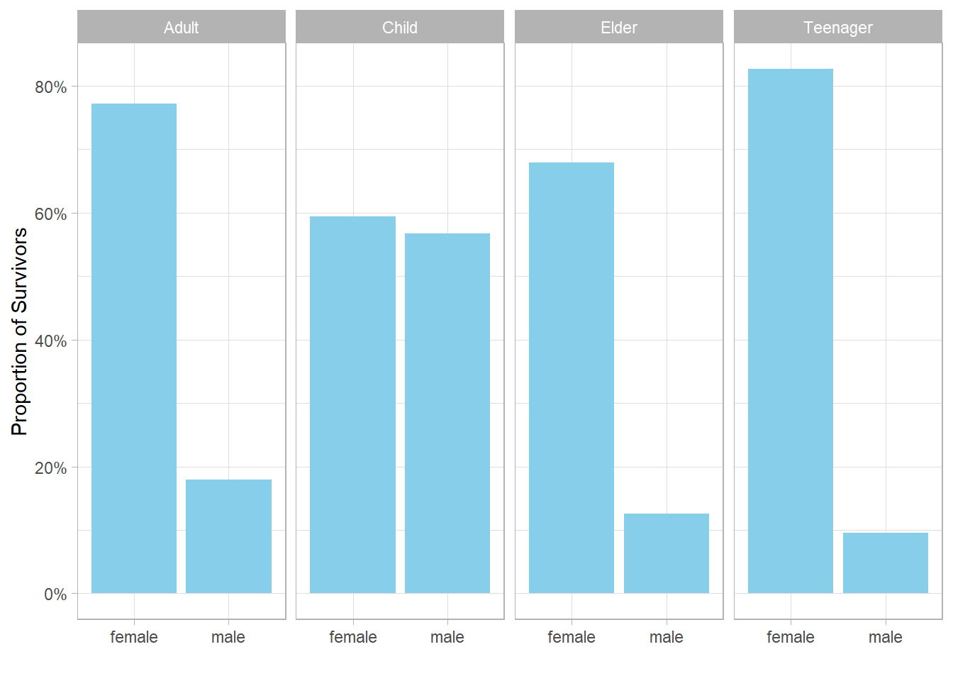
As expected, the proportion of survivors among children is high and roughly equal between males and females. However, we also notice that female teenagers and female elders have significantly higher proportions of survivors than their male counterparts, just like adult females do. Does this imply that teenage girls and elderly women were also given higher priority than males in those groups? It’s possible. But before drawing firm conclusions, we should consider the number of passengers in each group. If a group has only a few individuals, a single survivor can disproportionately influence the proportion of survivors.
To investigate this, we create a second plot showing the number of passengers (not the proportion of survivors), grouped by gender and age category:
# Bar plot: number of passengers by gender and age category
titanic %>%
  mutate(Category = case_when(
    Age <= 12 ~ "Child",
    Age <= 17 ~ "Teenager",
    Age <= 64 ~ "Adult",
    TRUE ~ "Elder")) %>%
  ggplot(aes(x = Sex)) +
  geom_bar(fill = "skyblue") +
  labs(x = "",
       y = "Number of Passengers") +
  facet_grid(. ~ Category)
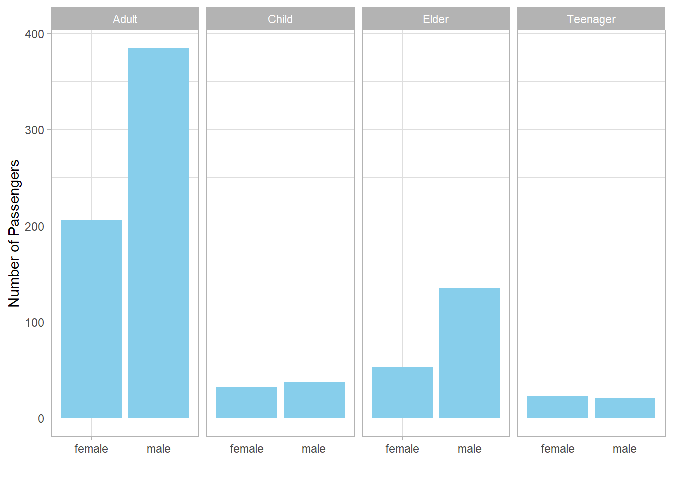
This plot shows that:
-
The number of male and female teenagers is roughly the same.
-
There are slightly more male elders than female elders.
-
In all categories, at least 20 passengers are represented.
So, the earlier proportions of survivors are not skewed due to small sample sizes. The observed gender differences in survival across all age categories are therefore meaningful and suggest a consistent pattern: female passengers—regardless of age—were more likely to survive than male passengers.
The next question is: what is the proportion of survivors per gender across the ticket classes?
To answer this, we calculate the proportion of survivors separately for males and females within each of the three ticket classes, and place ticket class on the x-axis.
This time, instead of using facets, we want to display the bars for
each gender side by side. To do this, we set the
position argument of geom_col() to
position_dodge(). For aesthetic reasons, we also use
the scale_fill_manual() function to assign distinct
colors to each gender: light pink for females and light blue for
males:
# Proportions of survivors by gender and ticket class
titanic %>%
  group_by(Pclass, Sex) %>%
  summarize(Proportion_Survivors = mean(Survived, na.rm = TRUE)) %>%
  ggplot(aes(x = Pclass, y = Proportion_Survivors, fill = Sex)) +
  geom_col(position = position_dodge()) +
  scale_y_continuous(labels = percent_format()) +
  scale_fill_manual(values = c("lightpink", "lightblue")) +
  labs(x = "Ticket Class",
       y = "Proportion of Survivors")
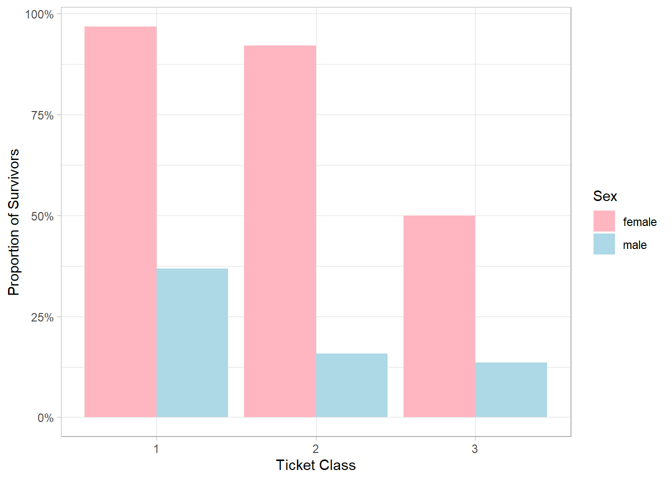
The resulting plot shows a clear trend: in both genders, proportions of survivors tend to decrease as ticket class becomes lower (i.e., from 1st to 3rd class). However, this trend is more pronounced in males. For females, proportions of survivors remain relatively stable between 1st and 2nd class, with a substantial drop only in 3rd class. For males, the decline is more gradual: there is a notable decrease when moving from 1st to 2nd class, followed by a slight further decrease from 2nd to 3rd class. One possible explanation for this pattern is that female passengers were generally prioritized for evacuation regardless of their ticket class, especially in 1st and 2nd class where evacuation procedures may have been more orderly and accessible. In contrast, male passengers, particularly those in lower classes, may have had more limited access to lifeboats due to physical location (e.g., cabins in the lower decks), crew protocols, or social norms prioritizing women and children. As a result, ticket class had a stronger impact on male survival than on female survival.
This observation may also help explain why teenage and elder males had significantly lower proportions of survivors than their female counterparts. From a logical standpoint, teenage girls and elderly women would not necessarily be expected to have higher priority than teenage boys or elderly men. However, if class and location on the ship played a key role in evacuation access, then the same gender-based prioritization seen in adult passengers likely extended across age groups as well, resulting in better outcomes for females, regardless of age.
We can explore this hypothesis by extending our previous code to
include the step where we create the Category variable
and then add facets to visualize proportions of survivors across age
groups:
# Proportions of survivors by age category, age and ticket class
titanic %>%
  mutate(Category = case_when(
    Age <= 12 ~ "Child",
    Age <= 17 ~ "Teenager",
    Age <= 64 ~ "Adult",
    TRUE ~ "Elder"))  %>%
  group_by(Pclass, Sex, Category) %>%
  summarize(Proportion_Survivors = mean(Survived, na.rm = TRUE)) %>%
  ggplot(aes(x = Pclass, y = Proportion_Survivors, fill = Sex)) +
  geom_col(position = position_dodge()) +
  scale_y_continuous(labels = percent_format()) +
  scale_fill_manual(values = c("lightpink", "lightblue")) +
  labs(x = "Ticket Class",
       y = "Proportion of Survivors") +
  facet_grid(. ~ Category)
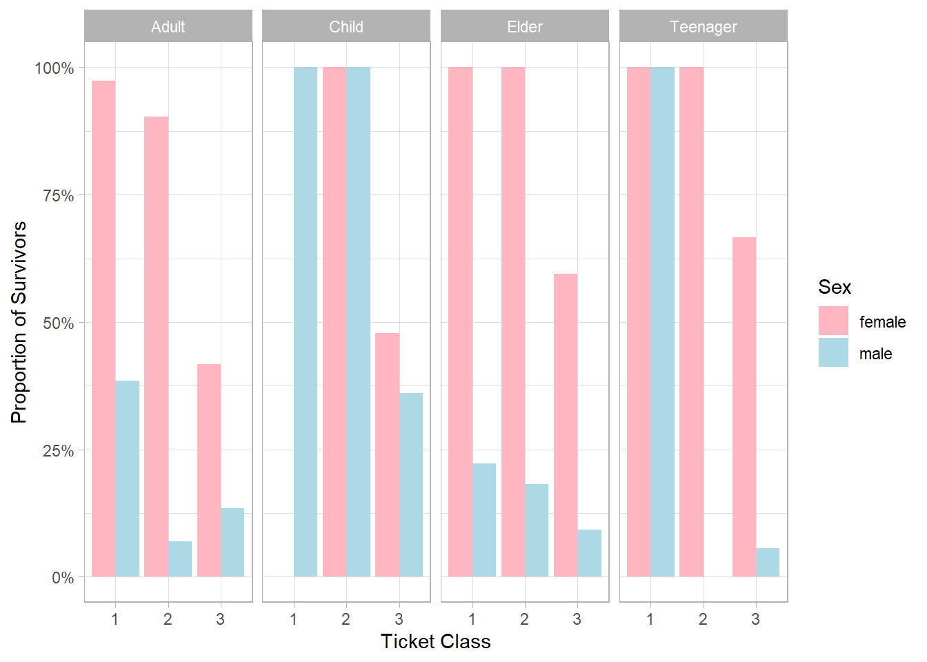
Although female proportions of survivors were consistently higher, or at least equal, across all groups, we notice that there were no male teenagers in second class, while second-class female teenagers had a 100% proportion of survivors. This lack of male data in that subgroup may partly explain the striking gender difference. Furthermore, we find strong evidence that female elders had a higher priority than male elders, as the proportion of survivors gap between them is considerable. Another notable finding is that children in both first and second class had 100% proportions of survivors, further reinforcing the idea that ticket class—and likely cabin location—had a major impact on survival outcomes.
This raises an additional question: could proportions of survivors also be influenced by whether adults were traveling solo or with family?
It is plausible that adults traveling solo were more likely to hold lower-class tickets, perhaps due to cost or personal circumstances, which in turn could have affected their chances of survival. Additionally, those traveling with family members might have received more attention or assistance during the evacuation.
To answer this question, we use the filter() function
to remove all children, teenagers, and elders from the dataset.
These age groups are typically treated differently in emergency
situations, often receiving priority during evacuation regardless of
other factors such as ticket class or whether they were traveling
solo. By focusing only on adults, we reduce this variability and
ensure a cleaner comparison. Adults are also more likely to be
traveling solo, making them the most appropriate group for testing
our hypothesis about the relationship between proportions of
survivors, travel companionship, and ticket class.
Additionally, we create a new variable called
Adult_Type, which takes the value
"Solo Adult" if both SibSp and
Parch are zero, indicating the passenger was traveling
solo. Otherwise, it takes the value "Family Adult".
Then, using group_by() and summarize(), we
calculate the proportions of survivors for these two adult groups
across the different ticket classes and plot the results using
facets for each Pclass:
# Proportions of survivors of adults by solo/family status and ticket class
titanic %>%
  filter(Age >= 18 & Age <= 64) %>%
  mutate(Adult_Type =
           if_else(SibSp == 0 & Parch == 0,
                   "Solo Adult",
                   "Family Adult")) %>%
  group_by(Adult_Type, Pclass) %>%
  summarize(Proportion_Survivors = mean(Survived)) %>%
  ggplot(aes(x = Adult_Type, y = Proportion_Survivors)) +
  geom_col(fill = "skyblue") +
  scale_y_continuous(labels = percent_format()) +
  facet_grid(. ~ Pclass) +
  labs(x = "",
       y = "Proportion of Survivors")
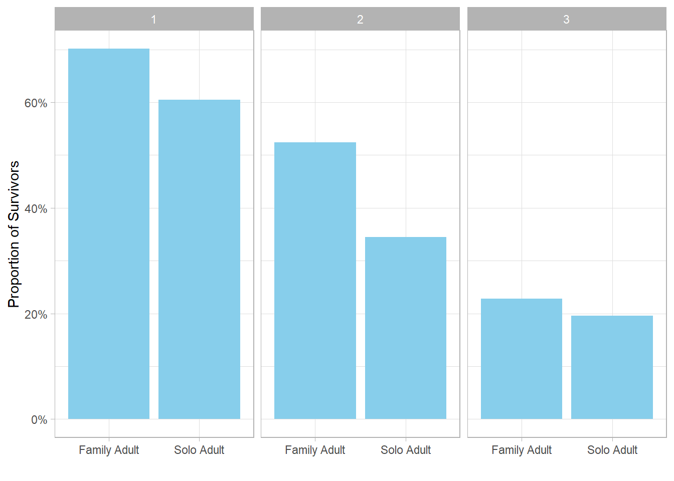
The proportion of survivors for family adults is higher than that of solo adults in all ticket classes, especially in the second class. This may indicate that adults traveling with family had better chances of survival, possibly because family members supported each other or received more assistance during evacuation. In contrast, adults traveling solo might have had less social support, which could have negatively impacted their survival chances.
This observation also connects back to our earlier hypothesis about why teenage and elder males had significantly lower proportions of survivors than females in the same categories. Since teenage females and elder females were more likely to be traveling with family, they might have benefited from this advantage, whereas males in those age groups traveling solo or with fewer family members could have had lower proportions of survivors.
20.6 Case Study Conclusions
This case study has explored proportions of survivors on the Titanic by examining the interplay between gender, age categories, ticket class, and travel companionship.
First, by breaking down passengers into age-based categories—children, teenagers, adults, and elders—we observed that proportions of survivors varied not only by gender but also across these age groups. While children of both sexes had similar, relatively high proportions of survivors, significant gender disparities appeared among adults, teenagers, and elders. Female proportions of survivors were generally higher than male proportions of survivors across most groups.
Next, analyzing proportions of survivors by ticket class revealed a clear positive relationship between ticket class and survival: passengers in higher classes had better survival chances regardless of gender. However, the drop-off in proportions of survivors between classes differed between males and females, suggesting a nuanced interplay of social status and evacuation priority.
Importantly, when considering adults separately and distinguishing between those traveling solo and those traveling with family, we found that adults accompanied by family members consistently exhibited higher proportions of survivors across all ticket classes. This suggests that companionship and social support likely played a critical role in survival outcomes.
Taken together, these findings highlight that survival was influenced not just by gender or ticket class, but by a combination of age, social status, and travel circumstances. The notably lower proportions of survivors among male teenagers and elders may reflect that these groups were less likely to be traveling with family or in higher ticket classes, factors which may have compounded their risk.
This nuanced understanding underscores the value of considering multiple interacting factors when analyzing survival patterns in emergency situations, and suggests further investigation into social dynamics aboard the Titanic could yield deeper insights.
Most importantly, throughout this case study, data visualization has proven to be an essential tool for exploring and communicating complex relationships within the Titanic dataset. By leveraging bar plots, faceted graphs, and color-coding, we uncovered and illustrated nuanced survival patterns across multiple factors such as age, gender, ticket class, and travel companionship. This reinforces the value of visual analytics in making data-driven narratives more accessible and insightful, especially when working with multifaceted real-world data.