In statistics, we often want to make inferences about a population
based on a sample. If we knew the population mean and standard
deviation, we could use the Normal distribution to
make these inferences, assuming that the distribution in the
population is normal. But in real life, we rarely have access to the
whole population—so we rely on samples instead.
When we estimate the population mean using a sample, we also have to
estimate the standard deviation. This adds extra uncertainty to our
calculations. The t-distribution accounts for this
added uncertainty. It is similar to the normal distribution in
shape—symmetric and bell—shaped, but it has
heavier tails, which means it gives higher
probability to extreme values. These heavier tails help protect
against underestimating variability when the sample size is small.
The t-distribution gradually becomes more like the normal
distribution as the sample size increases. This is because our
estimate of the standard deviation becomes more accurate with more
data. In fact, when the sample size is large enough, the
t-distribution and the normal distribution are almost the same.
Interestingly, the t-distribution was developed in 1908 by William
Sealy Gosset, a statistician working at the Guinness Brewery in
Dublin. Due to restrictive company policies, he published his work
under the pseudonym “Student,” which is why the distribution is
commonly called the Student’s t-distribution. Gosset
created it to address the problem of making reliable inferences from
small sample sizes, which was common in quality control processes at
the brewery.
18.2 When do we encounter
the t-distribution?
Suppose we want to estimate the distribution of IQ of students in a
university, but we only have data from a small sample of 10
students. A common approach is to calculate the sample mean and
sample standard deviation and based on these estimates we can make
inference about the population.
For this example, we generate 10 IQ scores randomly from a Uniform
distribution between 90 and 110. We then simulate 100,000 IQ scores
using the normal distribution with the calculated sample mean and
standard deviation using the rnorm() function:
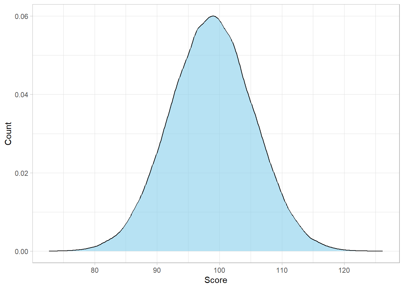
# Librarieslibrary(tidyverse)# Setting the themetheme_set(theme_light())# Setting seedset.seed(568)# Generate a sample of 10 IQ scoresiq_scores <-tibble(Score =runif(10, min =90, max =110))# Calculate mean and standard deviationmean_score <-mean(iq_scores$Score)sd_score <-sd(iq_scores$Score)# Simulate from the normal distributionsimulated_iq_scores_n <-tibble(IQ_n =rnorm(n =100000, mean = mean_score, sd = sd_score))# Plot the distributionsimulated_iq_scores_n %>%ggplot(aes(x = IQ_n)) +geom_density(fill ="skyblue", alpha =0.6) +labs(x ="Score",y ="Count")
As expected, the distribution looks normal, because we simulated it
from a normal distribution in the first place. However, there’s a
key issue here: we don’t actually know the true standard deviation
of all students’ IQ scores. Of course, we have used the
sample standard deviation as an estimate, but our
sample size is small. This means that our estimate is probably not
that accurate, even though it is our best guess.
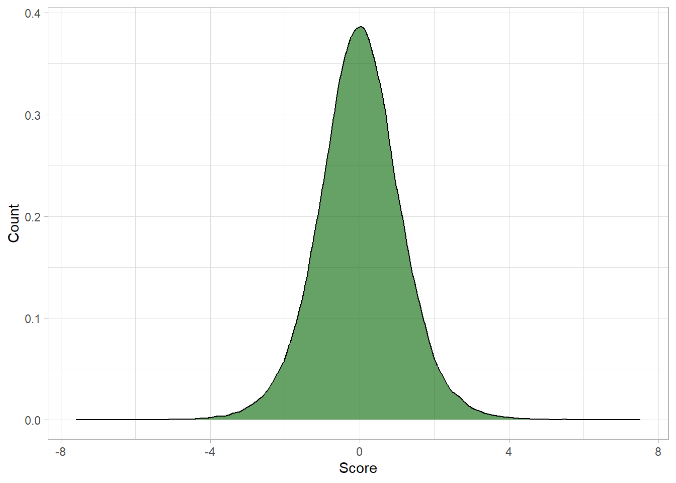
To demonstrate, let’s simulate values using the
t-distribution instead (we discuss the code later
in this chapter):
Notice how the center of the distribution is around zero (0). This
is because the t-distribution is standardized, meaning it
assumes a mean of 0. To compare it fairly to the normal
distribution, we need apply standardization to the data of the
normal distribution and plot both distributions together:
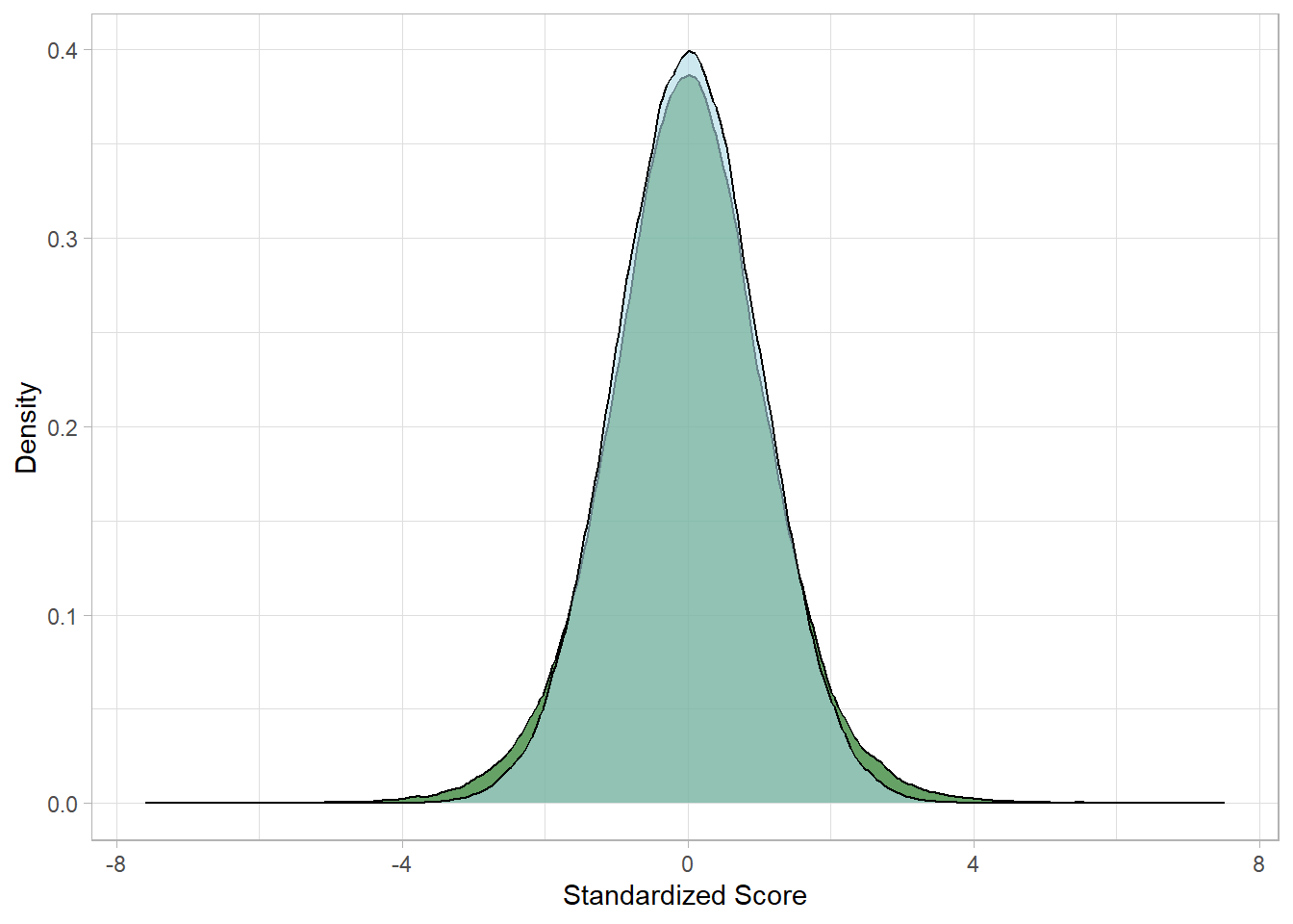
# Standardize the normal distribution samplesimulated_iq_scores_n <- simulated_iq_scores_n %>%mutate(IQ_n_std = (IQ_n -mean(IQ_n)) /sd(IQ_n))# Plot both distributionssimulated_iq_scores_n %>%bind_cols(simulated_iq_scores_t) %>%ggplot() +geom_density(aes(x = IQ_t), fill ="darkgreen", alpha =0.6) +geom_density(aes(x = IQ_n_std), fill ="lightblue", alpha =0.6) +labs(x ="Standardized Score", y ="Density")
We can now see the difference clearly: the dark green distribution
(t-distribution) has slightly heavier tails and a lower center than
the light blue distribution (normal distribution).
Degrees of freedom and sample size
In the example above, we generated 100,000 values from a
t-distribution to visualize its shape, but this does not mean
our sample size was 100,000. The sample size refers to the
number of actual data points we collected—in this case, just 10
IQ scores. The degrees of freedom used for the
t-distribution reflect this original sample size. So even though
we create many simulated values, the distribution’s shape still
depends on the small sample, not the number of values drawn for
plotting.
18.3 What are the
parameters and shape of the t-distribution?
We write the t-distribution using the following notation:
\[ X \sim t(df) \]
This means that the random variable
\(X\) follows a
t-distribution with df degrees of
freedom. Since the t-distribution is always standardized, it is
implied that the mean is always 0 and the standard deviation is
always 1.
In the chapter
Statistical Distributions, we discussed how the degrees of freedom are used to take into
account the fact that we use the sample mean instead of the
population mean to calculate the standard deviation of a sample. As
a reminder, the degrees of freedom (df) is equal to the sample size
minus one:
\[ df = n - 1 \]
The important thing to keep in mind is that the smaller the number
of degrees of freedom, the higher the uncertainty.
The t-distribution is a continuous probability distribution
characterized by its probability density function (pdf), which is
given by the following formula:
The first part of the formula is a constant that ensures the total
area under the curve equals 1. This is just like the constant
\(\frac{1}{2 \pi}\) in the normal
distribution. It contains the gamma function, which
is a generalization of the factorial function. This part helps shape
the height of the curve appropriately for different values of
df. The second part of the formula controls the shape
of the distribution. It works a bit like the exponential part of the
normal distribution. The term
\(\frac{x^2}{df}\) measures how
far a value \(x\) is from the
center, and the exponent determines how quickly the density drops
off as you move further from zero.
When the degrees of freedom are small, the drop is slow, meaning
more probability is placed in the tails. This reflects greater
uncertainty when we have little data. As the degrees of freedom
increase, the drop becomes steeper, and the distribution starts to
resemble the normal distribution.
From the student example, suppose we want to calculate the
likelihood of \(x = 0\) given
\(df = 9\). Using the formula, we
have:
which is is approximately the maximum height of the distribution we
saw in the last plot.
Now let’s look at the expected value and
variance of the t-distribution. As expected, the
expected value is:
\[ E(X) = 0 \] The variance is:
\[ Var(X) = \frac{df}{df - 2} \]This variance is greater than 1 when
df is small, which reflects the heavier tails. For
example:
With \(df = 5\) the variance is
\(\frac{5}{5 - 2} \approx 1.67\).
With $df = 30, the variance is
\(\frac{30}{30 - 2} \approx 1.07\)
As df increases, the variance approaches 1, just like
the standard normal distribution.
However, when \(df \le 2\), the
variance becomes undefined or infinite. This again highlights how
small samples carry more risk and uncertainty.
18.4 Calculating and
Simulating in R
R provides built-in functions that make it easy to work with the
t-distribution in simulations and probability calculations. Let’s
use these functions to explore a scenario involving a sample of 20
university students, where we want to estimate the average IQ.
Suppose we randomly select 20 students and calculate the sample mean
and sample standard deviation of their IQ scores. Since the
population standard deviation is unknown and the sample size is
relatively small, we use the t-distribution with
\(df = 19\).
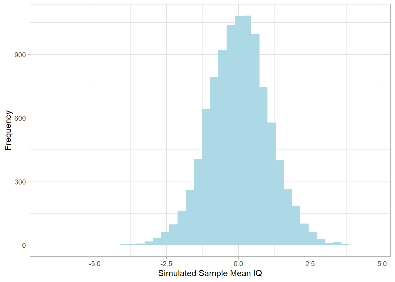
To simulate 10,000 possible sample means under this setup, we draw
from a t-distribution. Note that the values appearing are
standardized:
This histogram shows the distribution of simulated sample means. The
shape resembles a normal distribution, but with slightly heavier
tails, which reflect the added uncertainty due to estimating the
population standard deviation from a small sample.
To calculate the probability density at a specific t-value (e.g.,
the likelihood of observing a t-value of 1.5 with 19 degrees of
freedom), we use the dt() function:
# Density at t = 1.5 with 19 degrees of freedomdt(x =1.5, df =19)
[1] 0.1285716
To compute the cumulative probability up to a certain t-value (e.g.,
the probability of getting a t-value up to 1.5), we apply the
function pt():
# Cumulative probability of t ≤ 1.5pt(q =1.5, df =19)
[1] 0.9249757
Finally, to find the critical value corresponding to the 97.5th
percentile, which is useful for confidence intervals, we use the
qt() function:
# 97.5th percentile of the t-distribution with 19 dfqt(p =0.975, df =19)
[1] 2.093024
These functions allow us to simulate data and calculate
probabilities when working with small samples and unknown population
standard deviations, which is exactly the kind of scenario the
t-distribution was designed for.
18.5 Recap
In this chapter, we explored the t-distribution, a critical tool in
statistics when working with small samples and an unknown population
standard deviation. The t-distribution is similar in shape to the
normal distribution, meaning that it is symmetric and bell-shaped,
but it has heavier tails. These heavier tails account for the extra
uncertainty introduced when we estimate the population standard
deviation from the sample.
The distribution is defined by a single parameter: degrees of
freedom, typically equal to the sample size minus one. When the
degrees of freedom are small, the t-distribution is noticeably wider
than the normal. As the sample size increases and our estimate of
the standard deviation becomes more reliable, the t-distribution
gradually converges to the normal distribution.
The mean of the t-distribution is 0 and its variance is larger than
1 when the degrees of freedom are small, but this variance
approaches 1 as the degrees of freedom increase. This flexibility
allows the t-distribution to adapt based on the size of the sample
and make more cautious inferences, particularly useful in hypothesis
testing and confidence intervals for means when we do not know the
population standard deviation.